Energy Musings contains articles and analyses dealing with important issues and developments within the energy industry, including historical perspective, with potentially significant implications for executives planning their companies’ future. While published every two weeks, events and travel may alter that schedule. I welcome your comments and observations. Allen Brooks
July 26, 2022
Energy Crisis Tied To Economic Chaos and Geopolitics
The energy crisis, intertwined with inflation, has driven a stable world into a colossal mess. We follow Adam Tooze as he draws polycrisis diagrams to explain the dynamics creating this mess. READ MORE
Europe’s Natural Gas Conundrum In A World Context
Nord Stream 1’s 10-day shutdown elevated Europe’s fears of a winter without Russian gas. The EU has a plan to cut gas use. It is splitting member unity risking worse long-term outcomes. READ MORE
Energy Crisis Prompts Questions About The Role Of ESG
Solving the energy crisis has highlighted why more investment is needed. The ESG movement is limiting a funding surge. ESG measures may be creating worse outcomes with pain for investors. READ MORE
Random Energy Topics And Thoughts
Bloomberg Trumpets U.S. EV Tipping Point
Renewable Energy Is Cheap But Look Out For The Future
Energy Crisis Tied To Economic Chaos and Geopolitics
Energy analysts are hard-pressed to find a historical period analogous to the current environment. Soaring global inflation and energy prices have disrupted normal economic activity because the impacts do not flow evenly. Just as analysts struggle to find the elusive analog period, policymakers are just as fluxed by the lack of economic and monetary tools to correct the imbalances causing the economic disruptions. The pain from these imbalances felt by societies is creating unrest in many countries manifesting in riots, protests, and election backlashes. Whether it is the riots in Siri Lanka over a collapsing food system driven by poor government policies or the farmer protests in the Netherlands over government schemes to take over farms, people are incensed that poor leadership is harming them, their families, and their futures.
Citizens had counted on elected officials to enact policies that would ensure stable economies and societies, but they are experiencing the opposite. According to an early July report from the United Nations Development Program (UNDP), 71 million more people around the world are experiencing poverty from soaring food and energy prices. The UNDP report estimates that 51.6 million more people fell into extreme poverty in the first three months following the late February invasion of Ukraine by Russia which drove energy prices up, meaning they are living on $1.90 a day or less. These additional people pushed the total number globally facing extreme poverty to 9% of the world’s population. An additional 20 million people slipped to the poverty line by surviving on $3.20 a day. Low-income country families spend 42% of their household incomes on food.
The three months after the war’s outbreak in February saw a worse social impact than experienced during the pandemic lockdowns and economic closures of 2020-2021. The 71 million people UNDP cited falling into poverty in the three months since the war was proportionally worse than the 125 million additional people who experienced poverty during the 18 months of pandemic lockdowns. The more staggering figure is UNDP’s estimate that over five billion people, or nearly 70% of the world’s population, are living in poverty, or are vulnerable to falling into poverty.
We have written about the energy crisis that grips Europe. The crisis has been spreading globally and is likely to worsen this winter as adequate energy supplies remain in doubt merely a few months before cold weather arrives. In speaking about the European energy crisis, Shell Oil’s chief operating officer Ben Van Beurden told the Aurora Spring Forum audience, “Maybe some countries will fare better than others, but I think we will all be facing very significantly escalating pricing, so there will be a lot of pressure on industry and therefore there will be a lot of pressure on the economy. In the worst case, we will be in a situation where we have to ration.”
So how did we go from what was a relatively calm environment 12-18 months ago to the chaos that reigns across the world today? Someone who has tried to assess how the world has changed since the start of 2022 is Adam Tooze, an English historian who holds the Shelby Cullom Davis chair of History at Columbia University and serves as the Director of the European Institute. In 2019, Foreign Policy Magazine named him one of the top Global Thinkers of the decade. Tooze focuses on quantitative data that he ties to history to explain events such as the 2008 financial crisis, the Covid pandemic, and the evolution of the modern German state.
In January, Tooze wrote a Chartbook article on “Crisis Pictures (Krisenbilder) – Mapping The Polycrisis.” He characterized the then-current environment as a “polycrisis” that is “relentless” and “comes from all sides and it just doesn’t stop.” We identified with that description of what was unfolding and continues to cascade across the world stage. In late June, he updated his analysis, demonstrating how the crisis has become a total mess.
As Tooze questioned “how to get a handle on this situation,” he turned to the German language, something he grew up with, to find the appropriate term to describe the situation. It is the compound noun: Krisenbilder – Crisis Pictures. With that introduction, he began drawing pictures. The first linked the Russia-Ukraine-U.S. war scare to financial pressure on Russia. This was during the buildup of Russian forces on Ukraine’s border and the training exercises the Russian military was undertaking but before the invasion. No one knew what Russia’s President Vladimir Putin’s game plan was, so they thought about the worst possible outcomes.
Exhibit 1. The Emerging Global Crisis Matrix
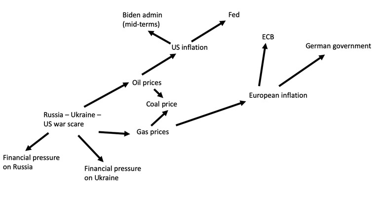
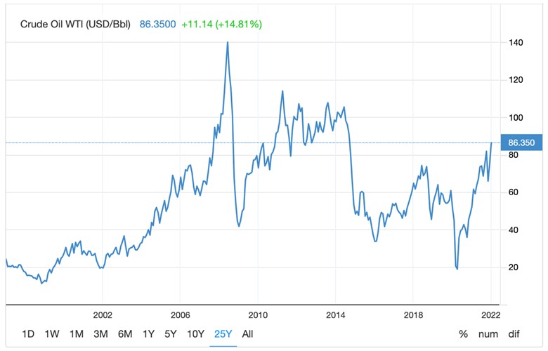
As his picture showed, the war scare was putting pressure on Russia, but also on oil and natural gas prices that impacted coal prices, and in turn Europe and U.S. inflation, their respective central banks, and government policies. This was logical because policymakers suddenly realized the economic vulnerability of Europe to Russian fossil fuels and their potential loss. The various pressures appeared straightforward and were supported by charts showing currency market trends and Ukraine’s credit default swap prices. Tooze asked whether the West could afford to sanction Russia. He pointed out that the 2014 U.S. sanctions on Russia following the first Ukraine confrontation were “calibrated in light of the state of the oil market.” Tooze wondered “how much more fragile” the oil market was in early 2022 than in 2014.
Exhibit 2. WTI Futures Record Shows Oil Market Conditions During Ukraine Crises
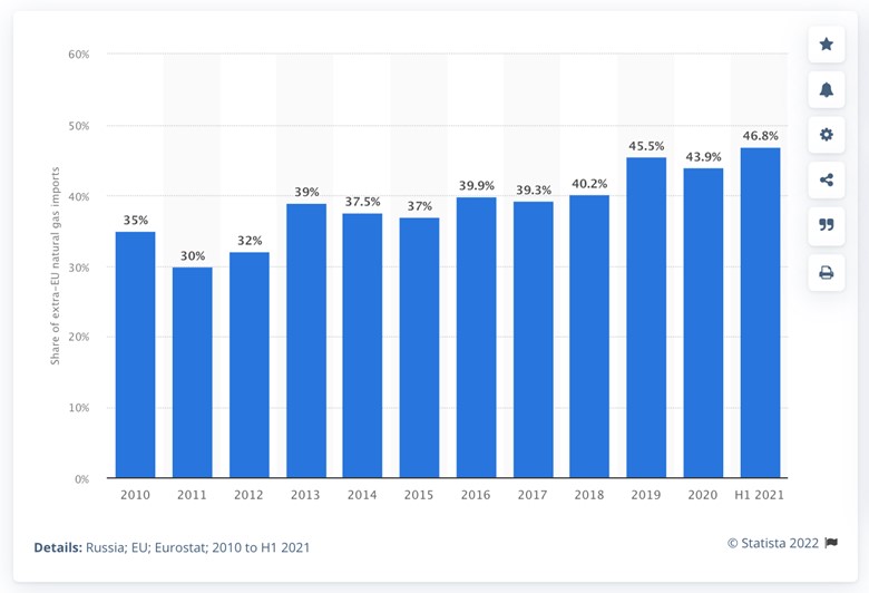
Tooze then wondered about the Biden administration’s vulnerability “given the inflation scare in the U.S. and Europe.” Remember, this analysis was done in January when the reported inflation rate was 7.5% up from 7.0% in December in the U.S., and in Europe, it was 5.6%, up from 5.3% the prior month. Tellingly, the European inflation rate was up from 1.2% a year ago. The inflation was driven by sharply rising energy prices that filter throughout economies. These soaring energy prices were considered critical for Europe because of its natural gas dependency on Russia and the need to wean itself off that supply, which would mean higher gas prices as countries sought alternative supplies. Tooze pointed out that since 2014, Europe had done little to improve its gas supply situation as the following chart demonstrates. Europe was more dependent on imported natural gas supplies, primarily from Russia, seven years later.
Exhibit 3. Europe’s Dependence On Russian Gas Has Grown Since 2010
“Framing the stand-off between Russia and the West, is China,” wrote Tooze, introducing that country to his Crisis Picture.
Exhibit 4. China’s Relations With Russia And U.S. Highlight Complexity Of Outlook
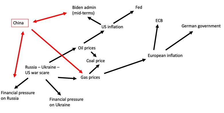
Since the 2014 Ukraine crisis, Russia has developed a “new and far closer relationship with Beijing.” Tooze thought it would be an interesting twist in Eurasian history if the two Ukraine crises drives Russia into China’s arms. But China was suddenly confronting a new Covid outbreak that sent it into an economic lockdown. Less economic activity in China would impact energy demand and prices, but also it would reduce the flow of low-cost goods to the U.S. and Europe eliminating the dampening effect on inflation rates. Geopolitically, there also were all the interactions between Russia, China, and the U.S. to consider.
Exhibit 5. China Becomes An Important Ingredient In Tracking Polycrisis
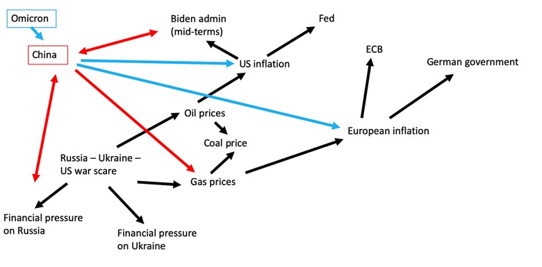
Tooze cited the Russia-China-U.S. interaction being played out in the politics surrounding Lithuania. Europe, especially Germany, was worried that Lithuania was becoming “an eager tool of U.S. policy vs. China,” and possibly having an impact on the latter’s relationship with Russia. Tooze pointed to research suggesting that the U.S. had pushed Lithuania to open “a representative office in Vilnius that carries the name Taiwan.” The introduction of another geopolitical flashpoint.
Exhibit 6. Net Zero Climate Policies Add Further Confusion To Polycrisis Matrix
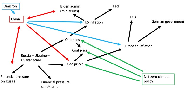
The final chart (above) from the January Chartbook included the impact of the COP 26 climate change and the commitments of many nations to net zero climate policies. Neither Russia nor China signed on to COP’s methane-reduction pledge, and China, like India, also did not commit to stopping the use of coal. These decisions and those of other countries who acted on the interests of their citizens and their priorities rather than falling into line with the climate change movement added new pressures to the matrix. While Tooze pointed the net zero climate policy arrows (impact) to coal, natural gas, and crude oil prices, in our opinion, he missed pointing out the policy’s impact on inflation rates in Europe and the U.S., which would also involve policy responses from the various central banks.
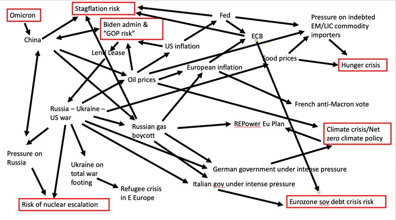
In his June Chartbook update, Tooze stated that he proposed using this schematic because it was a useful way of demonstrating interconnected forces and capturing many of the dynamics that have convulsed the world over the past five months. As he described the matrix below, “a relatively legible map has become a tangled mess.” Less than a month later, this matrix could be an even greater mess with the addition of factors such as heat waves, potential natural gas rationing, a soaring U.S. dollar, the collapsing value of the euro, U.K. and Italian government leadership changes, and growing numbers of protests in countries around the world.
Tooze commented that all these connections in the matrix are discussed in various analyses that may get into subtleties he was not considering. Stresses in energy and food markets were already surfacing in 2021. The Russia-Ukraine war has exacerbated those existing tensions such that they are more closely intertwined than they would be otherwise. What Tooze did in the chart below is to highlight in red what he suggests have emerged as the top macroscopic risks, all of which he believes may come to a head in the next 6-18 months.
While he acknowledged that his selection of macroscopic risks is debatable, he pointed out just how many radical challenges there are on our radar. He also noted the uncertainty that surrounds several of them, such as Covid variants or nuclear escalation. “These are tail risks which can no longer be ignored but to which it is hard to attach a real probability,” he wrote. The third and possibly the more important consideration about these challenges is that they all are happening at once and several of them reinforce each other. In Tooze’s opinion, we would be unlucky if all the challenges happened, but it is also virtually impossible that at least one of them does not happen.
Exhibit 7. How The Polycrisis Matrix Has Morphed Into A Mess
In attempting to show how these various risks may interact, Tooze created the table below. In preparing his table, he divided the stagflation risk into two – the risk of recession and the risk of accelerating inflation. There are many considerations involved in determining the impact of the interaction of the risks. That is why, when he could not determine the impact, he placed NA and question marks in boxes.
Tooze also questioned whether it is correct to assign an escalation effect to the climate crisis on inflation. He said his decision was because he used the “greenflation” concept as the determinator although he is somewhat skeptical of the concept. Greenflation is considered the cost of the energy transition in dealing with climate change, but expectations are that it will be less than the cost of climate change. However, other people are using the term greenflation to describe the increase in the costs of climate change. We are unclear about which definition of greenflation Tooze is using when he says he is skeptical of the concept. While there are other issues we disagree with, we may be arguing over subtle differences about his reasons for reaching his conclusions about the respective impacts in the matrix rather than substantive differences.
Exhibit 8. The Interactions Of Macroscopic Crisis

Source: Chartbook
He wrote: “I say that a recession would exacerbate the climate crisis because I expect it to lead to a recession in green investment. But these effects, their scale and sign are up for debate.” We think that may be much more dependent on the political landscape in countries, as many governments believe green energy investments are job-creating and economically stimulating, so it could become a preferred policy response in helping economies recover from a recession. But these uncertainties are what comes from engaging in such an exercise as Tooze has laid out.
Tooze concluded his June update to his January polycrisis article by writing the following:
Overall, what the combination of the crisis picture and the matrix help us to see is that not only do we face multiple macroscopic risks hedged with great uncertainty, but their interactions tend to be escalatory.
This is not inevitable; this is not a prophecy of doom. But it is an assessment of multiple and compounding risks.
It may perhaps be taken as the definition of the polycrisis, the concept borrowed by way of Jean-Claude Juncker, that I invoked in my book Shutdown.
A polycrisis is not just a situation where you face multiple crises. It is a situation like that mapped in the risk matrix, where the whole is even more dangerous than the sum of the parts.
We found the two Chartbook articles to provide an interesting perspective on the economic morass in which we are involved. There may be other ways to scope out the various challenges and risks facing economies around the world. This is merely one way. But as the evolution of the crisis map demonstrated, things are complex and all subject to change (escalation/de-escalation). We expect the next version of the crisis map to be even more confusing. Moreover, we have no idea when the crisis map will become less complex.
Europe’s Natural Gas Conundrum In A World Context
Call it a fire drill. The International Energy Agency (IEA), the International Monetary Fund (IMF), and the European Union (EU) have all mobilized to advise Europe on strategies to manage through a potential Russian natural gas supply cutoff this winter. The pressure to act sooner has grown following the total shutdown of the Nord Stream 1 gas line connecting Russia with Germany for annual maintenance. Associated with the planned maintenance was the reinstallation of a compressor that had been removed last year and sent to Canada for repair by Siemens under a long-term maintenance contract with Gazprom, the pipeline’s owner. The return of the compressor was prevented by concerns over possible violations of the western world’s economic sanctions against countries and companies doing business with Russia following its invasion of Ukraine.
Nord Stream 1 had been shipping at its capacity of 167 million cubic meters (mcm) throughout most of 2021, but then reduced the flow by 60% earlier this year, reportedly due to the compressor maintenance issue. For the ten days the annual maintenance was conducted, there was no Russian gas flowing to Europe. The pipeline has just been restarted but at a reduced flow rate equal to about 20% of capacity.
Last year, Russia supplied Europe with 40% of its total gas consumption, with actual country import shares varying widely. The most exposed country is Germany who received over half its gas supply from Russia last year, which was the result of historical geopolitical and trade ties with Russia that was a core of its international diplomacy policy for dealing with Moscow.
As Russian gas supplies shrank, renewable energy failed to deliver volumes sufficient to offset the lost supply. European countries have scrambled to secure more natural gas supplies both from neighboring countries and imports of liquefied natural gas (LNG). Restarting coal plants and extending the lives of nuclear power plants have been seized upon by government policymakers across the continent, as well as asking citizens to conserve, as ways to ease the energy crisis.
In late June, Germany announced it was moving to stage two of its three-stage emergency energy plan. The “alert” phase follows on the “early warning” phase, while the third stage is “emergency.” The stage definitions reflect the growing seriousness of the energy supply situation and substantial developments confirming an oncoming energy supply crisis.
EARLY WARNING PHASE – This stage is triggered when there are “concrete, serious and reliable indications that an event may occur which is likely to lead to a significant deterioration of the gas supply situation and probably to the alarm or emergency level.”
ALARM PHASE – This stage is triggered when there “is a disruption in the gas supply or an exceptionally high demand for gas which leads to a significant deterioration of the gas supply situation, but the market is still able to cope with this disruption or demand without the need to take non-market-based measures.”
EMERGENCY PHASE – This stage is triggered when there “is an exceptionally high demand for gas, a significant disruption in gas supplies or another significant supply situation and all relevant market-based measures have been implemented, but gas supply is insufficient to meet the remaining gas demand so that additional non-market-based measures need to be taken, in particular to ensure the supply of gas to protected customers.”
By moving from the “early warning” phase to the “alert” phase of its emergency gas plan, Germany was acknowledging that reduced Russian gas flows exacerbate fears of a winter supply shortage with serious social and economic consequences. When Germany’s Economy Minister Robert Habeck announced the move to stage two of the emergency plan, it meant Europe’s largest economy saw a high risk of long-term gas supply shortages. Those fears continue to grow despite the political moves allowing the return of the Nord Stream 1 gas compressor and Russia’s restarting of gas flows. The problem is that Russia’s leader Vladmir Putin stated that the resumed flow would be lower than its prior volumes – 30 mcm – but he signaled that could change in the future.
The move by the European Commission, the governing body of the EU, last week to ask member countries to voluntarily reduce their natural gas consumption by 15% compared with the five-year average use during the August 1 to March 31 period, is another example of reaction to the growing fears over adequate energy supply during the upcoming winter. The gas cutbacks are voluntary but if there are further supply issues the cuts will become mandatory. No one knows how such a mandatory cutback would be implemented, let alone monitored. Will there be penalties, and if so, what will they be and how will they be administered?
Already several EU members have objected. Greece, Portugal, and Spain are rejecting the move. The Spanish Energy Minister said that “contrary to other countries, Spain hasn’t been living beyond its means in energy terms.” Ouch! This is the latest confirmation of the growing fractures within the EU over addressing energy and inflation issues. The collapse of the value of the euro below parity with the U.S. dollar, the first time in 20 years, is a sign of growing global imbalances and Europe’s deteriorating economic outlook. EU leaders will be working overtime attempting to hold the organization together, as the social pressures for countries to go their own way in protecting their citizens overrules the unitary requirements of the EU.
The economic damage from a cutoff of Russian gas supplies was assessed in a paper by economists at the IMF. The economists acknowledge that “fully replacing Russian gas imports may prove difficult in the short-term.” While Europe has been able to offset reductions in Russian gas volumes and build its storage to average historical levels in June, those achievements were done before Russia’s gas flow was reduced further. The economists concluded that alternative gas supplies – higher non-Russian gas pipeline imports, increased LNG imports, and fuel switching within the power generation sector – could replace two-thirds of Russian gas over the next 12 months. The problem is the uncertainty about global supply and the ability of countries and companies to switch energy suppliers. These uncertainties are impacted by the limits of infrastructure to facilitate transportation of increased alternative supplies.
The major concern of the IMF economists is not a Russian supply that is reduced or even totally disrupted through the summer, it is the potential of a longer disruption that extends through the peak winter season. The latter concern, they believe, could result in costly regional shortages, extremely high natural gas and electricity prices, and fuel and power rationing in some countries.
Further impacting the outlook from these gas supply disruption scenarios is how they would harm industrial sectors of economies. The economists investigated the issue by employing two techniques: a general equilibrium approach and a production-function based approach. The first approach relies on prices adjusting the system, but it depends on there being few infrastructure bottlenecks. The production-function approach is useful in countries where technical constraints are not severe, such as infrastructure bottlenecks that fragment the gas market.
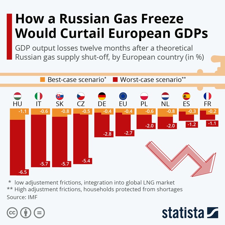
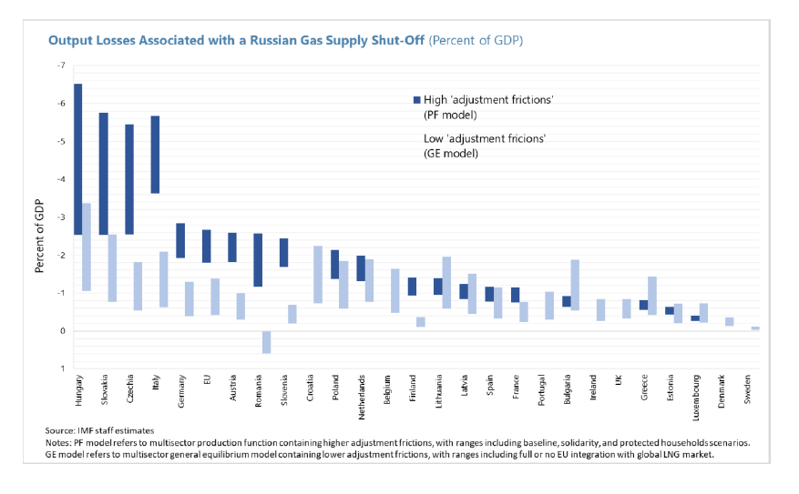
The IMF economists wrote: “When calculating the GDP impact, we focus on the loss in output over a 12-month period relative to a benchmark case in which total European gas supplies would be at “normal” levels (with 2021 used as a base on which to build the calculation).” The report’s conclusion about a full gas flow shutoff scenario is that severe shortages would likely emerge in certain Central and Eastern European countries with negative impacts on their GDPs of up to 6%. They believe the impact on Austria, Germany, and Italy would be significant, but would depend on their governments’ policy responses.
Optimistically, the IMF economists believe many EU countries are unlikely to face the constraints from infrastructure bottlenecks, the ability to secure alternative energy supplies, and for energy prices in their economies to adjust and help regulate demand. They also believe that Europe can “fully overcome adjustment friction, and demand and supply fully adjust to prices in an integrated market,” therefore, output effects could be smaller for the overall EU. Their analysis concludes that by addressing gas import and transportation from different locations would support further building of gas storage over the summer, thereby minimizing the risk of winter shortfalls. They believe this outcome requires “securing solidarity across countries.” Additionally, the IMF economists praised the swift response of the EU and its member governments to source alternative energy supplies, develop contingency plans, work to remove constraints to a more integrated European gas market, and pursue greater energy efficiency. This is the foundation of their optimism about Europe surviving a gas shutoff through the winter.
The IMF report cited actions by industries in Europe responding to higher energy costs. It reported that Norwegian fertilizer company Yara had temporarily reduced production at plants in Italy and France, while Europe’s largest steel producer, ArcelorMittal, accounting for about 2% of global output, is operating all its electric arc furnaces in “stop-start mode” to avoid peak electricity prices.
ArcelorMittal’s move comes on top of output reductions at other steel producers. In Europe, aluminum smelters have curtailed 900,000 metric tons (mt) of aluminum production capacity, or 1.3% of global output. And zinc smelting capacity has been reduced by 700,000 mt, approximately 5% of global production.
More recently, Wolfgang Grosse Entrup, the German chemical association chief executive officer said the industry has done all it can to reduce its gas consumption and there is little more it can do. They will either scale back production or quit producing. BASF, Germany’s large chemical company, has already indicated it may be forced to shut down its largest plant costing 39,000 jobs. According to Reuters, “Germany’s chemical and pharmaceutical industries are the country’s largest gas consumer, with 15% of total consumption.” The German chemical industry is also the nation’s third-largest industrial sector, surpassed only by automotive manufacturing and machinery.
This outlook is not positive, and it fits with the dark outlook expressed earlier this month by Germany Federation of Trade Unions head Yasmin Fahimi. He said, “Entire industries are in danger of collapsing permanently because of the gas bottlenecks: aluminum, glass, the chemical industry.” With Germany having the world’s fourth largest economy, should this scenario come to pass, there will be many disruptions in other economies around the world. It is hard to imagine such a large economy facing such a potentially dire outlook.
The chart below summarizes the economic impact on some of the leading countries as well as the EU. It shows the outcomes of the approaches used in the IMF paper to assess the least and worst outcomes from a total Russian gas supply cutoff. We have another chart later that shows the impacts for each of the EU member countries under the two scenarios. While the impact on the EU’s GDP does not appear too severe, more like what would happen in a deep recession, it is still a meaningful hit to economies with painful fallouts for citizens.
Exhibit 9. How Europe Economies Would Fare Under Russian Gas Cutoff
Source: Statista
Since the issue of Russian natural gas flows into Europe and the frantic effort of European governments to adjust their economies and to find alternative gas supplies is crucial for understanding where we may be heading geopolitically, we found some of the charts and tables in the IMF report useful. We fully expect to be writing about Europe’s developing energy crisis throughout the balance of 2022 and likely into 2023, therefore, we decided to reproduce the charts. These charts and tables provide a prospective on the current state of the European natural gas crisis and how key forecasters anticipate the crisis to play out.
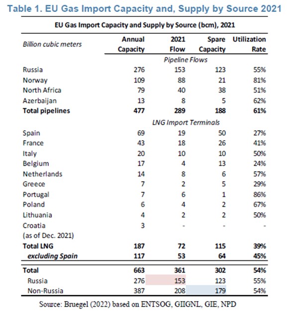
The next table lists the EU’s gas imports for 2021 by their source. This highlights the importance Russia was playing in the EU’s energy supply for heating and generating electricity, since natural gas has been the preferred backup power for intermittent renewable energy supplies. The table is also useful for identifying the key geographic regions for LNG importation and the spare capacity that existed in 2021.
Exhibit 10. Examination Of 2021 Europe Gas Market Shows Opportunities
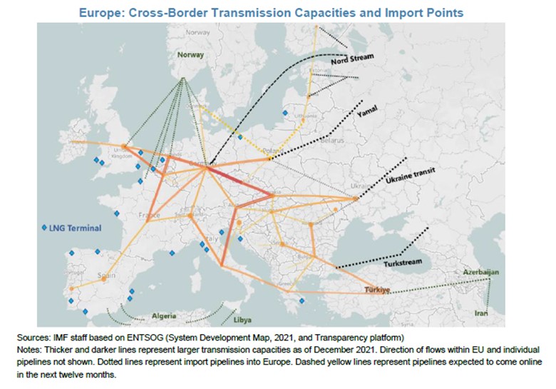
The map below shows the key import pipelines into Europe and the transportation network within the continent. The blue dots around the continent show where LNG import terminals are located. We would note that only the Nord Stream 1 gas pipeline from Russia is shown, which is because Nord Stream 2 has been constructed but not accepted and put into operation due to EU sanctions. We are hearing speculation that Putin will use the restart of Nord Stream 1 at sharply reduced volumes “because of maintenance issues” to argue that Europe could help ease its Russian gas supply shortfall by putting the new line into operation. If true, it will be an interesting measure of the EU’s resolve to hold to its sanctions. Moreover, as the table above and the map highlight, European unity could be fractured over the disparity in nations’ dependency on Russian gas imports.
Exhibit 11. How Natural Gas Flows Into And Around Europe Continent
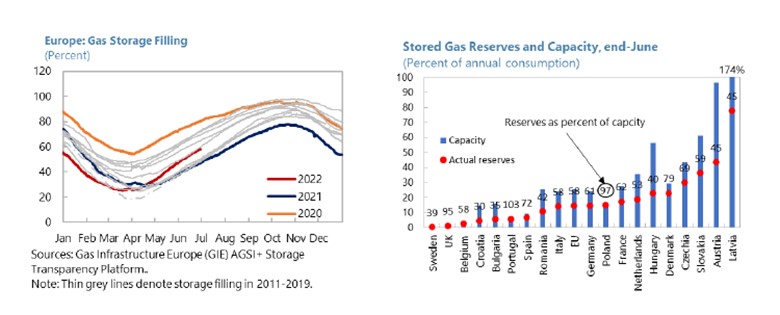
The next two charts show Europe’s gas storage as of June 30, and the progress in the effort to rebuild gas storage volumes compared to prior years and history. There is also a chart showing individual county storage levels relative to annual consumption, so the reader can assess which countries have done the best job in rebuilding storage ahead of the upcoming winter and better prepared to survive a total loss of Russian gas. We learned when Nord Stream 1 completely shut down that some countries resorted to tapping their gas storage volumes to ease their nation’s gas supply shortfalls and are counting on more supply being available after the pipeline maintenance hiatus.
Exhibit 12. Current State Of The European Natural Gas Storage Market
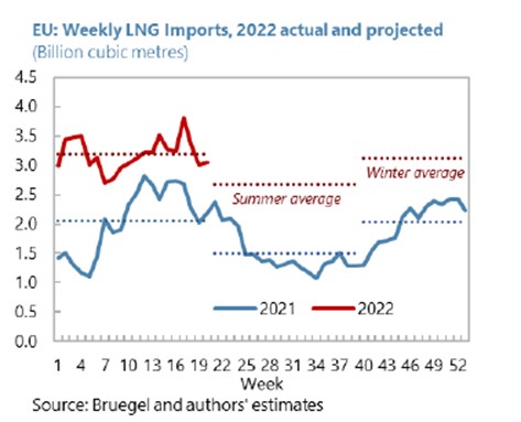
The next chart shows the volumes of LNG imported in Europe in 2022 so far compared with the record for 2021. There are also projections for the volume of LNG to be imported during the summer and in the winter. The forecasts were made after the Freeport LNG fire that has shutdown that gas export terminal until late fall, thereby reducing available U.S. LNG cargos.
Exhibit 13. LNG Imports 2022 Versus 2021
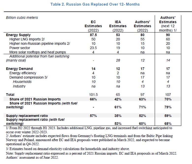
The next table shows the estimates for how Europe will replace all Russian natural gas in 2022. There are estimates by the EU and the IEA, as well as the economic team at the IMF who prepared this study. The authors also provided an estimate of 12-month gas supply replacement. Examining these estimates – whether they prove correct or not – is valuable for highlighting which energy policy tools the respective forecasters favor. If we see successes or failures of specific tools, this table will provide an opportunity to assess the implications.
Exhibit 14. Estimates Of How Europe Replaces Russian Gas Supplies
Lastly, we have the following chart that shows the least and worst economic impacts from the two scenarios for Russian gas supplies. While some of the countries appeared in the earlier chart, this provides the assessment for every member of the EU.
Exhibit 15. How Every EU Country Fares On Russian Gas Cutoff Scenarios
Source: IMF
The EU’s struggle to avoid a complete economic collapse if all Russian natural gas deliveries were curtailed will be front and center in the energy news for the balance of 2022. What happens in this arena will also play out in the geopolitical arena, especially if the financial pain for populations causes political backlashes. We have already seen the U.K.’s Prime Minister Boris Johnson lose his office, although there were other issues than just the energy crisis. In Italy, Prime Minister Mario Draghi held on to his office for a while but has finally gone. France’s president, Emmanuel Macron, lost his parliamentary majority only weeks after being overwhelming re-elected. Does that power shift reflect the speed with which the European energy crisis is spinning out of control along with the dissatisfaction of the French populace? We seriously doubt we have seen the end of the political turmoil across Europe because of its significant dependence on Russian fossil fuels and Putin’s use of energy as a weapon. We will watch to see when the EU’s voluntary 15% gas consumption cutback switches to a mandatory cut. How that will be implemented likely will create more social upheavals. Stay tuned.
Energy Crisis Prompts Questions About The Role Of ESG
As the world energy crisis worsens, we are seeing more articles raising questions about how environment, social, and governance (ESG) metrics may be contributing to the conditions that have exacerbated the crisis. This question is interesting following the surge in ESG-oriented investments and increasing pressure by investors and regulators on companies to report their progress on measuring their emissions and their long-term plans for making their businesses more sustainable. Many people would point to the letters and speeches of Larry Fink, the founder, and CEO of BlackRock, one of the financial industry’s largest money managers and a sponsor of many electronic tracking funds (ETF) including several tied to ESG investing, as the driving force being the ESG push.
Realistically, ESG’s history extends further back than a few years. Some students of ESG point to investing trends in the 1950s and 1960s as the first manifestation of ESG focus by the investment industry. They suggest investments by the pension funds of the Electrical and Mine Workers Unions in affordable housing and health facilities were early examples of ESG investing.
The 1960s saw the Viet Nam war and the anti-war movement, in addition to the Agent Orange chemical and human suffering from exposure to it as examples of growing ESG interest. The decade also witnessed the Black Power Movement, American Indian Movement, a further push for women’s rights, rights of farmworkers, and the Green Power Movement. The environmental movement emerged with the 1962 publication of Rachel Carson’s Silent Spring that highlighted the damage from indiscriminate use of pesticides, although some of the science behind the book was flawed.
Environmental disasters such as Love Canal and a burning Ohio river spurred the further push for environmentalism. These events led to the first Earth Day and the eventual creation of the Environmental Protection Agency (EPA). Soon after the EPA was formed, the U.S. passed environmental laws including the National Environmental Education Act, the Occupational Safety and Health Act, and the Clean Air Act. Two years later Congress passed the Clean Water Act, and a year after, the Endangered Species Act and the Federal Insecticide, Fungicide, and Rodenticide Act. Environmentalism was on the rise.
For many, the debate over ESG issues was crystalized in Milton Friedman’s Shareholder Value Theory. He presented the theory in a 1970 speech, “The Social Responsibility of Business is to Increase its Profits.” This theory was revisited in 2020 on its 50th anniversary as the focus on ESG investing was exploding. Now the debate is over the proper role of businesses, and especially managements and boards of directors, in dealing with social issues such as racial justice, employment and opportunity diversity, health care issues, as well as their contribution to climate change by business strategies and operational practices that generate carbon emissions.
In the 1980s, the concept of ESG helped political groups drive the U.S. Government’s passage of the “Comprehensive Anti-Apartheid Act,” which outlawed any additional investments in South Africa because of its racial segregation policies. Numerous shareholder proposals to force companies to acknowledge the social issue of apartheid and to withdraw from doing business in South Africa were considered at annual meetings. But the major environmental event was the massive Prudhoe Bay, Alaska, oil spill and huge clean-up effort required. This disaster was a catalyst in the founding of the Coalition of Environmentally Responsible Companies (CERES) that has become an important environmental organization in recent years.
ESG has become a large umbrella under which many social, economic, and environmental issues can be grouped that enables the interests of small interest groups to be leveraged into a much larger politically powerful pressure group. It has been thought that by bringing greater public pressure on companies to employ the best ESG practices they will perform better financially and become more attractive investment candidates. That would lead to their share prices outperforming those of their competitors who are not ranked as highly on ESG metrics. This belief formed the foundation of social investing, something that had started in the 1990s with the creation of the Domini 400 Social Index, now known as the MSCI KLD 400 Social Index. The index was the first of its kind to track sustainable investment through a capitalization-weighted methodology. By 1994, there were 26 sustainable funds with assets of $1.9 billion.
The 1990s decade saw the formation of the United Nations Framework Convention on Climate Change with its Earth Summit in 1992 in Rio de Janeiro, followed five years later by the Kyoto Protocol. The ESG movement continued growing and in 2011 the Sustainability Accounting Standards Board (SASB) was launched to standardize sustainability accounting and measurements across 77 industries. The mission of the SASB is “to establish and improve industry specific disclosure standards across financially material environmental, social, and governance topics that facilitate communication between companies and investors about decision-useful information.”
Pressure continues to build on companies to improve their ESG metrics that are being monitored and used by investors in selecting which securities should be included in their ESG funds. The Securities and Exchange Commission (SEC) has released a proposed set of expanded climate risk disclosure reporting guidelines for public companies with an accelerated timetable for compliance that are being evaluated and commented on. The recent ESG push within the investment community has been disrupted by the energy crisis that emerged in Europe last year and has exploded across the world in 2022 with the surge in global inflation driven by extremely tight fossil fuel markets, the impact of rising fossil fuel costs on food prices, and the potential use of energy as a political weapon in the war between Russia and Ukraine.
One criticism of ESG investing is its performance versus its cost. A recent column by Andy Kessler in The Wall Street Journal focused on this issue. He noted that there is $2.77 trillion in ESG investment funds with an average expense ratio of 0.41%. According to other research 81% of the ESG money is in European based funds, while only 13% is in U.S. based funds. That is not surprising based on the heightened attention directed to ESG and green energy mandates in Europe compared to other regions of the world. In the fourth quarter of 2021, $143 billion in new capital flowed into these ESG funds.
As Kessler highlighted, and something we have written about before, not all investment funds are complying with their marketing pitches, in other words, they may be misleading their investors. This reality was behind the recent police raid of Deutsche Bank’s DWS unit’s offices in an investigation over “greenwashing,” or the fund manager saying its investments were more sustainable than they were. The authorities said, “We’ve found evidence that could support allegations of prospectus fraud.” Last month, the SEC announced an investigation into Goldman Sachs for claiming some of its funds were sustainable and ESG credible when they really were not. These investigations allege “branding” issues, rather than serious fraud issues.
Kessler pointed to a statement by Larry Fink of BlackRock from his annual letter to corporate CEOs stating: “We focus on sustainability not because we’re environmentalists, but because we are capitalists.” This became the catalyst for Kessler to examine the BlackRock ESG Aware MSCI USA ETF fund’s holdings compared to its holdings in the S&P 500 ETF fund. Both funds hold Apple, Microsoft, Amazon, Alphabet, Tesla, Nvidia, JP Morgan Chase, Johnson & Johnson, and United Healthcare shares. The ESG Aware fund dropped Berkshire Hathaway shares and moved Meta and Home Depot shares to higher weightings. For this subtle difference, it charges investors a 0.15%, or 15 basis points, fee. On the other hand, BlackRock’s iShares Core S&P 500 ETF index fund charges investors only 3 basis points. For investing in the ESG Aware fund, an investor pays BlackRock five times as much as for the plain vanilla iShares fund with essentially the exact same holdings. What does that mean for an investor? It is the difference between $300 annually for a $1 million portfolio invested in the S&P 500 index versus $1,500 for the ESG fund, not an inconsequential difference. For the first six months of 2022, the ESG Aware fund was down 23.7% compared to only a 20% loss for the S&P 500 index fund, which adds to the pain of the higher expense fee.
BlackRock wanted investors to know that in the S&P 500 index, there are investments in controversial weapons (0.92%), nuclear weapons (0.59%), tobacco (0.68%), and violators of the United Nations Global Compact (0.12%). In contrast, the BlackRock Sustainable Advantage Large Cap Core Fund, an actively managed fund, held none of these investments. On May 31, that fund’s top holdings were like the S&P 500 with lower weightings of Berkshire Hathaway and United Healthcare and higher weightings of Visa and Exxon. Kessler was shocked that Exxon was in the ESG fund. The key point is that this fund charges a fee of 0.74%, but because BlackRock waives some fees, the net cost to investors is 0.49%. That waiver reduces the annual expense that our $1 million portfolio must pay from $7,400 to $4,900.
Not only will BlackRock charge investors between five and 15 times to make these small ESG weighting adjustments, so too do other money managers. Fidelity has a Women’s Leadership ETF with a net expense ratio of 0.59% and a similar themed mutual fund with a 0.90% expense ratio. Fidelity would earn $5,900 a year for the Women’s Leadership ETF and $9,000 for the mutual fund. These are 20 to 30 times the fee charged for BlackRock’s S&P 500 ETF. To capitalize on the interest of investors for funds focused on social factors, BlackRock and the United Nations have announced plans for “gender lens” investing. We suspect this fund will carry a hefty expense fee. Do you know what these higher fees do? They reduce the returns earned by investors in the funds. Maybe that is not an issue for investors because they are seeing their ESG funds outperform the overall stock market as reflected by the S&P 500 index. Unfortunately, that has not been the case so far in 2022.
Besides social conscience increases among investors, the rise of ESG funds may have been helped by structural changes in the investment industry. Over the last decade, index fund investing became a primary focus of retail investors and even pension funds. Until the current bear market, riding the overall stock market performance has been a successful investment strategy. With index investing dominating the industry, brokerage and investment management fees shrank. For investment managers, their goal became building “assets under management” (AUM) because even with small fees charged, firms could grow their revenues while their expenses were limited since it does not take much effort to manage money in index funds, as opposed to the expense of researching and choosing individual stocks to invest in.
Another important force reshaping the investment business was the Dodd-Frank legislation that limited the ability of financial institutions to utilize high-leverage and private placement investment products that were highly profitable for the sponsors. These restrictions forced money managers to shift back to an AUM business model. To make that business model more profitable, creating investment products such as ESG funds that could charge higher expense fees because of their specialized nature was aggressively embraced.
In a March 2022 Harvard Business Review article by University of Colorado professor Sanjai Bhagat, he found that ESG-oriented funds are not delivering the value they espouse. Moreover, he said, they may be harming the proper allocation of capital. The paper summary stated:
Investing in sustainable funds that prioritize ESG goals is supposed to help improve the environmental and social sustainability of business practices. Unfortunately, close analysis suggests that it’s not only not making much difference to companies’ actual ESG performance, it may actually be directing capital into poor business performers.
To support his conclusion, Bhagat cited a recent Journal of Finance article by University of Chicago researchers. They analyzed the Morningstar sustainability ratings of more than 20,000 mutual funds representing over $8 trillion of investments. They found that the highest rated sustainability funds attracted more capital than the lowest rated funds, however, none of the highly ranked funds outperformed any of the lowest rated funds.
Another study involved researchers at Columbia University and the London School of Economics. It compared the ESG record of U.S. companies in 147 ESG funds against that of U.S. companies held in 2,428 non-ESG portfolios. The companies in the ESG portfolios had worse labor and environmental compliance records. The researchers also found that the companies added to ESG portfolios did not improve the labor or environmental compliance performance of the funds.
Bhagat noted these results were not isolated conclusions. He pointed to a recent European Corporate Governance Institute study that compared the ESG scores of companies during 2013-2017 invested in by 684 U.S. institutional investors that signed the United Nation’s Principles of Responsible Investment (PRI) guideline and 6,481 institutional investors that did not sign it. The researchers did not find evidence of improvement in the ESG scores of those companies invested in by funds sponsored by PRI signers. Furthermore, financial returns were lower and the risk measures higher for those PRI funds.
In attempting to explain the performance discrepancies, Bhagat suggested that in competitive labor and product markets, focusing on ESG may be redundant. Corporate managers seeking to maximize long-term shareholder value should automatically be paying attention to employee, customer, community, and environmental interests. That is consistent with Friedman’s theory on corporate managements maximizing shareholder value. In fact, Bhagat believes that setting ESG targets and managing to them may distort decision making.
Bhagat offered additional insight into how ESG metrics are being used to distort reporting on corporate performance. He cited a recent article by Ryan Flugum of the University of Northern Iowa and Matthew Souther of the University of South Carolina that focused on corporate performance. They found that when corporate managers underperformed analyst earnings expectations, they were more likely to talk about their focus on ESG during their earnings call discussions. However, when managers exceeded earnings expectations, they made few, if any, public statements about ESG performance. Bhagat concluded that fund managers who direct their investments to companies publicly embracing ESG principles may be over-investing in financially underperforming companies. That may help explain why ESG funds have been underperforming besides the additional expense of these funds that cuts into investment results.
Another ESG issue was recently highlighted by climate scientist Roger Pielke, Jr of the University of Colorado at Boulder. He has produced a handful of issues that ESG investors should consider, but he felt that the most important is the plausibility of climate models that underly the scenarios that are used in ESG investing and in finance in general.
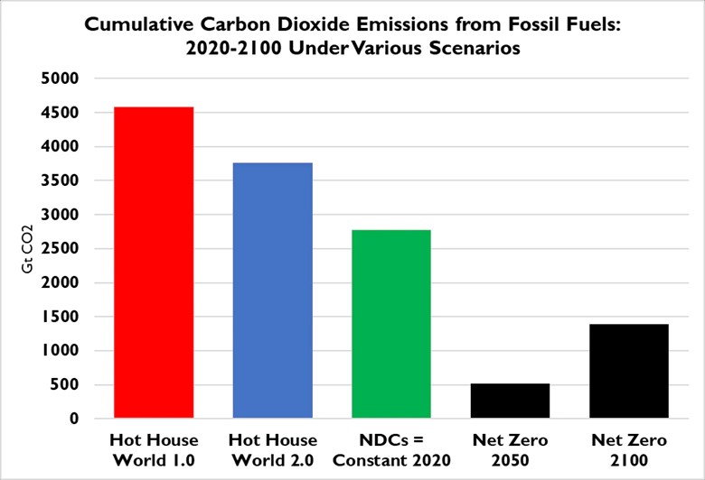
For corporations to plan their sustainability strategies and measure annual performance against the guidelines that come from these climate models, they should know whether the models are realistic. Pielke points to the climate scenarios offered on the homepage of the Scenarios Portal of the Network for Greening the Financial System (NGFS). The first scenario used is the “Hot House World” that projects a future characterized by implementation of “current policies.” The scenario’s first iteration projected increasing CO2 emissions from fossil fuels through 2100, and a 3.6-degree Celsius global average temperature rise to 2100. NGFS realized that this climate model was designed a decade ago and does not match well with recent emissions trends. So, Hot House World 2.0 was created. That scenario dramatically reduced projected CO2 emissions to 2100 and global temperatures, limiting them to only a 3.1-degree Celsius increase.
Understanding the important differences in what drives these two scenarios is often difficult for ESG planners. Moreover, planners may need months or years in using the scenarios to develop company scenarios for risk assessment and stress testing. Now another scenario has been put forth by NGFS called Nationally Determined Contributions (NDC), which uses the UN Framework Convention on Climate Change dynamics. This scenario further reduces future CO2 emissions from the two Hot House World scenarios and limits the temperature rise to 2.5-degrees Celsius by 2100.
Pielke produced the following chart showing the cumulative CO2 emissions from fossil fuels for 2020-2100 for various climate scenarios. Pielke used this chart in his recent testimony before the Senate Banking Committee. Note the significant reduction in emission volumes as NGFS transitioned through its three scenarios. The Net Zero scenario is presented to demonstrate the sharp difference between NGFS climate scenarios and the goal of reaching Net Zero emissions at different dates. Pielke recently calculated that “at the current rate of growth in carbon-free energy consumption, the world is on track to achieve net-zero in 2197.” Achieving that target would mean the Net Zero 2100 bar in the chart would increase to 1,750 gigatons (Gt) of CO2 emissions, putting it at two-thirds of the emissions from the NDC scenario.
Exhibit 16. How CO2 Emissions Vary In Different Climate Models
Pielke asked the burning question for ESG planners: What scenario should we be using? The answer, he suggests, depends on who you ask. He listed the following scenarios employed by the various major financial institutions around the world.
- The European Central Bank in 2021 used Hot House World 1.0, and in 2022 Hot House World 2.0
- The International Monetary Fund recently implemented NGFS NDC scenarios as a baseline
- The Bank of Canada in 2020 used the so-called “business-as-usual” scenario of the IPCC AR5 (not shown here, but over 7,000 Gt for RCP8.5)
- The 2022 stress testing by the Bank of England used a bespoke scenario projecting 3 degrees Celsius by 2050 (far above both NGFS Hot House Worlds and all IPCC RCPs — more on that below)
Pielke’s real answer to the planners’ question about selecting the plausible “worst-case scenario for stress testing” is that this is what they should be asking and answering before merely taking a scenario off the shelf. To help people understand the plausibility issue, Pielke produced the following chart as part of research he is conducting on plausible scenarios of the Intergovernmental Panel on Climate Change (IPCC) Annual Assessment 5 (AR5) and the recently released AR6. He put the three NGFS scenarios on the chart.
Exhibit 17. Where NGFS Temperature Predictions Fit In All Climate Model Forecasts
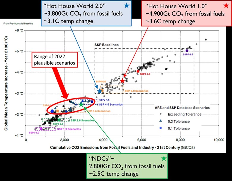
As Pielke points out, all the plausible scenarios under the methodology used in his new study lie between 2 and 3 degrees Celsius. This suggests a “worst case” scenario of about RCP4.5 or SSP2-4.5 from the AR5 and AR6 IPCC reports, and consistent with the NDC scenario. According to Pielke, few planners are using the NDC scenario. That difference has profound implications for company ESG plans and risk assessments. To rank higher on ill-conceived ESG metrics might cause companies to adopt business strategies that damage their long-term futures.
Another twist on the climate scenario evolution is that financial regulators sometimes get the IPCC consensus conclusions about climate events wrong. He cited the Bank of England’s departure from the IPCC consensus in its recent stress testing. In 2022, the Bank of England stated:
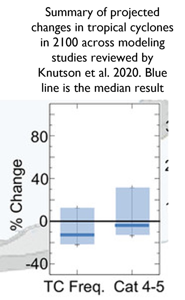
Global frequency of very intense tropical cyclones (category 4–5 storms) that tend to drive property damage is also projected to increase.
The Bank of England cites this claim from a peer-reviewed paper, but when you go to the paper, in fact it concludes exactly the opposite of the Bank’s claim. The paper states that the median estimate of various climate models for changes in category 4-5 tropical storms is for a decrease to 2100, which is shown clearly in the following chart. Note the blue lines for total tropical storms and for category 4-5 storms are below the zero line, meaning declines. If, however, the Bank of England researchers only looked at the two blue lines and saw the Category 4-5 line higher, they may have concluded, incorrectly, that these storms were projected to worsen.
Exhibit 18. The Bank Of England Misinterprets Storm Study

Source: Roger Pielke, Jr.
Knutson (lead author of the paper the Bank of England cited) also surveyed a group of experts on their views on future changes to the intense Category 4-5 storms, and they did not reach a consensus. This is consistent with the conclusion reflected in the IPCC AR6 report, as well as in several other assessment reports of the World Meteorological Organization. While the Bank of England is free to disagree with the consensus of scientific literature, it gave no reason for its disagreement. When others do something similar that minimizes climate change, they are typically cited for departing from the “scientific consensus” without good reason.
Understanding the issue of climate models and their plausibility is important for stress testing of company/bank business models. It highlights a fundamental flaw in ESG metrics that most company managers and their planners are not aware of, nor understand how such models might cause businesses to undertake actions that may be detrimental long-term to the companies’ sustainability. This morass suggests that the regulators should substantially slow their rush on ESG climate disclosure rules because we doubt the regulators have any idea of the models’ weaknesses and the potential long-term damages they can inflict. All this supports the view that much of the ESG push in the financial markets is more about fat fees from ESG funds sponsored by money managers rather than efforts to create sounder business strategies.
Random Energy Topics And Thoughts
Bloomberg Trumpets U.S. EV Tipping Point
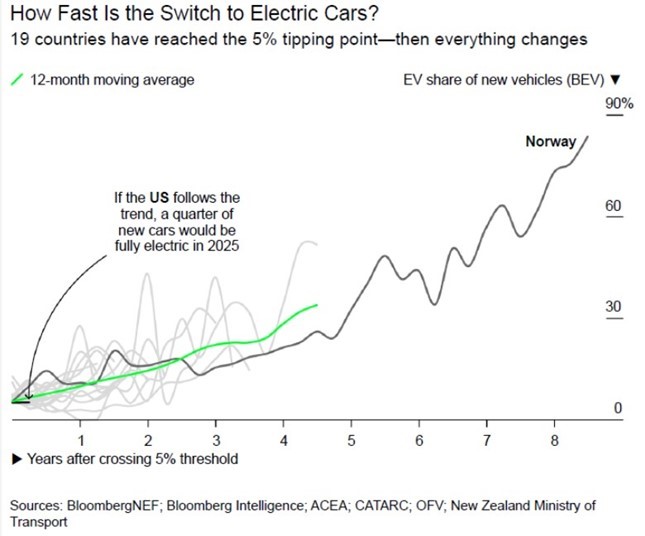
A recent article by Bloomberg.com, based on an analysis conducted by Bloomberg New Energy Finance (BNEF), highlighted that the U.S. had crossed a tipping point for mass adoption of electric vehicles (EV). This tipping point is five percent of new vehicle sales being all-electric (BEV). Based on studying the data for 18 countries that previously had crossed the tipping point, virtually all of them have achieved higher EV adoption rates since. This universe of countries includes China, Iceland, New Zealand, and South Korea. The remaining 14 countries are all European, often small ones, which makes the tipping point easier to cross.
Based on the 1Q 2022 EV sales data, BNEF says the U.S. is now the 19th country to cross the tipping point, which it believes will lead to a 25% market share by 2025. BNEF reported that about 173,000 BEVs were sold in the year’s first quarter, which translates into a 5.3% market share of new car sales. It also says the U.S. crossed the tipping point in 4Q 2021, but we never heard that significance declared before. However, when we examined the EV sales and registration data series of other EV data trackers, we cannot find a quarter’s sales figure as high. Estimates of EV market share reported by others range between 4.4% and 4.6%, but none over 5%. As a result, BNEF appears to be the only firm claiming the U.S. has crossed the magical EV tipping point.
Exhibit 19. Is The U.S. On The Road To An All-Electric Vehicle Fleet?
Source: Bloomberg.com
We wondered about BNEF’s estimate of a 25% EV adoption rate by 2025, which would translate into a fivefold adoption rate increase within four years. Based on the 1Q 2022 sales, achieving BNEF’s target would mean that roughly 865,000 EVs would be sold in a 2025 quarter, or, on average, 288,000 EVs a month, assuming no increase in total auto sales. Recently, insideevs.com reported the U.S. Department of Energy’s Vehicle Technologies Office highlighted that as of April 2022, the cumulative number of plug-in car sales reached 2.6 million. That number reflects all plug-ins sold since 2010 when Nissan’s LEAF and Chevrolet’s Bolt EVs entered the market. Plug-ins mean both BEVs and plug-in hybrid electric vehicles (PHEV).
Argonne National Laboratory calculated that it took eight years to reach the first million EVs, but the second million needed just two and a half more years. Ten months later, an additional 600,000 EVs entered the fleet. The rate of increase in sales is growing. The latest sales figure suggests the industry is selling at a 700,000-unit annualized rate. Everyone expects the sales rate to increase to 100,000 EVs per month, but that will not likely happen until 2023. At that point, forecasters believe the foundation for EV domination will be in place. Going from 100,000 units per month to nearly 300,000 in two to two and a half years would seem like a tall order.
Key impediments to the wide acceptance of EVs are not enough charging stations, expensive vehicles, limited model choices, and inadequate buyer education. In the latter category, we would include range anxiety, safety concerns, and quality issues. The recently released J.D. Power 2022 U.S. Initial Quality Study concluded that due to the pandemic, vehicle problems reached a 36-year high for the industry. The 2022 survey showed an 11% increase in problems per 100 vehicles (PP100).
BEVs and PHEVs were more problematic than internal combustion engine (ICE) vehicles. ICE vehicles average 175 PP100, PHEVs average 239 PP100, and BEVs ‒ excluding Tesla models ‒ average 240 PP100. J.D. Power introduced Tesla into its survey for the first time but kept its results separate to eliminate Tesla models that dominate the market from obscuring the performance of legacy automobile manufacturers who have recently introduced BEVs. Tesla models average 226 PP100. (Lower numbers are better quality vehicles.) EV electronics are the source of the problems – not surprising.
The charging issue is being addressed with increased government and private industry spending. Issues with charging station quality – speed of charging, lack of universal charging plugs, and high percentages of stations not operating – are being addressed, but long-distance road trips require more planning and take longer than similar trips in ICE vehicles. Trip planning can become problematic if a detour from the planned route is necessary.
The major impediment to rapid EV adoption, despite the surge in interest due to high gasoline prices, is vehicle cost. The NYTimes reported in an article that the average cost of EVs is $66,000 versus $46,000 for all new car vehicles. It did not cite a data source. J.D. Power tracks vehicle transaction prices and recently estimated that EVs cost $54,000 and ICEs at $44,000. It also noted that the average cost of the respective vehicles was rising at 14% for EVs but only at a 12% rate for ICEs. That means the price gap between the two technologies is widening rather than narrowing as forecasters count on in their models. Auto companies are introducing new models at lower price points, but Mary Barra, GM’s CEO, says it needs to get EVs into the $20,000-$30,000 range to become successful.
Until the battery raw material issue is addressed, or a new battery technology arrives, EVs are going to struggle with closing the price gap. The need for more aluminum and plastics in EVs, and specialized tires, as well as many more semiconductor chips (in short supply), will make it more difficult to reduce EV costs. Scaling up the number of EVs manufactured will help lower costs somewhat. But without cheaper EV models that people are willing to own, the pace of the revolution may slow. In the U.S., the inability to pass legislation to increase EV subsidies, shifting the subsidies from tax credits to vehicle price reductions, and lifting the cap on the number of EVs sold by a manufacturer before the credit phases out will have an impact on future sales, too. The final check on the Bloomberg NEF forecast is looking at the forecast by the Energy Information Administration (EIA) in its recent annual energy outlook. It projects the U.S. EV fleet will grow from about 1% of the total vehicle fleet today to 9% in 2050. That is much slower than suggested by Bloomberg’s projection based on the U.S. crossing the tipping point.
Renewable Energy Is Cheap But Look Out For The Future
Whenever you worry about the cost of your electricity, you can count on the global energy industry to give you comfort. The American Energy Action organization claims on its website that clean energy is cheaper and deflationary. They say it will create more jobs and keep energy costs low. Therefore, renewable energy is the answer to our energy crisis, high oil and gas prices, reducing CO2 emissions, and powering an electrified economy.
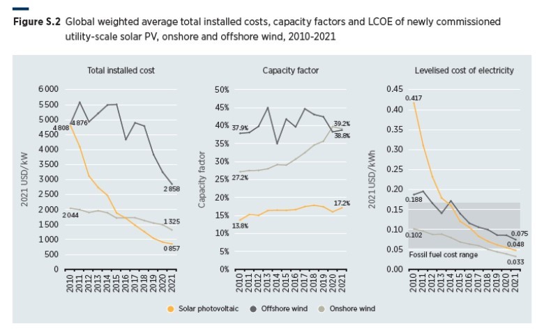
To confirm the wonders of renewable energy, the International Renewable Energy Agency (IRENA) reported on renewable energy cost trends in 2021. The report’s conclusions are summarized in the chart below from the Executive Summary of the new report.
Exhibit 20. How Key Factors Of Renewables Performed In 2010-2021
Source: IRENA
The three charts show the trends for total installed cost, capacity factors, and the Levelized Cost Of Electricity (LCOE) for solar, onshore wind, and offshore wind. As the curves in each chart demonstrate, every aspect of these renewable energies has improved during 2010-2021. One surprise is that offshore wind capacity has only improved by one percentage point (38.8% vs. 37.9%) over the 11 years of data tracked. That is surprising given how the onshore capacity improvement is attributed to the increased size of the wind turbines installed. A similar trend has happened offshore, albeit the monster wind turbines are only now arriving.
While IRENA talked about the renewable energy improvements, we noticed it commented that not all markets experienced similar cost improvements. It noted that “the country weighted average total installed costs of utility-scale solar PV increased year-on-year in three of the top 25 markets, while for onshore wind this was true of seven of the top 25 markets in 2021.” Hmmm.
IRENA reported solar and wind costs declined between 13% and 15% in 2021. It acknowledged that the cost decline has slowed, probably due to those countries that experienced cost increases. The bigger problem is that Bloomberg New Energy Finance has projections showing construction costs for solar will rise by about 14% this year, wind up by 7%, and battery costs higher by 8%.
The International Energy Agency (IEA) reported on renewable energy cost trends earlier this year. It wrote:
Prices for many raw materials and freight costs have been on an increasing trend since the beginning of 2021. By March 2022, the price of [solar] PV-grade polysilicon more than quadrupled, steel increased by 50%, copper rose by 70%, aluminum doubled, and freight costs rose almost five-fold. The reversal of the long-term trend of decreasing costs is reflected in the higher prices of wind turbines and PV modules as manufacturers pass through increased equipment costs. Compared with 2020, we estimate that the overall investment costs of new utility-scale PV and onshore wind plants are from 15% to 25% higher in 2022. Surging freight costs are the biggest contributor to overall price increases for onshore wind. For solar PV, the impact is more evenly divided among elevated prices for freight, polysilicon and metals.
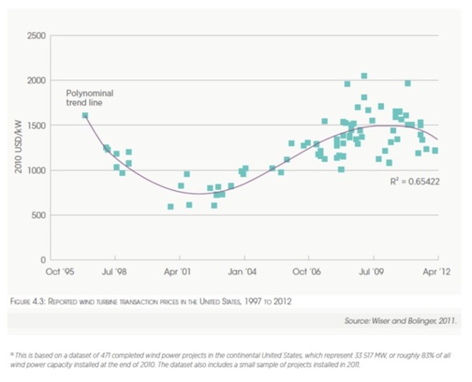
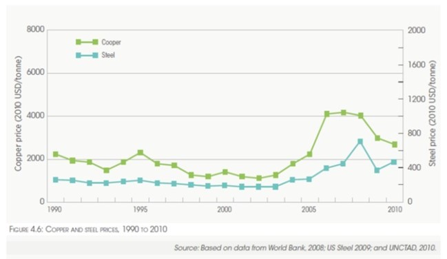
It is not surprising the IEA focused on steel and copper prices because those materials are key components of renewable energy equipment. We went back to IRENA’s 2012 renewable report. There were two charts of note in that report. The first chart shows transaction prices for wind turbines from 1995 to 2012, along with a polynomial trend line fitted to the data.
Exhibit 21. The History Of Wind Turbine Prices Reflect Cost Inflation
Source: IRENA
The second chart shows steel and copper prices from 1990-2010. Note how the prices for these two key metals rose in 2005-2009. The high prices were quickly reflected in increased wind turbine prices. While metal prices have declined recently in response to recession fears, they have been elevated for a sufficiently long period to drive up renewable energy equipment prices. Remember cost inflation is what destroyed the financials of wind equipment manufacturers last year, even forcing plants to shut down. The IEA sees cost inflation driving renewable energy costs up for 2022 and 2023, which was as far out as its report projected. We will not be surprised if raw material costs remain elevated for longer.
Exhibit 22. Key Renewable Raw Material Inflation In 2007-2010
Source: IRENA
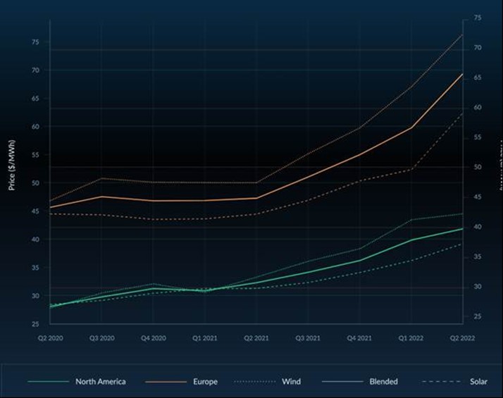
The latest game by IRENA was to say that even with higher costs, when measured in real terms renewable energy in 2022 will be cheaper than in 2019. The last time we checked, we do not get paid or pay bills in real dollars. The impact is that renewable energy prices will be higher, not lower. To substantiate our view, consider the following chart from leveltenenergy.com showing current cost trends for wind and solar power in Europe and North America based on transactions.
Exhibit 23. LevelTen PPA Price Index Shows Renewable Costs Up
Note: Euro to U.S. Dollar exchange rate calculated on June 20, 2022, at 1.0476
Source: www.leveltenenergy.com
The only way one can expect these wind and solar cost trends to reverse is to assume the worldwide energy crisis will evaporate and global inflation subsides. At some point the crisis will end, but embedded fossil fuel prices may be much higher in the future than they were during the 2000s and 2010s, although they may be meaningfully below early 2022 price levels. However, high-cost inflation from this period will become embedded in electricity prices and will not be reduced because renewable energy project developers cannot afford to roll back their prices. Welcome to a very different and more expensive electricity market.
Contact PPHB:
1885 St. James Place, Suite 900
Houston, Texas 77056
Main Tel: (713) 621-8100
Main Fax: (713) 621-8166
www.pphb.com
Leveraging deep industry knowledge and experience, since its formation in 2003, PPHB has advised on more than 150 transactions exceeding $10 Billion in total value. PPHB advises in mergers & acquisitions, both sell-side and buy-side, raises institutional private equity and debt and offers debt and restructuring advisory services. The firm provides clients with proven investment banking partners, committed to the industry, and committed to success.

