- Is Norway The Model For Future Electric Vehicle Adoption?
- Energy Stocks Begin Stirring: A Message For Investors?
- How Natural Gas Is Reshaping The Global Energy Market
- How Tax Policy Could Help The Climate Change Response
Musings From the Oil Patch
November 7, 2017
Allen Brooks
Managing Director
Note: Musings from the Oil Patch reflects an eclectic collection of stories and analyses dealing with issues and developments within the energy industry that I feel have potentially significant implications for executives operating oilfield service companies. The newsletter currently anticipates a semi-monthly publishing schedule, but periodically the event and news flow may dictate a more frequent schedule. As always, I welcome your comments and observations. Allen Brooks
Is Norway The Model For Future Electric Vehicle Adoption? (Top)
If there is a hot topic in Houston today, other than the amazing Astros and the incredible performance of the Texans’ rookie quarterback, Deshaun Watson, who is out for the year due to an injury, it is the pace of electric vehicle adoption here and around the world and whether it dooms our homebased energy business. Taking a page from the evolution of the Astros from a 100+ game loser to a 100+ game winner, we only need to look at how the owner and his general manager built the team into the 2017 World Series champion for a lesson in vision and long-term strategy execution.
In November 2011, the purchase of the Astros by Houston businessman Jim Crane was approved by Major League Baseball. By mid-December, Mr. Crane hired Jeff Luhnow as the general manager of the team. Their strategy was to dismantle the high-cost, but under-performing, Astros, invest in building a strong farm team system, seek out young, talented ballplayers, secure a few experienced players through trades and free agency, and wait for the stew to boil. Two of Mr. Luhnow’s first draftees in 2012 are now helping lead the Astros to greatness, while establishing a foundation for excellence for many years to come.
For energy executives, this playbook sounds familiar to what it supposedly takes to be successful in the cyclical oil and gas business. One tenet of a successful execution of a long-term strategy involves not overlooking the potential for new technologies to disrupt the conventional business. The most significant disruptive technology to impact the oil and gas recently has been the shale revolution, which involved marrying two older technologies – horizontal drilling and hydraulic fracturing – to tap resources previously thought to be too difficult, too costly, and too risky to tap. Through the experimental efforts of a few industry risk-takers, either
because they believed in the outcome or were forced to try it, the Barnett Shale in central Texas was successfully exploited, yielding many high-volume gas wells. The timing of the arrival of this new gas supply could not have been better. It came when the conventional outlook for domestic natural gas called for limited growth, with growing market needs being met from greater supplies arriving from Canada and via high-cost liquefied natural gas (LNG) shipments from abroad. This new shale gas supply has become a real industry disrupter.
The nascent global warming, now climate change, movement of the late 1990s exploded into the 2000s with gusto, as a record hurricane season in 2005, highlighted by the near destruction of New Orleans, heightened people’s concern about future devastating weather events. The 2005 hurricane season enabled environmentalists to campaign on the thesis that what we experienced that year was only a preview of our future. They pounded out the message that what was to come for the planet, unless, and until we ceased pouring carbon dioxide into the atmosphere by burning hydrocarbon fuels, would prove beyond our worst experience. Banning internal combustion engine (ICE) cars became a goal, and with the help of government incentives primarily in developed economies, the electric vehicle (EV) business began to grow.
Coupled with the growth of EVs, was the recognition that these vehicles would likely be powered by electricity produced from fossil fuel power plants. This set the stage for the “war on coal,” the dirtiest fuel producing electricity. Capitalizing on the ignorance of the public, massive media campaigns against the burning of coal were launched. These campaigns were dominated with photos of electric power plants billowing clouds of smoke from their smokestacks. The public was hoodwinked by these photos of plants with clouds of polluting smoke, when the clouds are steam that soon condenses into moisture, not carbon pollution.
Returning to the EV revolution, it is interesting to note that battery-powered vehicles dominated the early days of the “horseless carriage” era in this country around the turn of the 20th Century. As the first machine-powered vehicles appeared on the streets of America and Europe, horses still were the mainstay of local transportation. Initially, cars were powered by all types of fuel – corn ethanol, kerosene, gasoline, diesel, as well as batteries. In 1900, in the U.S., EVs accounted for one-third of all vehicles in use. Although EVs were limited in range, it was not a major concern because we had a very limited road system. Range-anxiety on behalf of car buyers was not a concern, as there weren’t many places to drive to. EVs were cleaner than virtually every other form of power, which helped their appeal with women.
In 1908, Henry Ford introduced the Model T and the fate of battery-powered cars was sealed. One could purchase Mr. Ford’s new car for $650 compared to buying an EV costing $1,750. Although women liked the cleaner EVs, the improving road network pressured EV-manufacturers to develop battery-swapping systems to help drivers overcome the limited range their vehicles confronted compared to ICE cars. What kept EVs in the market was the muscle-power requirement for starting ICE vehicles, which often proved too difficult for women drivers. That market impediment dissolved in 1912 with the introduction of the electric starter, eliminating hand-cranking.
During those early years, horses continued to dominate the transportation market. There were 24 million horses in North America in 1900 pulling people to their destinations. By 1917, the last horse-drawn trolley left the streets of New York City, to be replaced by electrified buses. It was not just that a typical horse deposited 45-50 pounds of manure and a gallon of urine a day on city streets, creating serious health problems and safety concerns, but horses, like people, need to eat every day and need to see doctors periodically. It soon became cheaper to keep a car. In 1900, only 4,192 cars were sold in the U.S., but by 1912, annual sales had climbed to 356,000.
As International Monetary Fund (IMF) economist Fuad Hasanov put it, “We were surprised at how fast cars replaced horses as the main means of transport in the early 1900s. It happened in only 10 to 15 years in spite of the many hurdles.” Some forecasters are suggesting that the hurdles encountered in the transition from horses to horsepower might have been much greater than the barriers holding back faster adoption of EVs today.
Exhibit 1 shows the transition between horses and motor vehicles during 1900-1950, based on ratios per thousand people. The crossover point occurred in 1915. In the chart, there is also a line showing the ratios for motor vehicles compared to EVs. If one imagines the EV growth curve continuing at its current trajectory, then the two curves – EVs and motor vehicles – will potentially begin to converge in 20-30 years, or somewhere in the 2030-2040 period. Of course, if the motor vehicle fleet penetration ratio begins to decline, which would be consistent with increased adoption of ride-sharing and use of mass transit, then the convergence with EVs could happen sooner.
Looked at in another way, the growth of EVs per thousand people is rising at a rate faster than occurred for motor vehicles. While this trajectory would argue that the optimists for a very rapid vehicle fleet transition are right, we should not lose sight of the fact that much of the EV growth has come with government support. That was not true in the early 1900s when the automobile was establishing its business. The significance of government policy in establishing the EV market remains a wildcard in projecting the pace of future EV penetration into the global vehicle fleet. This issue also raises
Exhibit 1. Horses To Horseless Carriages Took 15 Years

Source: IMF
questions about the assumption that EV acceptance will match the historical pace of consumer adoption of electronics products and electronic media, such as – PCs, cell phones, and the Internet. That assumption may prove too aggressive.
Exhibit 2. EVs Growing Faster Than Auto Growth

Source: IMF
Using the horse-to-motor-vehicle and EV-to-motor-vehicle analyses, researchers from the IMF and Georgetown University, sponsored by National Geographic, concluded that over 90% of passenger vehicles in the US, Europe, and the rest of the rich world (OECD/developed economies) could be powered by batteries by 2040. In their study, they produced a chart showing how the U.S. vehicle fleet could change in the future with fast-adoption rather than slow-adoption.
Exhibit 3. How EVs Might Take Over The U.S. Fleet

Source: IMF
This is where the latest EV sales figures for Norway provide another interesting perspective on how the trajectory of EVs might go. Through the first nine months of 2017, 43,700 plug-in vehicles were sold in Norway, up 29% over the same period in 2016. For a tiny country of 5.3 million people, Norway is now the third largest EV market behind the U.S. and China. More importantly, Norway’s EV penetration rate this year is the global leader at 32%, which compares with a 24% penetration rate in 2016.
Exhibit 4. How Norway’s EVs Have Taken Over Market

Source: ev-volumes.com
What is not surprising is that those countries with the highest EV penetration rates are small ones. Norway leads with a 28.9% rate for the first half of 2017, followed closely by Hong Kong at 20.9%, but the penetration rate then drops below 8% for Iceland, and below 4% for Sweden. The two largest EV markets – China and the U.S. – have penetration rates of 1.6% and 1.1%, respectively, but they tend to be the largest countries by population and vehicle fleets.
Exhibit 5. EV Share By Country

Source: ev-volumes.com
What is interesting from an analysis of the Norwegian data is that a market that once favored battery electric cars (BEV) over plug-in hybrid ones (PHEV), has changed in response to a shift in government incentives. Norway now provides higher tax savings on PHEVs compared to BEVs, and as expected, the mix of sales changed in 2015 and 2016. That shift seems to be continuing in 2017 as BEVs are only barely ahead of PHEVs. Ev-volumes.com is predicting that BEVs will claim a greater market share in the fourth quarter of 2017 due to several more popular BEV models increasing their sales effort.
Recognizing the leadership role Norway has played in the EV market, ev-volumes.com asks the question of whether a tipping point in the market has been reached? To attempt to answer the question, they focus on where Norway’s EV sales stand compared to the diffusion of innovators theory set forth by Everett Rogers in 1962. That theory holds that mass market adoption occurs after the first 15%-18% of the market has bought into a technology. With a 32% market share now, one would have to conclude that Norway is clearly past the point at which EVs would be recognized as being mainstream technology.
By keeping its generous subsidies for EVs in place through 2020, Norway is well on its way to reaching a 75% penetration rate, at which point incentives could start being removed. EV sales could be impacted slightly in the next couple of years if the proposed ‘Tesla
Exhibit 6. How Innovation Is Adopted By Society

Source: Everett Rogers, Diffusion of Innovations, 1962
(TSLA-Nasdaq) tax,’ designed to levee a tax on heavy BEVs is implemented. Under the proposal, the lighter weight Model S would only incur a 750 € ($) tax, while the heavy Model X would see a 7500 € ($) tax levied. Tax adjustments such as this may cause an acceleration in the purchases of the heavier vehicles, including other heavy luxury EVs, at the expense of lighter ones. Any sales shift would quickly be readjusted.
Many forecasters are highly focused on the penetration of EVs among new car sales. For the oil industry, the issue is how does the mix between EVs and ICE vehicles in the global fleet evolve? To explore the implications, we examined the history of global EV sales. There are approximately two million EVs on the road today. If we annualize the first eight months’ global EV sales, as reported by Inside EVs, we expect 980,000 EVs to be sold in 2017. The global sales growth rate for 2016 over 2015 was 41%. The growth in sales for the first eight months of this year was at a 26% growth rate. By using a 40%, a 26%, and a more conservative 20% rate of growth, we projected the number of EVs sold out to 2040.
Using the highest EV growth rate (40%), the world would have 2.25 billion of them by 2040, or about 10% more EVs than the most optimistic projection of the growth of the entire global vehicle fleet. This is not Jack’s Beanstalk!
Therefore, we used 20% and 26% annual growth rates to project EV fleet growth, with the lower rate reflecting our estimate for a realistic rate of growth, while the higher percentage growth rate must be considered aggressive. Applying these growth rates to today’s global EV sales means that in 2040, we will be selling between 65 million and 199 million units. As global vehicle sales, both passenger cars and commercial vehicles, totaled 94 million units in 2016, the 199 million EV sales seem too high, as that implies a more than doubling of new vehicle sales between 2017 and 2040, a 23-year span. The most optimistic global auto sales growth we have seen suggests that there may be 120 million vehicles sold in 2040, or 79 million fewer than the aggressive forecast for EV sales.
Exhibit 7. How EVs Might Grow And Impact Gasoline Demand

Source: Inside EVs, PPHB
If, however, we accept the annual sales projections from the respective growth rates, the cumulative EVs, assuming all new ones remain on the road, would be 322 million given the 20% per year growth, or 765 million at the higher 26% rate of increase. If we use the generous estimate of the 2040 global vehicle fleet, suggested by OPEC, of 2.1 billion vehicles, EVs would represent either 15% or 36% of the fleet. Other forecasts put the 2040 global vehicle fleet at 1.6 billion units, which implies 20% to 48% EV penetration rates.
Even with the highest new EV sales rate and the smallest estimated global vehicle fleet, we are left with over half the fleet, or more than 800 million vehicles, that will be powered by something other than electricity. Thus, the most aggressive EV sales growth rate is not a death knell for the oil business, but it certainly would put a dent in global motor fuel demand. If ICE vehicles continue to improve their fuel efficiency in the future, by utilizing the most aggressive EV sales growth forecast, the vehicle fuel market could be cut in half by 2040. What is different about our scenarios compared to those presented by the IMF/Georgetown study is ours does not have the sharp acceleration beginning in 2022 or 2027 shown in Exhibit 3 (page 5).
People might say that for those companies involved in the refining business, our scenarios more closely resemble the parable of the frog in the pan on the stove, in which the frog is boiled to death as the heat is gradually raised to boiling temperatures, rather than jumping out at the early sign of hotter water. We hope energy industry executives have more sense than the frog as they look at the data but more importantly, as they look to see whether these forecasts come to pass.
We acknowledge it is possible the EV transition will occur as quickly as horses gave way to horseless carriages, but we still don’t know whether there is sufficient raw material at a reasonable cost to assemble all the batteries necessary to power the projected fleet of EVs on that timetable, let alone whether we can produce the amount of electricity needed. While we know what France, the UK, and California plan to do with ICE cars, we only have an inkling of what China is thinking, and no idea where India is with respect to EV subsidies or mandates against ICE vehicles. Without an understanding of these two country’s future fuel policies, all the technology acceptance theory, horse transition history, and computer model projections are worthless. Mark us down as skeptical of the aggressive EV forecasts, but we are prepared to jump out of this pan.
Energy Stocks Begin Stirring: A Message For Investors? (Top)
Crude oil prices in the United States have climbed well above $50 a barrel and seem headed higher as Brent oil, the world’s oil price marker, is above $60 a barrel. Climbing oil prices that began in September have reached new two-year highs, convincing energy non-believers that the global oil market rebalance is for real. Following the chaos of 2015 and 2016, OPEC, led by Saudi Arabia, and with the support of some non-OPEC exporters, primarily Russia, engineered a 1.8 million barrel a day production cut to start at the beginning of this year. The output cut goal was designed to bring global oil inventories back within their five-year average range. Coupled with OPEC’s belief that global oil demand was picking up, the organization believed that the improving market conditions would help elevate global oil prices.
The primary impediment to a quick drawdown in inventories was the rebound in U.S. oil shale production due to the higher oil prices that came from the market’s euphoria over OPEC’s action. While OPEC member compliance after the production cut went into effect was high, it was helped by Saudi Arabia cutting its output by more than was required, and as a result letting the group meet its objective.
Two events confused the market. First, many exporters continued to pump up their production volumes before the cut’s effective date. That meant there was much more supply arriving in consuming markets than many people expected. Secondly, Russia was slower to implement its output reduction, explaining that it needed time for it to reach full compliance. As a result, there was more oil sloshing around in the global oil market than analysts expected, as most had assumed an instantaneous drop in output.
The global oil supply situation was further complicated by Nigeria and Libya, who were exempt from the cuts because of civil unrest that had sapped their output earlier, increasing their output. Lastly, Iran was granted the ability to continue increasing its production back to its pre-economic sanction level. The combination of all these factors helped to keep global oil supply growing despite the high compliance figures cited by OPEC members. The result was that it was a long while before oil inventories began declining, meaning that the expected oil market rebalancing was postponed.
Exhibit 8. A Longer Term View Of Oil Prices

Source: EIA, PPHB
The euphoria that greeted the production cut agreement announcement lifted oil prices above $50 a barrel, a critical threshold for market confidence. As global oil inventories failed to drop as the market expected, investors turned on the commodity as well as energy stocks, sending their prices lower. Since the oil price drop in early 2007, prices have largely traded between the low $40s a barrel to now above $54, with a brief excursion as low as $26. The narrow price range reflected global oil inventories remaining relatively flat, until recently. As oil inventories started falling a few weeks ago, we are now in a period favorable for higher prices.
Today, we are firmly planted in an oil market reflecting positive price momentum. Better projected oil demand growth seemed to be the initial factor that helped lift the oil market. The International Energy Agency (IEA) upped its demand growth estimates for the second half of 2017. About the same time, U.S. shale producers began
Exhibit 9. E&P Companies As Destroyers Of Capital

Source: ASPO
shedding oil drilling rigs in response to weakening oil prices and as they sensed a need to rebuild investor confidence in their financial health. Producers had to dispel the image of exploration and production (E&P) companies as destroyers of capital, a label the industry’s record seemed to warrant. Disciplined capital spending, meaning living within a company’s cash flow in order to not have to
Exhibit 10. E&P Overspending Still Needs To Fall

Source: EnerCom.com
borrow money or sell more equity to fund the overspending, appears to be the new mantra for E&P companies. The latest survey of E&P company spending plans versus cash flow demonstrates that overspending remains high. This may signal that it will take time for companies to generate positive cash flow.
In recent weeks, as Brent oil prices have risen at a faster rate than WTI oil, the forward oil price curve moved into backwardation, meaning that barrels of oil able to be delivered immediately are worth more than if they are stored and delivered in the future. This price disparity is further impacted by the cost of storing the oil. Backwardation encourages holders of oil in storage to begin selling those barrels, which has accelerated the shrinking of global oil inventories.
The combination of higher Brent oil prices and international oil inventory drawdowns is now sucking cheaper WTI oil into the market as weekly oil exports are exceeding two million barrels a day, which will pull down domestic oil inventories. The market rebalancing talk of the past 11 months is now beginning to seem within reach, as the final piece – U.S. oil inventories – is now shrinking. The prospect of reduced inventories has improved oil market psychology. It has also been helped by talk from Russia, Saudi Arabia and OPEC officials that the organization and its supporters plan to extend the production cut for an additional nine months, or through to the end of 2018, after the May 2017 extension ends in March 2018. That initial extension agreement had failed to lift oil prices as the inventory drawdown had been slowed by the growth in U.S. oil production. This market improvement still begs the question of what happens when OPEC wants or needs to restore its full production quotas. Will inventories slowly rebuild, or will greater demand soak up the additional 1.8 million barrels a day of incremental supply?
Exhibit 11. How Oil Prices Are Rallying At End Of 2017

Source: EIA, PPHB
The improvement in crude oil prices since September is shown in Exhibit 11 (prior page). As we discussed above, market improvements lifted Brent oil prices faster and to a higher level than the improvement in WTI oil prices. We expect the Brent premium gap to eventually narrow as U.S. oil exports accelerate and capture more international market share. While driving down domestic oil inventories and reinforcing the view that the oil market is rebalancing, higher oil prices have materialized.
Exhibit 12. 2017 Energy Equities Performance vs. Stock Market

Source: Big Charts, PPHB
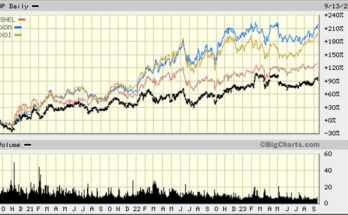
The improvement in oil prices, however, has only barely begun to help energy stock prices. Exhibit 12 shows the performance for 2017 of the indices for oil (XOI), natural gas (XNG) and oilfield service companies (OSX), as well as for the energy master limited trusts (AMZ), which are securities reflecting limited interests in the partnerships that control these MLPs. After declining steadily since the start of 2017 – other than for the AMZ, which has yield support from its distributions – energy share prices rose beginning in late June, but then fell back to new lows by late August. That price retreat seems to have resulted from the lack of sustained improvement in oil prices, as U.S. oil inventories were failing to follow the decline in international oil inventories.
The rally in energy stocks regained their momentum but seemed to be peaking in early October, which coincided with companies reporting third quarter financial results and management commentary on fourth quarter outlooks. Financial results were generally consistent with analysts’ projections, but the forward guidance for the fourth quarter was not as optimistic as analysts’ projections suggested. The only index that did not follow that pattern was the XOI, which may reflect bargain-hunting by institutional investors seeking to trade this lagging sector going into year-end, and who lack conviction about a sustainable industry recovery, seek the liquidity of the integrated oil companies and their attractive dividend yields. Often, institutional investors who have fallen behind their peers and/or their bogeys for bonuses, seek to catch-up late in the year. These portfolio managers are often willing to jump on the lagging industry sectors in hopes that investor sentiment will rotate from the best-performing to the worse-performing investment sectors. Portfolio managers are often exercising a strategy of harvesting some, or all, of their winners in the outperforming sectors and reinvesting those proceeds in unloved groups, in hopes that year-end and early 2018 trading will bring a better outlook for these lagging groups, turning them into winners. As shown above, the Standard & Poor’s 500 Index has climbed steadily throughout 2017, largely driven by the technology and FANG (Facebook, Amazon, Netflix and Google) stocks. Through October 20, energy stocks have generated negative returns.
In our attempt to understand the message from 2017’s year-to-date performance of energy stocks, we needed to step back and view their performance against the market over a longer time span. Earlier we showed the trend in WTI and Brent oil prices since the start of the second quarter of 2010. (Exhibit 11, page 12.) When we turned to the equity market in the second quarter of 2010, we knew that oil prices had quickly recovered from the 2009 recession, returning to the $90-$110 a barrel level by 2011, so it was not surprising that energy equity prices had risen. High oil prices continued through mid-2014, at which point they began sliding and ultimately plummeting, following Saudi Arabia’s November 2014 decision to abandon support for OPEC’s price target and to aggressively seek to regain its lost market share.
In Exhibit 13, energy stock indices followed the 2010 oil price recovery and then remained in a trading range for 2011 and 2012, before climbing to peaks in mid-2014. As oil prices slid after mid-2014, so did energy shares, only to collapse as oil prices crashed in
Exhibit 13. Energy Equities Performance Over Last Eight Years

Source: Big Charts, PPHB
December. Hopes for a quick rebound in oil prices early the following year, much like what occurred in 2008-2009, helped boost stock performance during the first half of 2015. Energy indices then dropped to new lows by early 2016 as quick repair expectations for the oil market dissipated. From that early 2016 low point, the various energy indices began to perform differently.
The energy indices most closely tied to commodity prices began performing better, however, the oilfield service index, which depends on drilling and completion activity, i.e., the spending of the producers, continued to underperform.
Exhibit 14. How Energy Equities Lost Their Market Clout

Source: BMO Capital Markets
A longer-term perspective of the role of energy stocks in the market was presented by BMO Capital in 2014. Their two charts show how the earnings contribution from energy within the S&P 500 earnings calculation declined. One outcome of that fall in earnings contribution was that the weighting for the energy sector within the S&P 500 index declined starting in 2008.
Exhibit 15. Energy Sector Weighting Reflects Investor Interest

Source: Bespoke Group
Looking at the weighting of the 10 sectors composing the S&P 500 since 1990 to the middle of 2017 is illustrative of how the fortunes of energy stocks have suffered over time in response to perceptions of the health of energy fundamentals. In 1990, energy accounted for 13.32% of the S&P 500 Index, but it fell to a low of 5.99% in 2002. As the shale revolution emerged and oil prices climbed back to $100 a barrel, enthusiasm for energy stocks grew. Energy’s weighting peaked at 14.05% as the stock market bottomed on March 9, 2009. But from that point to now, energy’s weighting for energy has declined. The weighting has recently bounced higher – 9.42% as of October 20, 2017, but it fell back to 5.95 % at October 31, 2017.
To further reflect on the headwinds confronting energy stocks, EPFR Global reports that through Oct. 20, 2017, only about $1.3 billion of investor money has flowed into energy-focused equity funds. That contrasts with inflows of over $6 billion in 2016 and $20 billion in 2015. The investments made in those two years turned into significant money losing bets, which is keeping investors cautious about investing in energy stocks.
We would suggest investors are shunning energy stocks for several reasons: the lack of profitability within the oil and gas sector; concern about future oil demand; and, the message about the oil sector’s long-term outlook suggested by Saudi Arabia’s plan to sell a portion of its national oil company. In that regard, portfolio managers ask why they should be interested in investing in oil equities when the one party whose future is most tied to the future for the oil business is selling stock in its “crown jewel” oil company. They are following the mantra that when the most knowledgeable investors in a sector are selling, one should remain highly skeptical about investing in it.
Investors seeking guidance by looking at the past, worry that the stocks are tied too closely to oil and gas price trends, and predicting them is a “fool’s game.” Despite energy executives preaching that they have gotten the message about managing their business for financial returns rather than production or reserve growth at the expense of profits, the data continues to show otherwise.
Skeptical energy investors are also watching the energy transition underway, the push for green energy, and the growing anti-fossil fuel attitude of society and governments. These industry headwinds show no signs of diminishing; but that doesn’t mean that they can’t. We suspect institutional investors will view energy shares as trading vehicles, which helps explain the recent improvement in share prices. We would remind readers that the stock market is fickle, so one shouldn’t assume that the current message from energy share price performance may not change – it will. But will it change for the long-term? We don’t know. That will be determined by macro industry, economic and social conditions, along with events and government policy actions, all of which are outside of the control of energy company managements.
How Natural Gas Is Reshaping The Global Energy Market (Top)
U.S. natural gas production in the Lower 48 states, which reflects the gas shale boom, continues to rebound. After falling from a peak in February 2016 to September 2016, onshore gas production, as reported to the Energy Information Administration (EIA) on its monthly Form 914 survey of producers, started climbing. The great concern for natural gas producers as they increase supply is where is the demand growth coming from? If we examine the average production for the June-August period this year versus last year, it shows that gas consumption in the residential sector was flat, but industrial use increased. Commercial gas use increased slightly year over year, but natural gas fuel for electric generating plants is down due to cheaper coal, natural gas’ primary competitor in the fuels market.
With overall gas consumption lower, the shortfall is being offset by increased pipeline exports to Canada and Mexico, and now growing liquefied natural gas (LNG) shipments. As the United States has shifted from being a net natural gas importer to a net exporter, this means the global gas business is being disrupted.
Exhibit 16. Lower 48 Natural Gas Production Growing Again

Source: EIA, PPHB
This change in the natural gas sector’s fundamentals is projected to continue for years. As the EIA shows in its Annual Energy Outlook 2017, gas exports will continue growing in the form of LNG exports. The EIA expects growth in pipeline exports to Canada and Mexico will peak in the next year or so and then slowly decline, with LNG picking up the slack. LNG exports should increase as the number of terminals to liquefy flowing natural gas and then ship it abroad grows.
The EIA has recently prepared a chart showing how LNG export volumes may grow as terminal export capacity grows. We now have four export terminals operating at Sabine Pass, and Maryland’s Cove Point terminal is starting up. With these terminals, export
Exhibit 17. How EIA Sees U.S. Gas Exports Growing

Source: EIA
capacity has reached about 3.5 billion cubic feet per day (Bcf/d). With the terminals that have been approved by regulators and are, or shortly will be, under construction, gas export capacity is scheduled to rise above nine Bcf/d. As U.S. natural gas remains cheap compared to gas resources from other regions of the world, U.S. LNG exports will be in demand. So far, domestic LNG shipments have targeted South America, and now Europe. Eventually, LNG shippers expect to be sending supplies to the Asian market in direct competition with Middle East, Australia and Indonesia LNG supplies. The keys to success in gaining Asian market share are continued low domestic natural gas prices and cheap shipping costs.
Exhibit 18. How U.S. LNG Export Volumes Might Grow

To appreciate the importance of the Asian natural gas market, and the formable competition Americans face from Middle East and Southeast Asia suppliers is shown by the volumes that flow from these suppliers to consumers in China, Japan and Korea. Seeking to capitalize on the growing Asian consumption, Qatar, the world’s largest supplier of natural gas, has decided to begin expanding its LNG export capacity. That cheap gas supply will be a competitive factor in reshaping the Asian LNG market.
Exhibit 19. Supply And Demand Of LNG In Asia Region

Source: EIA
An interesting development occurred last week when Mitsui & Co., Japan’s second-largest trading house by market capitalization, announced it will shift the focus of its energy operations from the traditional crude oil business to LNG. Mitsui’s chief executive, Tatsuo Yasunaga, told the Financial Times in an interview, “We’re not that keen in liquid (oil), we are now shifting more to gas.” He went on to explain why his firm’s shift is taking place: Mr. Yasunaga said, “Beyond 2020 we have seen lots of opportunities, and demand will be increasing significantly. Now we have to prepare the supply side.”
Exhibit 20. Changing LNG Supply Patterns

Source: The Wall Street Journal
Energy researcher Wood Mackenzie has presented a forecast of LNG production supply by primary regions of the world. As the forecast shows, Qatar’s volumes remain stable, while Australia’s output grows, as well as supply from the Rest of World category. The major supply change is the sharp rise in LNG output from the United States, which, by utilizing an expanded Panama Canal, can compete in virtually every regional gas consuming market worldwide. LNG from the Gulf of Mexico has a competitive advantage in serving the European gas market due to its shorter shipping distance. Europe may become a more important LNG market because the continent is fighting to reduce its carbon emissions and increased renewable fuel use cries out for more stable electric power sources, which natural gas can provide. Additionally, Europe is concerned about its high dependence on Russian gas supplies that make energy a possible political weapon.
The emergence of the Age of Natural Gas has occurred without many people noticing, or paying too much attention. The U.S. shale revolution has become the driving force disrupting the global gas market. We need to continue focusing on LNG’s growth and how it will reshape global energy markets.
How Tax Policy Could Help The Climate Change Response (Top)
The U.S. Senate overwhelmingly passed the $36.5 billion disaster relief spending bill, which had already been passed by the House, sending it to President Donald J. Trump’s desk for his signature. The bill combines $18.7 billion for the Federal Emergency Management Agency (FEMA) with $16 billion to permit the financially troubled federal flood insurance program to pay an influx of Hurricane Harvey-related claims. There was another $577 million included to help pay for western firefighting efforts, in particular for the ongoing Napa and Sonoma wildfires. This was on top of the $15.3 billion emergency disaster relief money approved last month to help Texas, Florida and Puerto Rico following the hurricanes that hit those locations.
Two senators, Susan Collins (R-ME) and Maria Cantwell (D-WA) were concerned enough about the need for the spending bill that they previously asked the General Accounting Office (GAO) to prepare a report on the amount of money the federal government was likely to be spending in the future on such disaster relief efforts. The report concluded:
“Climate change impacts are already costing the federal government money, and these costs will likely increase over time as the climate continues to change.”
The report, which required two years to complete, relied mostly on two national-scale studies, but it also culled information from a review of 28 government and academic studies examining the national and regional impacts of climate change. The GAO report authors also interviewed 26 experts familiar with the strengths and limitations of the studies, which rely on future projections of climate impacts to estimate the likely costs of climate change-related weather, which involved compared managing climate risks with leading practices for risk management, and performing economic analysis. While acknowledging that it was impossible to place a precise price tag on the impact of climate change, the report noted that the research shows “the impacts and costs of extreme events — such as floods, drought and other events — will increase in significance as what are considered rare events become more common and intense because of climate change.”
According to the GAO, the U.S. federal government has spent $350 billion over the past decade to deal with the after-effects of climate related disasters – floods, hurricanes, tornadoes, droughts and wildfires. Based on the emergency disaster relief spending this year, and estimating the additional requests that will be forthcoming, 2017 federal relief spending could approach the $110 billion spent in 2005 for Hurricane Katrina and other storms.
The GAO report noted that the impacts of climate change will likely vary widely by region of the country. For example, the Southeast is at risk because of coastal property that could be swamped by storm surge and sea level rise. The Northeast is also threatened by storm surge and sea level rise, but not by as much as the Southeast. The Midwest and Great Plains are susceptible to decreased crop yields, while the West can expect to experience increased drought, wildfires and deadly heatwaves.
The report says the government should take more preparations to deal with climate-related weather events, noting that previous GAO studies had found that “the federal government had no comprehensive, strategic approach” to disaster resilience, nor did it have “strategic government-wide priorities related to climate change.” That should not come as a surprise given the reactionary approach to government. But Senator Collins said all the right things when talking about the report to The New York Times. “We cannot ignore the impact of climate change. This nonpartisan GAO report Senator Cantwell and I requested contains astonishing numbers about the consequences of climate change for our economy and for the federal budget in particular.”
So, what are the numbers? According to The New York Times, “one estimate projects that rising temperatures could cause losses in labor productivity of as much as $150 billion by 2099, while changes in some crop yields could cost as much as $53 billion.” Those are impressive numbers until you remember that the current federal budget is $3.8 trillion, making the $2.5 billion annual average productivity and crop yield cost a rounding error, and substantially less than some agencies waste with poor decisions and management.
The GAO report provides an opportunity to consider some other aspects of natural disasters and how we plan for them and manage the after-effects. Hurricanes Harvey, Irma and Maria highlighted the significantly improved response from FEMA since its disastrous performance following Hurricane Katrina in 2005. Municipalities and states exposed to deadly storms still need to improve based on the learnings of the recent storms, and hopefully changes will happen. However, one of the major challenges for disaster management is the concentration of population along the coasts, which are most exposed to storms.
The late Professor William Gray, who oversaw the Department of Atmospheric Studies at Colorado State University, which has become one of the leading hurricane prediction centers, worked for years to develop a hurricane landfall prediction model. He appreciated the difficulty of predicting the frequency of hurricanes in a particular season, as well as targeting where they are likely to go. He was always challenged to try to tell exactly where the storms might come ashore, but this was the Holy Grail of hurricane forecasting as it would enable forecasters to tell people well in advance of storms who was a risk of severe damage, so they could prepare better. Even though hurricane trackers have become better at predicting the paths of storms, their ability to warn people well ahead of time still does not exist. As we saw with Hurricanes Harvey and Irma, meteorological conditions constantly shift, causing the storm track to suddenly veer one way or another. The best the landfall prediction model has been able to do is to highlight the risk – higher or lower – of a storm’s landing on a broad swath of the coast compared to its historical experience.
Exhibit 21 (next page) shows the 73 extreme hurricanes that made landfall in the United States in the last century and where that landfall occurred. There were essentially five coastal areas where these storms were concentrated.
Exhibit 21. Major Hurricane Landfalls Were Concentrated

Source: Colorado State University
We follow that chart with a table from last August’s CSU hurricane forecast update showing the percentage likelihood of a hurricane and a major hurricane making landfall in coastal states during the post-July 2017 hurricane season. The two top states based on risk of experiencing storm landfalls were Florida and Texas, which just happened to be the locations of Hurricanes Harvey and Irma. Of course, those states also happen to have a history of being among the most exposed to tropical storm landfalls.
Exhibit 22. Where CSU Predicted 2017 Hurricane Landfalls

Source: Colorado State University
During the media coverage of the three major hurricanes in the Atlantic basin at one time, there was a lot made about how bad this hurricane season was turning out. September 2017 marked the first time that two hurricanes (Irma and Maria) attained Category 5 strength (winds in excess of 157 miles per hour) in the same season since 2007 when Hurricanes Dean and Felix reach that level. According to weather department records, there have been 33 Category 5 storms in the Atlantic basin since 1924. It is acknowledged that there were probably more storms in the earlier years, but due to reporting being limited to coastal areas or islands hit by the storms, or ships that encountered them (but most would have avoided the storms), we only know of this limited number.
Exhibit 23. A View Of Caribbean’s Exposure To Major Storms

Source: National Hurricane Center
The decade that recorded the greatest number of Category 5 hurricanes is 2000-2009 with eight. That decade was helped by 2005, which was a banner year for hurricanes with 15 recorded, four of which reached Category 5 status (Emily, Katrina, Rita and Wilma). While the current storm season is not over, we are well passed the peak storm time (September 10), so we are in the downswing of conditions being highly favorable for storm formation and strengthening.
Yes, this hurricane season has been worse than normal, but not materially worse. It stands out, partly because the past drought of Category 3 or stronger hurricanes making U.S. landfall. Until Hurricane Harvey landed at Rockport, Texas on August 25th, the U.S. had gone nearly 12 years without such a strong storm hitting a coast. The emergence of a more active storm season led to opportunities to focus on the risk of damage from them. The real estate firm CoreLogic prepared a study estimating the number of homes at risk from storm surge damage and the cost to reconstruct them. The maximum exposure was 6.9 million homes and a reconstruction cost of $1.6 trillion. Being the most extreme estimate, these were the numbers highlighted by the media.
Exhibit 24. U.S. Homes Exposed To Hurricane Risk

Source: CoreLogic
When the totals were allocated to the respective Atlantic and Gulf Coasts, there were 30% more homes exposed on the Atlantic Coast. However, the reconstruction cost for the Atlantic Coast homes was 64% more than for the Gulf Coast homes. Are the Atlantic Coast
Exhibit 25. Possible Property Damage From Hurricanes

Source: CoreLogic
homes just bigger, or merely costlier to rebuild? The Atlantic Coast is longer than the Gulf Coast, which allows for the greater number of homes, but the cost difference is more a function of living costs. One aspect of living costs is the difference in state and local taxes between those states populating the Atlantic Seaboard versus those along the Gulf Coast. This brings into play the potential federal income tax overhaul being debated in Congress that involves the possible elimination of the deduction for state and local taxes.
When individual states are analyzed by their exposures, Florida is first, with Louisiana and Texas in second and third places, followed by New Jersey and New York rounding out the top five.
Exhibit 26. Number Of Homes By State Exposed To Storms

Source: CoreLogic
However, when the dollar figure on reconstruction is included, Texas drops to fifth with New York leapfrogging New Jersey into third place. Interestingly, Texas’s most costly rebuilding estimate is barely over half of the estimate for New York.
Exhibit 27. State Storm Property Damage Estimates

Source: CoreLogic
CoreLogic pointed out a similar observation in its report by discussing differences in Core Based Statistical Areas (CBSAs). The Miami CBSA, which includes Fort Lauderdale and West Palm Beach, has the most homes at risk, totaling almost 785,000, with a reconstruction value of $143 billion. In contrast, the New York City CBSA has slightly fewer homes at risk at 723,000, but a significantly higher reconstruction cost estimate of $264 billion, which CoreLogic attributed to the greater home values and high construction costs in the area.
An argument against eliminating the state and local tax deduction for federal income taxes is that it will drive homeowners from these high tax states and thereby reduce real estate values. We believe that is correct, as states that have raised their state income taxes have experienced net outmigration of their citizens. People are voting their pocketbooks by using their feet. So maybe from a disaster relief expense point of view, eliminating state and local tax deductions might be the optimal way to minimize our exposure future impact from climate change driven storms.
Contact PPHB:
1900 St. James Place, Suite 125
Houston, Texas 77056
Main Tel: (713) 621-8100
Main Fax: (713) 621-8166
www.pphb.com
Parks Paton Hoepfl & Brown is an independent investment banking firm providing financial advisory services, including merger and acquisition and capital raising assistance, exclusively to clients in the energy service industry.