- IMO 2020 To Create New Natural Gas Demand
- Is The Future Of EVs About Their Cost Or Government Policy?
- UK July Electricity Data Shows Problem Of Renewables
- As If You Didn’t Already Know The Pain Of Energy Investing
- Which Winter Forecast Should You Believe?
- Correction:
Musings From the Oil Patch
September 4, 2018
Allen Brooks
Managing Director
Note: Musings from the Oil Patch reflects an eclectic collection of stories and analyses dealing with issues and developments within the energy industry that I feel have potentially significant implications for executives operating oilfield service companies. The newsletter currently anticipates a semi-monthly publishing schedule, but periodically the event and news flow may dictate a more frequent schedule. As always, I welcome your comments and observations. Allen Brooks
IMO 2020 To Create New Natural Gas Demand (Top)
Two issues ago (August 7, 2018) in the Musings we discussed the impact of the International Maritime Organization’s (IMO) new rule mandating the use of low-sulfur fuel by the global shipping industry. In focusing on how the industry and fuel suppliers will adjust to satisfy the rule by its start on January 1, 2020, there are multiple actions that can be taken. The new rule requires all ships, except those operating in Emission Control Areas (ECA), to use fuel with no more than 0.5% sulfur content. The ships that operate in ECAs are only allowed fuel with a sulfur content of 0.1%, much lower than the IMO 2020 rule. This new rule ratchets down the sulfur content to 0.5% from the currently allowed 3.5%.
One of the possible ways for ships to deal with the low-sulfur rule is to use alternative fuel supplies such as liquefied natural gas (LNG). In our earlier article, we wrote the following:
“Use alternative fuel sources. Ships using liquefied natural gas (LNG) or methanol are in operation, under construction and being ordered. MSC Cruises, Disney Cruise Lines, Princess Cruise Lines and Carnival Cruises have all ordered LNG-powered ships, or dual fuel vessels. Because these companies deal exclusively with the public, their image of being environmentally responsible is an important consideration in their decisions. Marine forecasters predict that about 5% of the global fleet will eventually be powered by LNG, but their projections assume limited fuel availability. For cruise lines, their predictable routes and regional areas of concentration will incentivize LNG suppliers to establish bunkering facilities.”
A recent article about the shipping industry adopting LNG in The Wall Street Journal (WSJ) and a webinar conducted by DTN added further data and opinions to the discussion about how this rule will upend the fuel market. The WSJ article suggested shippers were rapidly adding ships to their fleets that will burn LNG as the way to meet IMO 2020. The article quotes data from maritime consultant DNV GL showing that the world’s largest cargo carriers and cruise lines have ordered 125 new LNG-powered ships. The data reports that the companies already have 119 such vessels in operation. While the article cites cruise lines and cargo companies ordering new LNG-powered vessels, it also touched on the use of emission scrubbers as an alternative to satisfy the new rule.
The WSJ article pointed out that Carnival Corp. (CCL-NYSE), the world’s largest cruise company, is about to take delivery of its AIDAnova, the first cruise ship to be fully powered by LNG. The company has under construction and on order 11 LNG-powered cruise ships to be delivered between now and 2025. Later in the article, Carnival said that it planned on using scrubbers on 69 of its existing 103 ships. That is an amazing statistic given that cruise ships generally operate in areas of the world where ECAs are in place, but obviously this segment of the fleet must not have been operating in those areas. Another take away from the scrubber data for Carnival is that the company must believe sufficient high-sulfur fuel oil (HSFO) will continue to be available in the markets where its scrubber-equipped ships work. That likely means that many of the refineries in those regions are not going to upgrade, or are not technically capable of being upgraded, to eliminate HSFO production and increase low-sulfur fuel oil (LSFO) output.
Issues mentioned in the article presenting economic hurdles for LNG include a lack of infrastructure for storing onshore as well as refueling LNG ships. Also, LNG tanks on ships take up more space than those currently storing fuel oil. This is why many ships will not be retrofitted to burn LNG since the tank space cannot be accommodated within existing ships.
The LNG industry is now creating a short-term contracting market, in contrast to its history of long-term supply contracts. It was always felt that only the existence of 20-year contracts facilitated the construction of the infrastructure necessary for an LNG project (construction of liquefaction and re-gasification terminals as well as the tankers to haul the gas between the two sites).
The chart in Exhibit 1 (next page) was from the WSJ article. It shows that shipping LNG demand in 2030 is estimated by energy consultant Wood Mackenzie to be 21 billion cubic meters (Bcm), compared to various country imports in 2017. That would make shipping the fifth largest market in 2030, assuming that LNG consumption in the other countries remains the same as in 2017, which is unlikely. The question is whether Spain or Turkey might
Exhibit 1. 2017 LNG Imports By Market

Notes: * Marine LNG Demand in 2030
Data from BP Statistical Review of World Energy (countries), Wood Mackenzie (marine)
Source: WSJ
experience demand growth that would make their 2030 consumption more than the forecasted shipping demand.
The DTN webinar provided a materially different demand outlook. It sees global shipping consumption of LNG in 2030 of 30 million metric tons (MMT). Based on translation metrics, this estimated 2030 demand equates to 41.4 Bcm, nearly twice the Wood Mackenzie estimate. DTN pointed out that LNG bunker demand will account for 13% of long-term LNG demand growth. Eleven major ports have joined the LNG shipping focus group. Three LNG bunkering vessels have already been built and another is on order. Possibly more significant is that many new ships are buying dual-fuel engines – LNG and an alternative fuel. Also, LNG suppliers are starting to enter into long-term supply agreements with major cruise lines and cargo shippers and tanker operators, providing comfort about future fuel availability.
The DTN analyst stated that IMO 2020 is the next best thing for U.S. LNG export growth after China. He sees the United States becoming the third largest LNG supplier in the world by 2020. After 2020, he sees the U.S. being more than 50% of global LNG supply growth. In the shipping sector, LNG accounts for 3% of the global LNG market and is predicted to growth to 7% by 2030.
The significance of the market change for LNG created by the enactment of IMO 2020 was summed up well in a quote by Steve Hill, a vice president at Royal Dutch Shell plc (RDS.A-NYSE). He was quoted by the WSJ saying: “Historically, LNG has struggled to compete with heavy fuel oil, which is cheap. But in this new world, where the costs of the alternatives are a lot more expensive, LNG will be a lot more competitive. We’re starting to see a lot of interest and a lot of activity.” This outlook helps explain why LNG suppliers are rushing to build new export terminals, and promoting a short-term cargo market, further improving the ability of the industry to meet fluctuating LNG demand around the world.
Is The Future Of EVs About Their Cost Or Government Policy? (Top)
We listened to Catherine Wood, founder and CEO of ARK Investment Management, LLC, expound to CNBC anchors why her firm was adamantly opposed to Elon Musk’s proposal to take Tesla, Inc. (TSLA-Nasdaq) private. Her argument was that ARK’s research showed that by 2023 annual electric vehicle (EV) sales would be 17 million units per year worldwide. Tesla, because of its focus on software, its ability to collect the driving mileage of its vehicle purchasers, and its vision about Mobility-as-a-Service (MaaS), coupled with its ability to create a fleet of four million EV taxis, would be worth nearly $1 trillion, in less than five years, earning shareholders a 17-fold return from the current share price.
The day following this interview, Mr. Musk announced he was dropping the idea of taking Tesla private. He stated that he changed his mind because his shareholders told him that they didn’t want him to make such a move. Was Ms. Wood one of those shareholders Mr. Musk decided to listen to? He had spent an incredible amount of time and energy since his tweet about privatizing Tesla in preparing for the move, as well as defending himself from a Securities and Exchange Commission (SEC) investigation about possible investment fraud. That inquiry will not go away as easily as merely changing his mind, and we have yet to hear from the plaintiffs’ attorneys.
Tesla is not our focus; EVs are. That said, the arguments behind the high prospective valuation of Tesla’s shares involve some of the same issues underlying the arguments for a bright EV future. Let’s address the issue of MaaS, as that is a reason why EV promotors believe internal combustion engine (ICE) vehicles will become dinosaurs.
For MaaS to be successful, three conditions are necessary. Those include population density, network capacity, and vehicles equipped with the appropriate hardware and software. With respect to population density, there are two reasons why it may promote MaaS. First is the traffic congestion associated with the population, creating headaches for the owners. That congestion can mean a lack of parking for those desiring to own a personal vehicle, as well as a higher cost for automobile insurance. There is also the time necessary for fueling the car, as well as the time and cost of vehicle maintenance.
The second argument for MaaS is that it will be built on autonomous driving vehicles (AV), meaning a safer traveling experience. So far, MaaS, in the form of ride-hailing services, has done nothing but add to traffic congestion. That increase has come, not only from more vehicles on existing roads, but also because people have abandoned mass transit (often uncomfortable and unsafe) and they are deciding not to walk to destinations.
As an aside, we recently read about Altamonte Springs, Florida where the local government has done away with its public transit, instead providing subsidized Uber trips in its place. Uber CEO Dara Khosrowshahi recently announced he wants the company “to run the bus systems for a city.” As cities are beginning to see MaaS eroding their public transit ridership, they are beginning to implement surcharges on Uber and other ride-hailing trips to support their existing transit systems, which will ultimately create a fierce battle with the tax payers having to decide.
According to research by financial consultant Deloitte, based on data from the United Nations, 30% of the world’s population lived in urban areas in 1970. That figure rose to 54% in 2014 and is projected to reach 66% by 2050. There are other studies showing the migration of populations to urban centers, and how that migration would continue and possibly accelerate if population, economic and social trends continue. This data supports criteria number one for a successful AV taxi service such as Tesla envisions for its future growth.
Exhibit 2. Urbanization Of The World Continues

Source: Deloitte
A study released last week by the motor and travel firm AAA shows that ride-hailing trips in 20 major urban areas cost more than owning a personal car. The study examined the cost of trips provided by Uber, Lyft with the use of an occasional rental car trip. It excluded the cost of the carpooling option offered by ride-hailing companies and the use of public transit.
The study examined the total cost of ride-hailing based on data from 243,838 economy-level, single-rider trips in the 20 cities examined. The AAA estimates that an urban car owner drives, on average, 10,841 total miles each year. The study based its ownership figures on the cost to operate a median sedan car.
According to the AAA report, those who use ride-hailing services, including the use of a rental car for a longer trip, spent, on average,
$13.15 per trip, which covered 6.66 miles and took 15.11 minutes. AAA said that the average urban driver takes 2.1 longer road trips per year, totaling 11 days and covering 1,476 miles. The cost of a rental car for these longer trips was added in to the ride-hailing costs. The total cost for an urban resident relying on ride-hailing for her transit needs would be an average of $20,118 per year. Since the study’s results were reported by the Boston media, they highlighted that it was costing a local resident an additional $7,427, making it the most expensive ride-hailing city in the study at $27,545 per year.
After considering the cost of fuel, insurance, parking and the vehicle itself over the 10,841 miles driven annually, the average cost for a personal vehicle in one of the 20 cities in the study was $10,049, making the cost of a MaaS-oriented lifestyle twice that of car ownership. The study actually concluded that the annual cost to own and operate a new vehicle, the costliest form of vehicle ownership, is $7,321. To evaluate urban car ownership compared to ride-hailing, the study needed to account for parking in the vehicle ownership evaluation. The average cost of parking in urban areas was $2,728, or over 37% of the total cost of vehicle operatorship. The AAA analyzed the costs of flat-rate parking per year, which ranged from $706 in Phoenix to $8,088 in New York City. If you have access to free parking, the cost of living with ride-hailing services is nearly three times that of owning a personal car.
Exhibit 3. Cost Of Car Ownership By City

Source: AAA
The cost of vehicle ownership can be lower if one is talking about purchasing a recent model used car, as depreciation in the first year of ownership of a new car is a significant component of the vehicle’s average cost. The older car, however, may not be as fuel-efficient, but over less than 11,000 miles of driving, that is probably not a major issue. Additionally, insurance on an older vehicle may cost slightly less than for a new car, but new vehicles often have more safety features enabling insurers to actually grant lower rates. New cars also have more “creature comforts” that are not in older cars.
A AAA representative stated: “For those who travel a very limited number of miles annually, or have mobility issues that prevent them from driving a personal vehicle, ride-hailing can be a viable and important option. But, for everyone else: the car is still king.”
As expected, ride-hailing companies objected to the results of the study. In a statement, Uber said the study erred by only examining single-occupancy rides. It said that by ignoring ridesharing and focusing on solo travel only, can have consequences on the environment and transportation issues in a city, in particular traffic congestion and deaths due to drunk driving.
After population density, the network is the second most important ingredient for MaaS. People are pointing to the emerging 5G internet system, but even that may ultimately not prove adequate. An argument is being made that the global auto industry is rapidly morphing from being all about vehicles – style, engineering and comfort – to being all about data. That transformation is at the heart of the ARK argument for a more richly-valued Tesla. While Mr. Musk earlier this year said Tesla’s newest version of autopilot would be released this year, it is now envisioned as a small tweak to the existing driver-assist technology and not the revolutionary autonomous driving version. That version may not come until later next year or early in 2020. The technology is estimated to cost the Tesla owner an additional $8,000 above the cost of the car.
This data transformation is a reason why Ford Motor Company (F-NYSE) has announced it is investing $4 billion in self-driving technology, including $1 billion in self-driving partner Argo AI. Ford anticipates having a Level 4 AV, one level below totally autonomous, in operation by 2021.
Level 4 and 5 autonomous technology assumes nearly all, and then all, the responsibility for driving the vehicle. But, as we are finding out, this technology may require the car to be watching the rider/driver. In one case, we understand the driver will need to constantly have her hand on the steering wheel. If not, there will be multiple warning signals sent to the driver within a ten-second span of time, after which the car will move to the edge of the road, stop and engage its emergency signal. In another case, there will be a camera inside the car focused on the driver’s head and eyes and if it detects that the driver is not appearing to be watching the road or the instrument panel, it will stop the car and turn on the emergency flashers. We have no idea how quickly these emergency procedures will be executed, so could they create unsafe road conditions?
The last condition for a successful MaaS is the car. Certainly, much is being done with the construction of AVs, especially for those based on EVs. The number of sensors and the software necessary to gather, interpret and direct the car, raise issues about the ability of Level 5 autonomous technology to process all the data being collected, let alone the cost of cars fully equipped with sensors. Cars, even the EVs of today, are using the same electric wiring harnesses for gathering and operating vehicles as they have for years. Auto engineers believe cars of the future will need a totally new internal electric wiring system in order to handle the massive amounts of data that will be collected and analyzed in order for the AV to operate.
While MaaS is the transportation environment of the future, the current debate is whether EVs are a better choice for the economy than ICE vehicles. Recently, several analyses have been done to examine this issue, with EVs having a slim advantage over ICE vehicles, depending on the assumptions used.
The most extensive analysis on the economic value of EVs versus ICE vehicles has been conducted by Goehring & Rozencwajg (G&R), a money management firm focusing on natural resource investments. The analysis relies on the research by Vaclav Smil, a Czech-Canadian scientist and policy analyst. He is a Distinguished Professor Emeritus in the Faculty of Environment at the University of Manitoba in Winnipeg, Manitoba, Canada. His focus is on understanding the “energy return on energy invested” (EROEI). As Dr. Smil has shown in a number of his books about energy transitions, there has not been a single time in the course of history when a technology with an inferior EROEI replaced one with a superior EROEI. Adopting EVs, as well as wind and solar power, would be the first time in history.
A gallon of gasoline contains 120 megajoules of energy. A fuel-efficient sedan, today, averages approximately 35 miles per gallon, which equates to 3.4 megajoules per mile. Approximately 12% of the energy in a barrel of crude oil is lost through the refining process to create gasoline, as well as another 5% lost in transportation. Applying these losses to the 3.4 megajoules per mile ups the total gross energy cost at the wellhead to 4.1 megajoules per mile.
Now that we have the energy cost of the ICE vehicle, we need to determine the amount of energy expended in exploring, drilling, completing and producing an oil well. Most academic studies show that the EROEI of oil production is approximately 20:1. Dividing the 4.1 megajoules per mile required by an ICE vehicle by 20 results in approximately 200 kilojoules per mile traveled.
How much energy does an EV need to drive that mile? The Tesla Model 3 has a 75 kilowatt-hour (kWh) lithium-ion battery with a 310-mile range. That means the EV needs 241 watt-hours per mile, or 0.9 megajoules per mile, some 75% less than an ICE vehicle. Recharging and discharging a lithium-ion battery results in about a 10% energy loss. There is also an additional 12% loss in transmitting electricity. Thus, at the source of generation, 1.1 megajoules is required to move the EV one mile versus the 4.1 megajoules to move an ICE vehicle, for a 72% savings.
The problem is that producing Tesla’s battery is highly energy intensive. The raw materials needed to make the battery – lithium, cobalt, copper, nickel and other rare metals – are all energy intensive to extract and process. The question is how much? There is great disagreement, with the range of estimates from least to most being a factor of ten. G&R says that the consensus is focusing on a range of 900 to 1,800 megajoules per kWh, which translates into 65 to 134 gigajoules per Tesla Model 3 battery.
A modern lithium-ion battery is expected to last between 400 and 500 full recharge cycles before the battery degrades in a significant non-linear fashion. As the Tesla Model 3 can travel 310 miles on a full battery charge, it translates into a lifetime range of 140,000 miles. Dividing the 65 to 134 gigajoules by 140,000 miles yields 0.5 to 1.0 megajoules per mile traveled, bringing the EV total to 1.6 to 2.1 megajoules per mile. The EV is still 50% more efficient compared to the ICE vehicle.
The challenge for EVs becomes how they are powered. The ideal scenario envisioned for how EVs will solve the global climate change problem is to electrify the transportation system and have that power produced by renewable fuels with no carbon emissions. Certain aspects of renewable fuels are open to debate. Solar power was once considered an energy sink (requiring more energy to produce than it generates over its useful life), but most energy experts now agree that the EROEI for solar is approximately 7:1, compared to 20:1 for crude oil. This estimate does not include battery storage, which when added to solar reduces the EROEI to less than 4:1.
Exhibit 4. The Bull Case For Renewable Fuels

Source: 8020vision.com
Wind energy’s EROEI is equally as problematic as that of solar. A number of studies suggest wind’s EROEI is 25-30:1, while others put it at 12:1. To demonstrate the wide range of estimates, Exhibit 4 (prior page) shows the range of EROEI for various fuels. As the chart shows, the EROEI for wind ranges from a low of 24 to 69, a fairly wide range, but not as wide a range as for solar film.
It appears from examining a number of the studies on wind EROEI that the extent of the range of values calculated may relate to the type and age of wind turbines studied (newer are more efficient). As well, they may have ignored the impact of other key variables such as the energy consumed in mining and processing the metals used in the turbine, the energy needed in the transportation of the turbine’s components to the site and its installation, the life of the turbine, and importantly, the turbine’s load factor, or percentage of time it is producing electricity. Many of the studies demonstrating how cheap is the wind power produced utilize much higher than actually recorded utilization rates. For example, some studies use a 50% utilization factor, when the history of utilization based on BP plc’s (BP-NYSE) energy statistics shows a stable rate of slightly under 30%. The fact that wind is highly variable, often not blowing when power is needed, but equally as frustrating, having to be shut down when the wind blows too fast, means it cannot be relied upon for dispatchable power.
In G&R’s research, they fall back on the “input-output” methodology for capturing the full life-cycle cost of wind power, which showed an EROEI of 12:1 in 2010. This research is well substantiated. G&R assumes that the EROEI has improved now to about 15:1 without battery storage, but only 9:1 with battery storage.
Considering the average EROEI of solar and wind power, as well as assuming that these power sources require grid-level battery storage, the total cost to travel one mile in an EV is approximately 305 kilojoules per mile, which is 40-45% greater than for an ICE vehicle.
The poor performance of EVs versus ICE vehicles will come as a surprise to many. However, the analysis shows how many assumptions must be made, some of which may be too onerous due to the pace of technological improvements. The areas needing greater research include the energy for manufacturing batteries, the recharge life-cycle of batteries, and the EROEI of renewable power. Each of these areas faces challenges for improvement, often overlooked by those promoting EVs.
Battery research often ignores where the improvements in costs have come from and why they may not continue. The energy consumed in battery manufacturing has two components – the energy needed for extracting and processing the raw materials and the energy needed for the actual battery manufacturing. G&R point out that the bulk of the energy savings have come from the manufacturing stage, especially in the production of the cathodes and anodes of the battery cell. A tremendous amount of energy is used to heat and dry the slurry making up these components in operating “dry rooms.” As the amount of energy needed for operating these dry rooms is not impacted by their throughput, as the rooms have seen their utilization grow from 25% to 100%, there has been a significant cost savings per unit dried. Many, if not most, of these dry rooms are now at full utilization and thus no longer offering further cost reduction opportunities.
Moving to the 30% of energy needed for extracting and processing cobalt, copper, lithium and nickel used in EV batteries, the trends here are not clear. While there have been many concerns about the availability of these minerals, there are sufficient reserves to meet most EV forecasts located around the world, but many of them are undeveloped or are of lower quality. For example, most of the copper mined a decade ago had an average head-grade of 1.0%, but now the large-scale copper porphyries are averaging 0.5%. It takes twice the amount of energy to mine copper now, given the lower grade ore compared to that of a decade ago.
In the case of lithium, it is produced in two ways – from brines that are allowed to evaporate and from hard rock that is mined, crushed and the spodumene ore floated. Expansion of both sources of supply are underway, but brine facilities require longer to develop, and they are running into opposition from locals in South America where most of this outcome comes from. At issue is the question of the use of water, which is sometimes diverted from farmers. Lithium ore manufacturing is expanding in Australia where the largest new supplies are located. While cheaper on a per unit basis, producing this ore is eight times more energy intensive, reducing the EROEI. (We will treat this issue in a separate Musings article.)
Exhibit 5. How Global Lithium Prices Are Rising

Source: www.metalary.com
What is most interesting about the lithium market is observing what is happening to its price, measured in dollars per metric ton. As the chart in Exhibit 5 shows, lithium prices have soared as demand is growing much faster than supply. It is also incumbent on analysts to acknowledge that lithium is a metal that is not traded on markets, so there is no true market price. The prices included in most analyses are based on estimates of volumes and contract terms among the few global suppliers and their customers. This pricing can also be influenced by the multiple lithium products produced for the wide range of products that use lithium. EVs represent a relatively new market for lithium, but one that is growing rapidly and will strain the industry to expand supply sufficiently to meet demand. As an example of EV demand growth, Benchmark Minerals maintains a battery megafactory tracker measure. These super battery plants have an annual output of over 1 gigawatt in capacity. The tracker started with one in 2014 and currently shows 41 plants in operation or under construction.
Exhibit 6. China Lithium Prices Remain High

Source: Seeking Alpha
Because the EV industry is centered in China due to the number of EVs sold annually and the government’s incentives for developing this industry, it is also important to pay attention to lithium prices in this market. Exhibit 6, from a presentation by Lithium Americas (LAC-NYSE), shows the price for the two primary lithium materials used – one for electronics and the other for batteries. While spot prices for 99.5% lithium carbonate have declined by nearly 10% in July in China, Global Lithium Carbonate Equivalent contract prices remain around $16,000 per ton, and are about 20% higher than the 2017 average price.
Other issues with lithium-ion batteries are the need to provide a stable operating environment to enable them to age properly. Extreme temperatures will degrade the battery’s life. Proposed new lithium battery chemistries appear to be even more climate sensitive, although future improvements may change that relationship. We also know that quickly recharging and discharging the battery impacts its longevity. However, solutions to overcome that problem also involve increased energy input.
Solar panel prices are also declining, and projected by many analysts to continue to decline. The question is how much of the decline to date is due to the reversal of a price increase in polysilicon in 2010 due to an industry-wide supply shortage. With the supply shortage resolved, prices declined by as much as 75%. This has contributed to the bulk of the reduction in solar panel prices. This raw material price decline does not ignore the fact that panel manufacturing has also improved, but the overall panel price decline may be more due to raw material prices falling, which is not likely to continue and could derail those price projections calling for continued price declines.
G&R expresses the view that EVs will eventually win the battle with ICE vehicles based on their clear advantage in energy efficiency. That victory may actually come because the world may eventually have to rely on more supply from the least efficient marginal sources of crude oil. Today, the marginal supply is Canadian oil sands, which has an EROEI close to 5:1. At that point, EVs would become the most efficient transportation fleet.
While the debate will continue raging over whether ICE vehicles or EVs are the most efficient transportation system, the arguments quickly morph into debates about autonomous driving technology and MaaS futures, which ignore the true economic issue. As a result, politicians have been convinced of the need to promote “clean” vehicles with mandates, bans and subsidies. We are not aware of any studies examining the social and economic costs of these policies. At the moment, this is the world the auto and energy companies must deal with, making long-term planning a challenge since so much is determined by forecasts that may be based on faulty assumptions.
As Ms. Wood has promoted at ARK, disruptive technologies may be the future of investing striving for outsized returns. That strategy is predicated on modeling the cost declines that come from the adoption of these new technologies. The point her firm makes on its web-site is that “Without understanding what a service will cost, today and in the future, and without considering what early adopters will be willing to pay, consultants and analysts will have difficulty forecasting the size of any market correctly.” That is true. But, it is also true that these forecasts require making assumptions about the future that may prove wrong, or too optimistic. Fusion energy has been just around the corner for over 30 years, although cell phones exploded in the global economy in a matter of a few years. Betting on one technology rather than the other is a ticket to the poor house or the bank. How to know which technology wins involves lots of assumptions, and each one can alter the conclusion.
UK July Electricity Data Shows Problem Of Renewables (Top)
American humorist Mark Twain has a famous comment about the weather. “If you don’t like the weather in New England now, just wait a few minutes,” he said. But weather is a topic of much discussion, as writer Kim Hubbard pointed out. “Don’t knock the weather. If it didn’t change once in a while, nine out of ten people couldn’t start a conversation.” Reflecting on our experience that may be truer than many appreciate.
For those who have traveled to the United Kingdom, and especially anyone who spent considerable time, or lived there, England’s weather is notable, usually for its rain and dampness. On the other hand, we have been there during a London heat wave, causing us to drink more bottles of water than our waitress at Harrod’s café could imagine. This July in the UK was warm and sunny, but as British author Natasha Pulley put it a few years ago, “It is not summer, England doesn’t have summer, it has continuous autumn with a fortnight’s variation here and there.” Those variations create challenges for those charged with managing the nation’s power grid, and July’s weather highlighted the problem of dealing with renewable energy, something the country has been investing in heavily over the past decade, and capitalizing on as shown in Exhibit 7. Coal and oil generated less electricity in 2017 than all other forms of energy, with solar and wind accounting for a substantial share of that non-fossil fuel mix.
Exhibit 7. Renewables Out-powered Fossil Fuels

Source: gridwatch.templar.co.uk
What July’s data on electricity generated by fuel source showed was that the wind doesn’t always blow. The data also showed that solar output soared with the sunny days that dominated the month’s weather.
Exhibit 8. Where Was The Wind In July In The UK?

Source: gridwatch.templar.co.uk
July saw overall wind power output for the month averaged only 11.7%, down sharply from the normal annual percentage in 2017 of 27.3%. On the other hand, solar power was at maximum performance enabling output to average 21.2% as opposed to the annual 2017 capacity factor of 10.3%. To highlight the variability challenge even more, we can examine the output of power by fuel source over the three-day period of Thursday through Saturday, July 12-14, 2018.
Exhibit 9. Proving Wind Does Not Always Blow

Source: gridwatch.templar.co.uk
What we see is a huge variability of wind and solar output, highlighting the importance of dispatchable power from fossil fuel and nuclear plants. The UK has 19 gigawatts (GW) of installed wind power, but output ranged from 0.1 GW to 13 GW, even over the course of a single day. During the first two days of the period, the
extremely low output from wind points out that the dispersion theory of wind – it is always blowing somewhere – is not valid. For this three-day span, wind power totaled 4.4% of output, but only supplied 2.8% of UK electricity demand because of other supply constraints.
Over the course of a day, solar output swings widely. For the UK, which has 13 GW of installed solar PV sources, the daily variation ranges from zero at night to up to 60% of capacity at noon on sunny days. That maximum can also be impacted by clouds and bad weather days, further compounding the grid management challenge.
From an environmental point of view, the biomass energy is highly questionable. This power comes primarily from the UK’s Drax power plant that has been converted from coal to burning wood pellets. The pellets are imported from the U.S. East coast where clear-cutting of forests is providing the supply. Studies have shown that the harvesting of trees, palletization, sea transport and burning releases more carbon emissions per unit of power generated than the burning of the coal underlying the power plant. Biomass is the only dispatchable form of “green” energy, but with greater pollution.
Interestingly, nuclear plants in the UK are consistently supplying a quarter of all the power used. As these plants are reaching the end of their service lives, replacing their base load power is becoming a more pressing issue to avoid grid failure. At the same time, France and the Netherlands electricity interconnectors are supplying nearly 9% of the UK’s power during this low demand season. Since most of this power comes from continental nuclear plants, nearly one-third of total UK power is presently coming from nuclear energy, either from the UK or the continent. Assuming that this interconnector power will always be available could be a mistake, as France is moving to reduce its nuclear generation by one-third to 50%. If France needs the balance of its nuclear power for local consumption, electricity exports to the UK will be non-existent.
Exhibit 10. How Wind And Solar Did In July

Source: gridwatch.templar.co.uk, Ed Hoskins
When looked at from a different perspective, wind power during the period from July 3-27, 2018, provided as little as 1% to as much as 26% of total electricity demand. However, for most of the time, wind power was less than 5% of total demand. Solar power was highly productive during this time, but it never exceeded 10% of daily electricity output.
Proponents of renewable energy will suggest that one month does not make a year, which is correct. But the purpose of showing this data is to highlight the challenges grid operators face in figuring out how to ensure they can deliver the electricity supply customers want and need, while not engaging in actions that cost the customers due to wasted power. The UK, as many developed economy governments are doing, promotes the construction of new renewable power facilities through output subsidies or tax credits for the investment.
An example of this problem is the chart showing the excess cost needing to be spent to deliver the same amount of renewable power as from dispatchable power sources, in this particular case from a nuclear power plant. Presumably this excess spending is to support the “green” energy agenda, but often without any proof it does much to impact climate change, and certainly this is done without the full support of local populations.
Exhibit 11. Renewables Are Much More Expensive

Source: Ed Hoskins
The long-term cost analysis assumes that renewable installations will continue to be run, maintained or replaced for 60 years, the equivalent service life of a nuclear plant. In addition, there are significant other costs not included in the estimates coming from using weather-dependent renewables. These costs include the fuels’ intermittency, their non-dispatchability, and the cost of connecting and transporting the power from dispersed locations of renewable installations. The analysis is based on 2017 cost data from the Energy Information Administration (EIA).
When all these variables are considered, the results of overnight capital and 60-year long-term costs for capacity by various fuel sources are shown in Exhibit 12 (next page). When compared with generating power from a natural gas-fired plant, the 60-year long-term cost for onshore wind, offshore wind and solar PV on the grid are 7.5, 17.5 and 14.3 times more expensive, respectively, than natural gas-generated power.
Exhibit 12. How Renewables Cost Multiples Of Fossil Fuels

Source: EIA, Ed Hoskins
These capacity-related long-term cost estimates are impacted by both the low utilization figures for the renewable fuels compared to that of a natural gas plant, and the projected operating lives of each power plant. Onshore wind turbines are estimated to last for 25 years, while offshore wind turbines and solar PV panels will only last 20 years. These life spans compare against the 40-year life of natural gas power plants. This means that renewable power facilities will need to be re-created a second time, while that of a natural gas plant does not. For some UK offshore wind turbines, their replacements are happening as early as five years, while others are being replaced at 12 years. Some older turbines are still operating after 15-18 years.
The utilization figures for renewable fuels are the secret their proponents hide from the public. When the capacity investment is adjusted to reflect this difference, let alone the shorter life-span of renewable facilities, the true cost of renewable energy becomes clearer. This allows for a more accurate assessment of the investment being poured into renewables. It facilitates an analysis of whether there is a positive environmental/economic benefit from the massive renewable investment. A positive analysis would help convince opponents of renewables they are wrong in their opposition. However, if there is no positive outcome, this would suggest possibly we should be putting our energy research dollars into developing other technologies in an effort to extend the history of energy transitions. Those have always been adopting a new fuel that has higher energy density and costs less than the existing dominant fuel. A move to adopt wind and solar would be the first time our transition has regressed.
As If You Didn’t Already Know The Pain Of Energy Investing (Top)
A debate has broken out in financial circles about whether the roaring stock market of recent years has now become the longest bull market in history. The argument has centered, to some degree, on whether the stock market’s performance is measured on closing stock prices or intra-day highs, and how to round off share prices. We are not going to get into that debate, but rather focus on the Bloomberg chart showing the stock market’s best and worst performing stocks and industry sectors during the nine-plus years of the bull market.
Exhibit 13. Bull Market’s Best And Worst Performers

Source: Bloomberg, National Post
As the chart above shows, two of the ten worst performing stocks over this period were energy stocks – Apache Corp. (APA-NYSE) and Kinder Morgan Inc. (KMI-NYSE) – down 20.18% and 42.16%, respectively. When we look to the three worst performing investment sectors, two were Oil and gas drilling (-32.75%) and Coal and consumer fuel (-74.53%). Not surprisingly, the third of the worst performing trio was Metals and mining, which fell 36.51%.
The most surprising sector included in the worst performing list was Renewable electricity (0%). This poor performance was likely caused by the collapse in solar energy stocks as Chinese panel pricing hit earnings hard, and now the imposition of tariffs on cheap solar panels imported from China. Cheap solar panel shipments from China that helped stimulate the rooftop solar installation boom, have now undercut the profitability of the U.S. solar industry. Solar employment declined in the most recent year by 4.1%, which was a reflection in how much the solar industry has suffered.
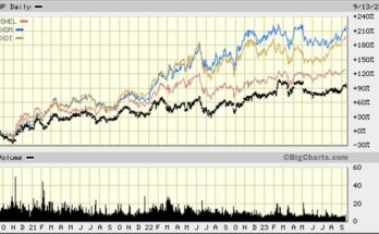
Given the bull market in energy prices during the years immediately after the 2009 recession that followed the 2008 Financial Crisis, investors might have expected somewhat better performance from the stocks during this bull market. However, the oil price collapse that started in the second half of 2014 and continued until mid-year 2017, has taken a significant toll on energy equities, especially oilfield service stocks. These trends are demonstrated in the accompanying chart that plots the oil index (XOI) and the oilfield service index (OSX).
Exhibit 14. How Oil And Oil Service Stocks Performed
![]()

Source: Big Charts, PPHB
As the chart shows, the peak in the two indices occurred in mid-2014, the point at which crude oil prices also peaked. As the oil index demonstrates, it began recovering in mid-2017, again when oil prices changed direction and started rising. However, as shown with the red line connecting the historical peak and the most recent price peak, the oil index has not broken through that downward sloping line, suggesting that oil stocks are likely not to return to that historical past peak, at least for some time.
The chart of the oilfield service stocks has been quite different than the oil index, especially since the historical peak in mid-2014. The OSX actually fell faster than the XOI, and then failed to recover as much as the oil index. It also fell more in the first half of 2017 than the oil index and has not participated in the industry recovery associated with rising global oil prices. That helps explain why the oil drilling stocks have been one of the worst performing sectors during the bull market.
It is important to understand that oil and gas producing companies are much more sensitive to the price of the commodities since it directly translates into their improved cash flow. The oilfield service companies committed two cardinal sins heading into the downturn – they rapidly added new capacity and they used debt to finance those capital investments. The result has been an inability of the oilfield service industry to recapture control over the pricing for equipment and services. The lack of pricing improvement has restrained cash flow and earnings improvement, meaning that the financial leverage taken on by companies has held down profitability gains and thus share price performance. In a number of cases, the high leverage has forced many companies into bankruptcy, which has acted to keep investors away from the sector.
Unfortunately, the bull market performance of the oil drillers sector was not a total surprise, but it was still painful to see the group on the worst performing sectors list. At some point, as has happened in all other cycles, we expect oilfield service stocks to outperform. Why? As the capacity overhang disappears because either demand grows substantially, technology improvements make equipment obsolete, and/or equipment ages out, pricing power will swing back to the oilfield service companies and away from the oil and gas producers. For those in the oilfield service sector, that shift can’t come soon enough.
Which Winter Forecast Should You Believe? (Top)
We now have three winter forecasts from traditional forecasting sources, which diverge widely over what we should expect for temperatures and snowfall. The Famers’ Almanac calls for “teeth-chattering cold” this winter for most of the nation with the exception of the West. That is good news for natural gas producers, and to the extent they buy into that outlook, they will soon be pressured to boost weekly storage injections, which may lift gas prices above $3 per thousand cubic feet.
Exhibit 15. Winter Outlook Warms Producers’ Hearts

Source: Farmers Almanac
On the other hand, The Old Farmer’s Almanac has a different conclusion, calling for a winter with slightly above normal temperatures, but possibly greater precipitation. Their forecast rests on the view that winter temperatures and weather patterns will be influenced by an El Niño climate pattern, which normally produces warmer temperatures and greater precipitation across North America. This outlook would seem consistent with the pattern of minimal weekly gas storage injections, since that gas supply will not be needed to survive a warmer winter.
Exhibit 16. A Warmer Than Normal Winter Forecast

Source: The Old Farmer’s Almanac
Most energy analysts focus on the Northeast and Midwest regions when thinking about winter weather’s impact on energy demand. The Old Farmer’s Almanac’s outlook for the Northeast region calls for this winter to be milder than normal, on average, and with above-normal precipitation and near-normal snowfall. For the Midwest, the forecast calls for the winter to be slightly milder and drier than normal, with snowfall near or below normal. Analysts often forget the Southeast region, which is a huge natural gas consumer, but according to the forecast will experience a warmer than normal winter season. None of this outlook is good for energy and natural gas producers.
Exhibit 17. Winter Sport Enthusiasts Go To Canada

Source: The Old Farmer’s Almanac
For our friends to the north, The Old Farmer’s Almanac predicts a colder than average winter with higher than average snowfall. Given the nearly 25% discount of the Canadian dollar to the U.S. dollar, our U.S. readers may want to consider the Canadian Rockies for their winter ski trips.
Exhibit 18. El Niño Causes Warmer Winter Outlooks

Source: NOAA
Based on the presence of El Niño this winter, as the National Oceanic and Atmospheric Administration (NOAA) predicts and shows in its chart, this is why we will experience above normal winter temperatures for much of the continental U.S. and Alaska. Based on NOAA’s methodology for forecasting weather, it sees the Northeast as the region with the highest probability of all regions forecasted to experience warmer than normal temperatures this winter.
The key to which of these battling winter predictions happens will be the formation and strength of El Niño. We are still months away from the actual winter weather that is being predicted, so things can change. A bigger potential problem is if natural gas producers accept the warmer winter outlook and enter into contracts to ship their production out of the U.S. and we then get a colder winter. We will continue to watch the weather forecasters, natural gas prices and weekly storage injections for signs of how energy may fare this winter.
Correction: (Top)
In our last Musings we incorrectly identified the location of Shell Oil’s new petrochemical complex. It is located in Beaver County, Pennsylvania, some 30 miles from Pittsburgh. The plants are situated along the Ohio River, hence the company’s reference to its Ohio Complex. We apologize for any confusion.
Contact PPHB:
1900 St. James Place, Suite 125
Houston, Texas 77056
Main Tel: (713) 621-8100
Main Fax: (713) 621-8166
www.pphb.com
Parks Paton Hoepfl & Brown is an independent investment banking firm providing financial advisory services, including merger and acquisition and capital raising assistance, exclusively to clients in the energy service industry.