Allen Brooks, Managing Director
Energy Musings contains articles and analyses dealing with important issues and developments within the energy industry, including historical perspective, with potentially significant implications for executives planning their companies’ future. While published every two weeks, events and travel may alter that schedule. I welcome your comments and observations. Allen Brooks
February 22, 2022
Get Your Worry Beads – Times Are Changing; Few Realize It
There is so much geopolitical and economic turmoil in the world, many people are failing to grasp the changes underway that are going to challenge the new generation of energy executives. READ MORE
Solar Power Growth Running Into Economic Challenges
A war has begun in California over the impact of net metering arrangements on the economics of electricity. That is one fundamental issue utility executives must deal with, but there are others. READ MORE
Random Thoughts On Energy Topics
Updating The Block Island Wind Farm Data Leaves Questions
November output was up but still trails all previous Novembers by 36%.
The Battle Over Stoves Continues
Catalyst Environmental points out Stanford’s gas stove study lacked realism in testing.
Stoves Are A Target In The U.K.
Woodburning stoves emit half the carbon believed, but still targeted during energy crisis.
U.S. Electricity Consumption Poised To Rise
Flat U.S. electricity use due to LED bulb transition. Now done, electricity use will grow.
Good News For Our Rhode Island Electricity Bills
National Grid agreed to rollback its overcharging for a power cable that will lower bills.
Get Your Worry Beads – Times Are Changing; Few Realize It
War in Ukraine. China flying military aircraft near Taiwan. Inflation ‒ the highest it has been in 40 years. Crude oil prices nearing $100 a barrel. The Federal Reserve contemplating seven rate hikes this year taking the Fed Funds rate from near zero to 2% or higher. Tech stocks crashing and commodity stocks rising. All of these are signs of impending changes to the world’s economy and order that may create greater instability and challenges for policymakers and businesspeople. Did we mention the Green Energy Deal?
Inflation is accelerating, and the idea it is a transitory phenomenon, as labeled by Federal Reserve Board Chairman Jerome Powell and supported by the Biden administration, is falling by the wayside. Remember when we did not have enough inflation? Then when it arrived, we would have to “normalize” it by 2024. Then it became transitory. And now?
What action plans should we put in place to address rising prices? Some of the proposals are comical. The Biden administration rode into office on an anti-fossil fuel agenda and promptly killed major energy initiatives that would have continued the nation’s energy self-sufficiency and would have aided the government’s ability to influence geopolitical challenges. Now, it is worried about high gasoline prices because an election is on the horizon. With crude oil above $90 per barrel and gasoline averaging $3.488 per gallon last week, a 39% increase from the $2.505 price of a year ago according to the American Automobile Association (AAA), President Joe Biden is leaning on OPEC to boost its oil output to bring price relief and help offset the possibility that Russian oil supplies might be lost if a war over Ukraine breaks out. Biden’s fellow Democrats have proposed a federal gasoline tax holiday for the rest of 2022 to ease the financial pain for Americans. Yes, suspend that $0.184 a gallon tax. Comical? How does that square with the climate change agenda, let alone address the other $0.816 increase in the price of gasoline?
About two weeks ago, a column in London’s The Telegraph by opinion writer Nick Timothy took on the shift underway in geopolitical and economic conditions. While the column was U.K. centric, the key points Timothy made, we believe, are universally applicable. Timothy’s column followed by two weeks a major investment strategy white paper from Jeremy Grantham, a British investor, who also is the co-founder and chief investment strategist of Grantham, Mayo, & van Otterloo (GMO), a Boston-based investment firm with $65 billion of assets under management. At age 83, Grantham’s long history in the investment business and as a value investor gives him credibility when commenting on major investment trends. [We used to meet with him during our research analyst days in the late 1990s and early 2000s and those meetings were never short.]
While the two authors approach the issue of what the future holds for us from different perspectives, each author zeros in on key underlying economic, financial, and geopolitical trends that are in the process of change or need to change. We contend that the significance of the likely changes underway and needing to change is not fully appreciated by anyone who will be impacted. Moreover, powerful interests will oppose addressing the trends that need to change for as long as they can, desiring to perpetuate the good times they are enjoying. The cliff may unexpectedly come sooner than they may imagine with damaging implications.
The trends Timothy and Grantham describe will put the world in a different position and on a different trajectory than it has experienced during the past 20-30 years. It will be a world with different metrics and dynamics that executives, politicians, and the public will need to adjust to. Will they be able to adjust, or will they engage in policies and undertake actions that make the problems worse as they try to guide the world back to where it came from? Adjusting to the “new world order” will take significant courage and perseverance and we are not sure how many people will be willing to take the medicine. Sticking your head in the sand is not the answer.
Timothy opened his column paraphrasing Earnest Hemingway. “At first it happened slowly, but now it is sudden and harsh: the Age of Unreality in which we have lived in comfort and security is coming to an end.” He went on to write:
For years, the global trading system gave us cheap manufactured goods. Asian economies helped to keep our inflation low and credit cheap. The warning signs were there – stagnant wages despite high employment, shuttered factories and low productivity to name but a few – but life was comfortable enough, for the political classes at least.
He labeled the “political classes” as the “Complacent Generation.” And he described them as “Shallow leaders who preferred the ephemeral and peripheral to the serious and complex.” He said they had “failed to fix our structural weaknesses…” Amen.
After discussing how British leaders had failed to deal with the weaknesses in NATO and the U.K.’s military strength, as well as having failed to address the threat from “Islamist terrorism,” he commented that “the energy crisis especially is a case study in stupidity.”
He decried the shortsightedness of Britain’s leaders in addressing that nation’s energy situation. He claims Britain should have gone nuclear 20-years ago, but the political leaders at that time “dithered” and ruled out nuclear subsidies. He wrote:
Theresa May began her premiership promising “an energy policy that emphasizes the reliability of supply and lower costs for users.” This should have meant new nuclear and a dash for gas, but instead we got a net zero target with no idea of how to achieve it or what it would cost. Now the Johnson government, even more religious about net zero, opposes fracking and chooses not to exploit North Sea gas fields. Confronting an energy crisis, ministers protest there is little then can do.” (emphasis added)
Timothy points out that Britain’s energy policy is hurting households and energy-intensive industries, and soon everyone will be dealing with rising inflation and eventually tax increases. The structural weaknesses in the economy he says are due to the decisions and indecisions of the Complacent Generation. No politician has developed a “coherent plan for growth we need.” He then goes on to discuss the failures of government to see and confront the challenges from Russia and China. He concluded his column with the following:
And now, from a position of unnecessary weakness, we face great challenges – revolutionary new technologies, mass migration, competition for energy sources, security threats, the decline of international institutions, the need for economic growth and doubts about how we protect our way of life and project power – but our eclipse and defeat is not inevitable. Now the Age of Unreality is indisputably over, the truth is before us. We need a new generation of leaders to return us to reason and strength.
Grantham’s lament is not as broad. For him, it is that our Federal Reserve leaders have learned nothing over the past 25 years, despite the U.S. having experienced three asset bubbles, more than would normally be expected. As Grantham puts it: “I believe this is far from being a run of bad luck, rather this is a direct outcome of the post-Volcker regime of dovish Fed bosses.” In his view, the Fed leaders misunderstood the forces at work when each of Greenspan, Bernanke, Yellen, and now Powell encouraged fiscal actions and enacted monetary policies that inflated asset values. In that regard, Grantham is seeking new leadership, but is open to current leadership learning and applying lessons from the past.
The title of Grantham’s paper sums up his view of the risk financial markets face today, with knock-on effects on the U.S. and world economies, America’s wealth, and economic inequality. The paper is titled: “LET THE WILD RUMPUS BEGIN* (Approaching the End of) The First U.S. Bubble Extravaganza: Housing, Equities, Bonds, and Commodities.” In his view, the U.S. is in the midst of a super-bubble era with bubbles in each of the four major investment sectors enumerated in the paper’s title. The paper examines these investment bubbles by exploring aspects of the three great asset bubbles in U.S. history – equities in 1929 and 2000, and housing in 2006 ‒ as well as the bubbles in the Japanese stock and real estate market in the late 1980s. As Grantham demonstrates, when each bubble deflated, the market returned to its trendline from their grossly over-valued status with huge financial costs and pain. In his estimate, when the four asset bubbles he enumerated return to their historical valuations, total U.S. wealth losses may be on the order of $35 trillion. Ouch!
Grantham, and Bill Bonner, another financial writer, focuses on the malfeasance of the leadership at the Federal Reserve for printing vast sums of money to finance the government’s deficit spending and the buildup of overall debt in our economy. They both focus on the encouragement by the Fed for the massive stimulus spending that has accompanied each of the recent financial and economic crises. As Grantham put it: “…the only ‘lesson’ that the economic establishment appears to have learned from the rubble of 2009 is that we didn’t address it with enough stimulus. That we should actually have taken precautions to avoid the crisis in the first place seems to be a lesson not learned, in fact not even taught. So we settle for more lifeboats rather than iceberg avoidance. And we forgive and forget incompetence and fail to punish even outright malfeasance.” Grantham then cited Iceland with a population of 300,000 that sent 26 bankers to prison over the financial crisis impact on the nation, while the U.S. failed to send any to jail.
Inflation is our number one problem. It is a manifestation of many smaller issues such as problems with supply chains, the lack of investment in key industries and sectors, printing too much money that supports extremely low interest rates, labor force structural problems that are being compounded by policies that reward less rather than more work, a lack of innovation and challenged productivity growth, and many other issues too numerous to mention. Government policies are often enacted because they poll well when what we really need is a dose of castor oil.
Inflation is a cruel and invisible tax on consumers who see their incomes rise at rates trailing those of the goods and services they buy to live. The public understands that when government officials and politicians tell them inflation, as measured by the Consumer Price Index minus the cost of food and fuel, is not increasing that much, they know they are being hoodwinked. Food and fuel are two of the largest components of family budgets. Add in housing costs, also escalating rapidly, and you capture most people’s budgets.
In a recent interview with Yahoo Finance, legendary investor and Warren Buffet associate Charlie Munger commented, “inflation is a very serious subject, you could argue it is the way democracies die.” He went on to say, that after years of inflation when “eventually the whole damn Roman Empire collapsed, so [the current situation] is the biggest long-range danger we have, apart from nuclear war.” That is a stark assessment of the challenge facing our political, economic, and financial leadership.
In our view, and increasingly being confirmed by the statements of our leaders, getting inflation under control, which also means addressing our debt load, is going to take a significant amount of time, and may not be accomplished easily or painlessly. What actions are taken raise the question of how our economic and financial structures will change. We suspect they will look considerably different in a few years from what they look like today, and especially how they looked and operated in recent years. Therein lie the long-term issues we must consider and how addressing them will impact our future economy, government, lives, and finances.
The chart below shows the long-term history of inflation going back to 1914. The early years in the chart were marked by volatile economic activity that marked the creation of the Federal Reserve System. Those early years also coincided with World War I, which further distorted economic activity. Throughout this long history, we can see several periods of very high inflation ‒ at the time of World War II; during the oil crises of the 1970s; and currently.
Exhibit 1. The Long History Of Inflation In The United States
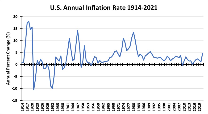
Source: St. Louis Federal Reserve Bank, PPHB
We will focus on the 1970s as the period in history that offers key lessons about what we are beginning to experience. The history of this era reflected a sharp divergence from the world we lived in (or grew up in) during the 1950s and 1960s, much like our future will not be like today.
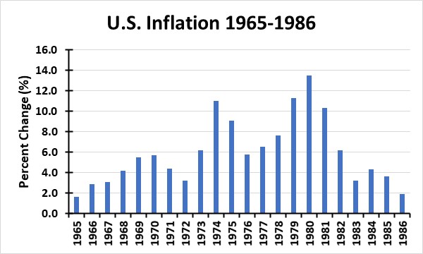
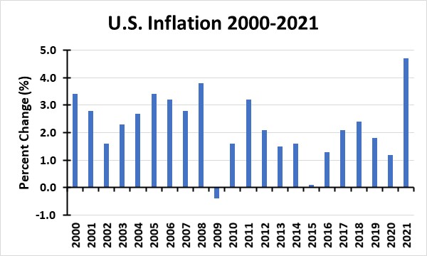
We start with a look at U.S. gross domestic product (GDP), which shows how well the economy is performing. Our first chart (next page) shows annual GDP growth during 1965-1986, which encompassed the first great oil boom, but also the time when inflation soared and the U.S. closed its gold window, preventing holders of dollars and government securities from converting them into gold, which had been the norm since the founding of the U.S. That event was monumental globally and influenced how foreign governments dealt with the U.S., at least economically, as the value of the dollar was impacted, and foreign governments moved to protect their economic interests. The second chart looks at 2000-2021, a period marked by historically low economic growth and inflation, but praised for its extended durability and comfort, although job growth was low and unemployment a problem, hurting our social fabric.
Exhibit 2. GDP Growth In The 1970s Was High
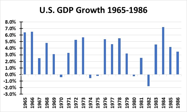
Source: St. Louis Federal Reserve Bank, PPHB
What one sees in the chart above is the high economic growth during 1965-1986, albeit with periodic recessions. To contrast the difference in growth between this period and the 2000s, we put the data for each chart on similar vertical axes (y-axis) for visual affect. That better illustrates the low GDP growth of the 2000s, although there were only two recessionary years with negative growth compared to the five experienced in the earlier period.
Fewer recessions are pointed to as a sign that policymakers are better able to manage our economy now than in the past. However, the slow economic growth levied a cost on society by limiting incomes, jobs, and personal advancement.
Exhibit 3. GDP Growth In The 2000s Was Lower Than In The Past
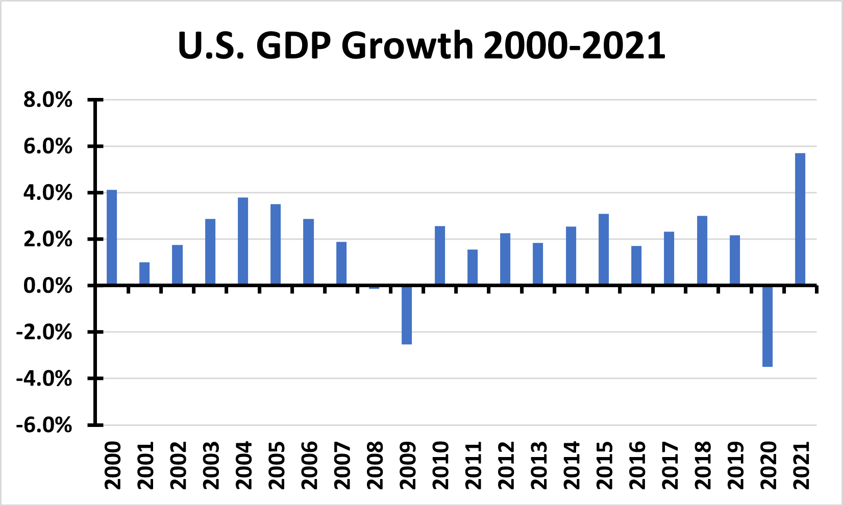
Source: St. Louis Federal Reserve Bank, PPHB
When we look at inflation during these two time periods, the rate experienced in 1965-1986 is high, including years when annual inflation was above 10%. The most interesting thing about that period was that inflation spiked in 1974, which coincided with the first explosion in oil prices caused by responses to the Arab oil embargo in late 1973. However, inflation fell the next two years and remained considerably lower than 1974 until 1979, as the economy struggled to recover from the oil-induced recession. The Iranian Revolution in 1978 removed a substantial volume of the world’s oil supply from the market and caused oil prices to spike once again and drove inflation even higher than in 1974. (We have a chart on this issue later.)
Exhibit 4. Inflation During The 1970s Was Extraordinarily High
Source: St. Louis Federal Reserve Bank, PPHB
What we see when we look at inflation during the 2000s (chart below), we see that it was higher in the early years of that period than in the latter years. That was because in the early 2000s, the global economy was experiencing robust growth driven by the emergence of China as a major economic (and geopolitical) power, coupled with oil and other commodities being in short supply and accelerating capital investment. The U.S. housing boom, which spilled over to other nations in the developed world, was also a contributing factor to both economic growth and inflation.
However, once the 2008 financial crisis and resulting global liquidity-driven recession occurred, inflation was crushed and remained low for the balance of the next decade. Of the intervening 12 years between 2008 and 2020, there was only one year when inflation exceeded 3%. There were two years when it nudged just over 2%, and one year when it was measurably above 2%. But for two-thirds of the time, inflation was at or below 2%, something touted by politicians and government officials.
Exhibit 5. The Low Inflation Of The 2000s Is About To Change
Source: St. Louis Federal Reserve Bank, PPHB
Most people’s memories are short, especially when it comes to economics and finances. That is probably the result of there being so much economic and financial news every day that makes remembering actual data and dates harder. In that regard, as mentioned earlier, we have a chart (below) showing the annual inflation rate as well as the annual nominal and real oil price for 1965-1986. It shows that oil prices were partially responsible for higher inflation, just as inflation and government policies designed to help control inflation impacted oil prices. We are not drawing any equivalency between oil and inflation, only stating that each influenced the other.
Exhibit 6. Inflation And Crude Oil Prices Were Intertwined In The 1970s
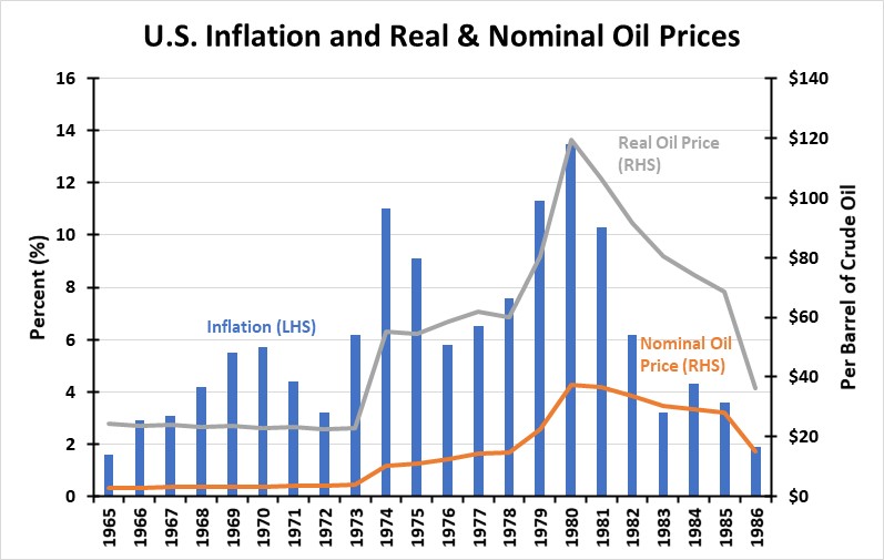
Source: St. Louis Federal Reserve Bank, PPHB
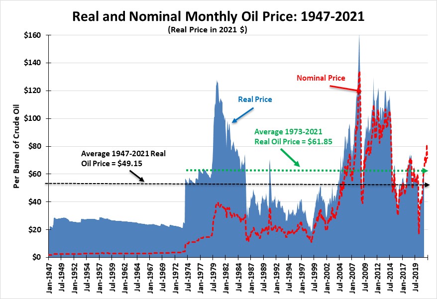
When we examine a long-term chart of real and nominal oil prices, we see how stable prices had been prior to the 1970s. After oil prices fell in the early 1980s, they remained low until the early 2000s when the China-driven economic boom began. Surprisingly, the return of nominal oil prices to $100 a barrel in 2014 did not drive inflation higher. We attribute the absence of inflation to the low interest rate environment sponsored by the Federal Reserve and the growing interconnection of world trade that afforded the developed world the ability to tap the vast amounts of cheap labor in the developing world that lowered the cost of goods produced globally.
Exhibit 7. How Real And Nominal Oil Prices Moved Over The Long-Term
Source: EIA, BEA, PPHB
Turning to interest rates, the following chart shows the long-term history of 10-year Treasury securities yields and the Consumer Price Index (CPI). What is noticeable is that when the CPI rose, such as it did in the late 1960s and during the decade of the 1970s, the 10-year Treasury yields increased sharply. Once inflation moderated, the CPI was barely above the horizontal axis and Treasury bond yields declined. In fact, the steady decline in the yield from its peak in 1981 to 2020 marks the 40-year bull-market in the bond market that brought interest rates overall from double digits to very low single digits. Owners of bonds benefitted as their prices rose as interest rates declined. However, those who depended on the income from bonds suffered as yields fell and they replaced higher-yielding bonds with lower-yielding ones. This was another unseen tax on the incomes of our older and retired populations.
As seen at the far right of the chart, the CPI has shown a recent uptick, as has the 10-year Treasury yield. We believe this is the start of a new bond market era marked by rising yields, something not experienced for 40 years.
Exhibit 8. Interest Rates Have Been Impacted By Rising Inflation Rates
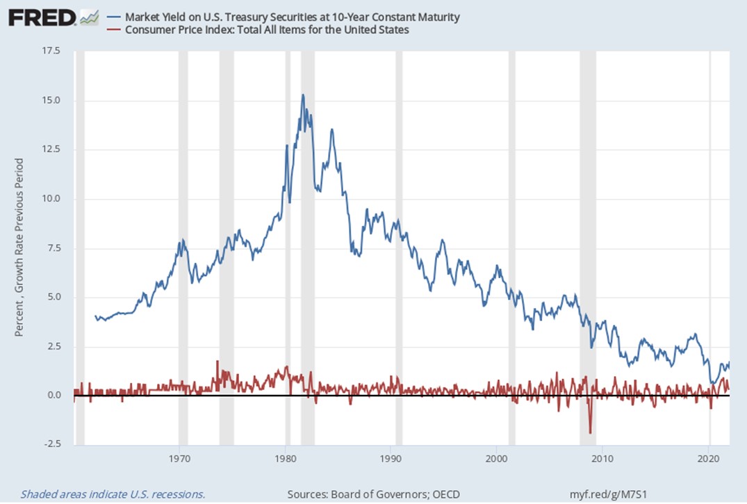
Source: St. Louis Federal Reserve Bank
What we hear most about today is the Federal Funds rate, which is the primary tool the Federal Reserve has for managing monetary policy. To inject even more liquidity into the financial market, the Fed has also engaged in an aggressive policy of buying government and public debt that lifts bond prices and depresses interest rates. The debate underway at the Federal Reserve and among economists and in financial markets is how soon the Fed will change its zero-interest rate policy (easy money) and how high the rate might move. It is now a guessing game of how often and by how much the Fed raises rates, along with when they stop buying debt securities.
The following chart shows the history of the Fed Funds rate. That history demonstrates how the Paul Volker-era at the Fed during the 1970s was marked by his aggressive use of interest rates to choke off the inflation that raged in that era, especially during the later years of the decade. Pushing commercial banks’ prime interest rate for its best customers to 20% was accomplished by sending the Fed Funds rate soaring. Banks needed to price their loans at a slight premium to the Fed Funds rate to make money on their loans supported by customer deposits, for which the banks had to pay. Sky-high interest rates caused a dramatic slowdown in economic activity that eventually killed the inflation dragon. People who lived through that period may recall having secured home mortgages with rates in double-digits compared to today’s rates in the 4% range for 30-year loans, which are currently at three-year highs.
When we focus on the past 20 years, we see that Fed Funds rates were used aggressively to fight the recessions of 2001 and 2008 by dropping them to very low levels and in effect injecting cash into the economy. As the chart shows, there were periods when interest rates were hiked to try to slow economic growth considered too rapid and inflationary. Since the 2008-2009 Great Recession, there has been only one time when the Fed attempted to raise rates from the zero level to end its easy-money policy, but it abandoned that effort when the stock market crashed – an asset bubble being burst? The record shows that for most of the past decade, the Fed Funds rate has averaged close to zero – or essentially free money. What comes next?
Exhibit 9. Fed Funds Rate Reflects Government Monetary Policy At Work
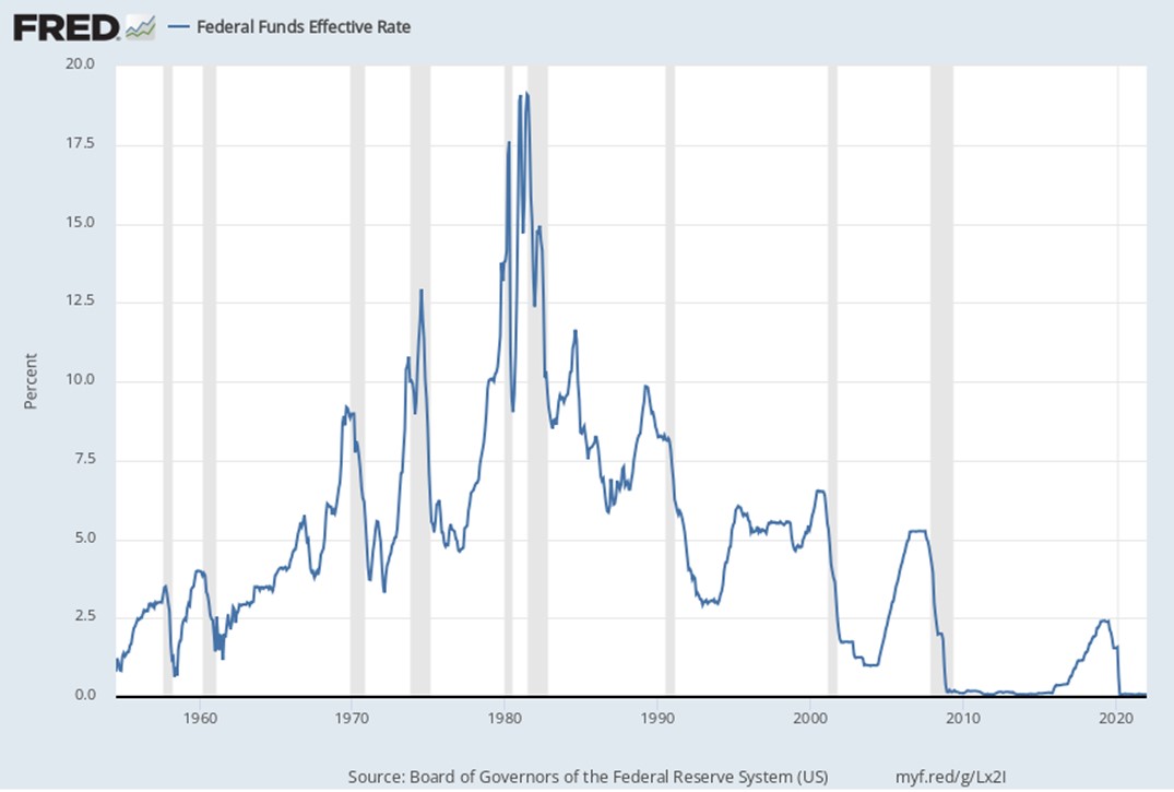
Source: St. Louis Federal Reserve Bank
The following chart shows the similarity of interest rate patterns between the Fed Funds rate and the yield on the 10-year Treasury. This shows how short-term and long-term financial markets are linked together. Therefore, it is safe to assume that if, and when, the Fed begins to raise the Fed Funds rate, there will be a lift to the 10-year Treasury yield, also. The cost of money will be going up, which will be a reversal from what has been experienced for the past 40 years.
Exhibit 10. Both Short-Term And Long-Term Interest Rates Have Moved Together
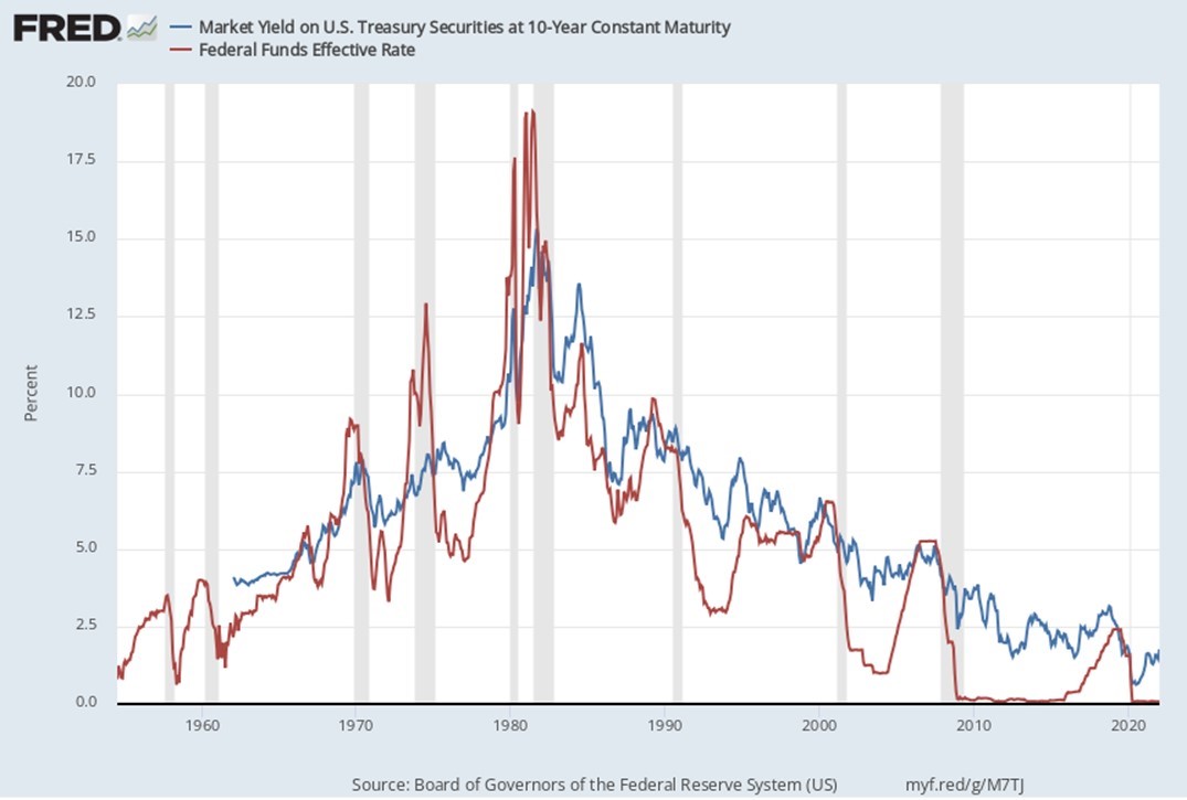
Source: St. Louis Federal Reserve Bank
One outcome from the long-term decline in interest rates is that debt became progressively cheaper, which encouraged companies and individuals to use greater amounts of it. Governments also resorted to using debt to finance their over-spending rather than taxes, as such a policy is popular with voters and seen to boost politician re-election prospects. Cheap money has reduced the cost of government by minimizing the interest expense for servicing the debt load, even as it grows. Lower debt-servicing expense reduced the pressure to control deficit spending – why worry about a few more billion in debt. The result is that federal government debt has exploded, especially recently. In 2000, total federal debt was $5.7 trillion, which grew to $13.6 trillion by 2010. Five years later debt it had increased to $16.2 trillion, and today is over $30 trillion. Since January 2020, immediately before the emergence of Covid-19, the U.S. has added $7 trillion in federal debt and looks set to further add to that balance.
A chart from the Peter G. Peterson Foundation shows the history of interest rates and the cost of servicing the federal debt over 2000-2020. It is clear our economy has been protected from the ill-effects of greater borrowings because of low interest rates, but we may not be able to avoid the tax and spend question any longer. This chart does not reflect the additional $7 trillion borrowed since 2020. And it does not reflect the higher interest rates we are likely to experience soon.
Exhibit 11. Servicing Government Debt Has Been Helped By Low Interest Rates
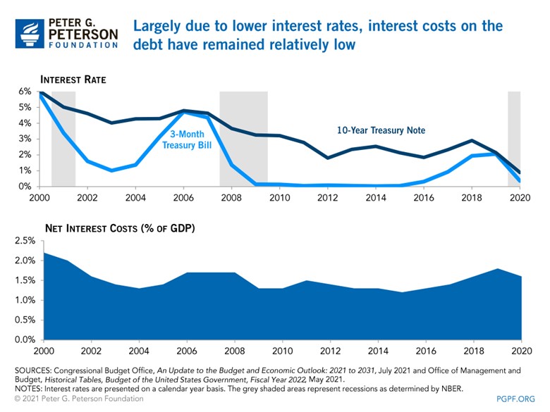
Source: Peter G. Peterson Foundation
The point Charlie Munger made about the impact of debt on the stability of economies and governments is captured in the following chart. It shows the ratio of our public debt to the size of our economy. As the chart shows, immediately prior to the 2008 Financial Crisis, the debt/GDP ratio was 64%. At the depth of the economic fallout from Covid-19 in 2Q 2020, that ratio hit 135%. As of 3Q 2021, the ratio had improved to 123%. A ratio that high is not sustainable. Something will have to give. What will it be – sharply higher interest rates, lower government spending, rising taxes, a serious recession, a crippling of family budgets landing many more people in poverty? None of those are popular outcomes. But they are the choices we face.
Exhibit 12. Debt/GDP Ratio Has Soared And Is Unsustainable
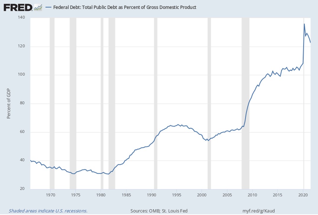
Source: St. Louis Federal Reserve Bank
Corporations have aggressively used cheap debt to fund investments and operations. Cheap money – both debt and equity – helped fund the drunken spending wave that financed the oil and gas shale revolution. The nation secured substantially more oil and gas output, but at the expense of a decade of negative financial returns from companies in the petroleum industry. When global oil prices collapsed in 2014, this chapter came to a rude ending with hundreds of corporate bankruptcies, thousands of lost jobs, financial devastation in energy-dependent communities and states, and the transfer of geopolitical power to nations outside America’s sphere of influence.
Higher interest rates and taxes will change capital spending, balance sheet structures, and financial returns for all businesses. These changes will not be good for companies, individuals, or governments. A case in point. In our last Energy Musings, we wrote of the challenging economics for wind energy. We cited an analysis from a report by the Carbon Trust on the economics of the U.K.’s wind industry that pointed to the reason its levelized cost of electricity (LCOE) had declined was the reduction in the weighted average cost of capital (WACC) for wind farm developments from 10% to 7%. The study stated that a one percentage point reduction in the WACC would translate into a reduction in the cost of electricity of 7%. The WACC decline was explained by better performance in constructing wind farms that reduced the performance risk premium investors demanded along with an improvement in borrowing costs for the long-term debt for the projects, which are perceived now as less risky. The three-percentage point decline in wind’s WACC explained the 21% decline in the calculated LCOE.
That WACC reduction came amidst a decline in long-term interest rates. What is impossible to separate right now is how much of the WACC improvement was in response to better operating performance versus lower interest rates. Now wind energy is facing significantly higher raw material costs, greater transportation expense, and soon rising interest rates. These higher costs will take a financial bite out of the business. The wind industry will suddenly become riskier, and investors will demand higher returns, boosting the WACC requirements for future wind developments. Thus, the likelihood is that wind costs will be rising rather than falling in the coming years that will put upward pressure on wind power costs, raising questions about the financial health of developers. This will have a knock-on effect in power markets and utility bills.
As we cited in this Energy Musings issue’s article on solar power costs, utilities are facing new pressures in financing the cost of the energy transition that will necessitate rebuilding the electricity infrastructure. We discussed how Nova Scotia Power wants to restructure how it is compensated for financing new capital projects designed to protect the financial health of the utility. The prospect of higher interest rates is pushing Nova Scotia Power to seek to reduce its debt exposure on new projects, while also earning more on its capital to support the business. The possibility of increased financial stress on the power industry comes at a time when major international oil companies are shifting capital spending from their traditional oil and gas businesses to renewable electricity projects. The CEOs of both BP and Shell Oil have warned shareholders that renewable investments have lower financial returns than oil and gas investments. The lower returns for renewable projects are because they appear to have reduced risk – long-term power purchase agreements and government subsidies. However, their returns are supported by them having higher debt/equity financing structures. With higher interest rates, the returns on these projects will be squeezed putting upward pressure on electricity prices to offset the higher borrowing costs. As those energy CEOs warned, shareholders and pensioners depending on the dividends from these oil companies need to be prepared for little or no growth in future dividend payments. That is not a popular proposition for retired employees.
We are not picking on renewables in this discussion, but these happen to be examples that we have written about recently. Higher interest rates will cause pain throughout every sector of the economy – some to a greater degree than others. Governments will also face a reckoning between cutting spending, or raising taxes, or kicking the can down the road. What about the cost of their pension obligations that escalate with higher interest rates? Just another cost.
The managers in corporate America, as well as throughout the world, will be dealing with an economic and political/regulatory environment they have not experienced in their careers. They will have to develop a new playbook for managing, and the sooner they begin the better. One suggestion – start talking with the ‘old guys’ in your industry – they will have knowledge and experience to share. In addition, they can share the surprises they learned as their worlds were turned upside down. Grab the worry beads because you will need a calming influence to weather the future we are about to enter.
Solar Power Growth Running Into Economic Challenges
Solar power is the fastest growing renewable energy source in the United States, and likely worldwide. What is there not to like about it? The fuel is free – it comes from the sun. All you need to do is capture it with a polysilicon panel, turn it into electricity, and send it to the wires in your home. Oh, we forgot – the sun does not shine 24 hours a day, unless you live in the northern most regions of the planet during the summer. So, what do you do about those times, like at night and when it rains or snows or is cloudy and you can’t see the sun? You rely on a battery, so in December you can use the power stored back in June. The problem is batteries are expensive, and most of them can only deliver their stored power for about four hours. That won’t cut it if you need electricity at 3 am while it is still dark.
Ah, the easiest solution is to hook your house up to the local utility’s electricity grid and arrange to send them your surplus power during the day and use their power when the sun doesn’t shine, or your battery is exhausted. That was easy. But wait a minute. You have invested a lot of money in your solar panel system, so the utility needs to pay you what they charge you for the power when you buy it from them. That’s only fair because obviously the price of electricity is what the regulators allow the utility to charge for it.
Just what is the price of electricity? There is the wholesale cost – what it costs a developer to generate that molecule. Then there is the retail price, or what the utility charges the homeowner for the molecule. In between the wholesale cost of the power and the retail price of the electricity delivered to your home can be a spread that ranges anywhere from 4-5-cents to 20-cents per kilowatt of power depending on where you live. That spread is what finances the utility’s operations – getting the power from where it is generated to your home’s electric meter, with a profit for the utility’s shareholders for the use of their capital. As solar power installations grow in this nation’s and the world’s push for clean energy, determining the price of electricity, especially for those people with solar arrays, is becoming a contentious issue.
If you install a solar array and a backup battery and use all the power yourself, there is no issue. If you agree not to use the power your array generates and only sell it to the utility, there is little issue. If, however, you opt for a hybrid arrangement – use their electricity to power your home; sell your surplus electricity to the utility company – both you and the utility must agree to the price of the power.
The hybrid arrangement is termed “net metering.” In many cases, a homeowner sells his surplus solar power to the utility company at the same retail electricity rate he pays when he buys power from the utility. The problem is that the utility company has invested in and finances the operation and maintenance of its electricity system, which supplies and delivers power to the homeowner some of the time. If the utility company pays a price equal to what they charge the homeowner, they only earn money to support their operations when they sell power. They do not earn anything when their system is used to haul away a homeowner’s surplus power.
As more homeowners install solar panels, the net metering arrangement distorts the cost to operate the power grid. Those homeowners who do not install or cannot afford solar panels are forced to finance a disproportionate share of the total cost of the electricity system. The battle over net metering is slowly evolving into a war involving renewable power proponents, utility company managements, and non-solar system homeowners. The regulators are getting caught in the middle. What this war highlights, however, is just another of the number of issues now confronting the electric utility business as it rapidly shifts to renewable power.
Exhibit 13. Solar Panels Are Becoming The New War Zone In California

Source: proudgreenhome.com
The energy transition is being driven by a concern about the climate effect from continued carbon emissions by burning fossil fuels to generate electricity. Eliminating all carbon emissions is the new goal, referred to as getting to net zero emissions. In this push, renewable energy sources are seen as the solution. If we electrify our entire economy and generate the power from renewable sources, we can eliminate all carbon emissions. As part of this clean energy transition, many states have developed Renewable Portfolio Standards (RPS) that spell out the desired mix of electricity fuel supplies at points in time to achieve the state’s specific carbon emissions reduction goal. In certain states, their RPS targets have been modified, bringing forward the target dates for cutting emissions and in some cases reaching 100% renewable power requirements.
California has been a leader in RPS targets and now has installed a 2045 target date for reaching 100% renewable power. As part of the initiative, the California Energy Commission (CEC) created the California Solar Mandate that began on January 1, 2020. It requires California to produce 50% of its energy from clean energy sources by 2030. One policy in fulfillment of this objective is the 2019 Building Energy Efficiency Standard that has solar photovoltaic (PV) system requirements for all newly constructed low-rise residential buildings in the state that receive construction permits issued after January 1, 2020. This mandate impacts any new residential structure that is three floors or less in height. Existing structures that are remodeled or added-on-to are exempt. This mandate is the first in the nation.
According to the CEC:
Generally, the installed PV system must be big enough to offset the electricity use of the proposed building as if it was a mixed-fuel building. A mixed-fuel building assumes a natural gas furnace, water heater, stove, and clothes dryer. This means electric heat pump space heating and water heating loads, and electric appliances will not affect the minimum PC system size requirement.
The climate zone of a building will affect the cooling demand of the building and, as a result, the PC system size. The conditioned floor area of a building will also affect the cooling demand, as well as possible plug loads. For multifamily buildings, the number of dwelling units will affect the expected number of occupants and energy demand.
The mandate does not require the solar PV system be installed on the roof of the structure. In addition, there is an exception if the effective annual solar access of the roof of a building is restricted to less than 80 contiguous square feet because of shading, in which case the building does not have to have a solar PV system.
The rationale for the solar mandate is the belief of an ever-declining cost of solar electricity. According to the CEC, potential homebuyers can expect new homes with solar PV systems to cost an additional $9,500. However, homeowners can also expect to save an average of $19,500 over the life of the system. Therefore, the homeowner will see a two-times return on his investment in the solar PV system. The low-cost estimate comes partly from the idea that homebuilders can use their regular labor force to install the panels and hardware, rather than needing to hire a solar installer. Perversely, the CEC also expects that solar companies will give up the market for new construction and only target homes built prior to 2020. Thus, we not only have a climate change policy with this solar mandate, but we also have an industrial policy promoting specific businesses as to who will install solar systems on which types of homes. Big brother is really at work!
This nice solar plan has suddenly run amuck of the net metering issue. We will come back to the net metering issue later, but it is only one aspect of problems besetting the electric utility industry as the clean energy transition marches forward. Let’s step back and examine the transition to clean energy and its impact on the electric utility sector, primarily from the perspective of solar power.
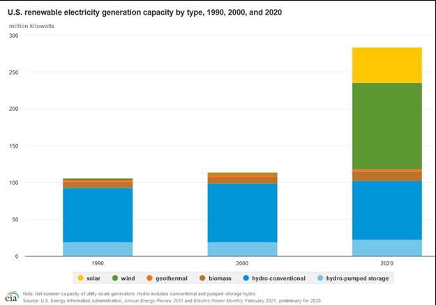
Solar has been the fastest growing sector in the power generation business in the United States during the past decade. The chart below shows the growth in U.S. solar net generation for 2014 through the trailing twelve months ending November 2021 (latest government data available). What it shows is approximately a 350% increase in generation over the eight-year period.
Exhibit 14. How U.S. Solar Power Has Grown In Recent Years
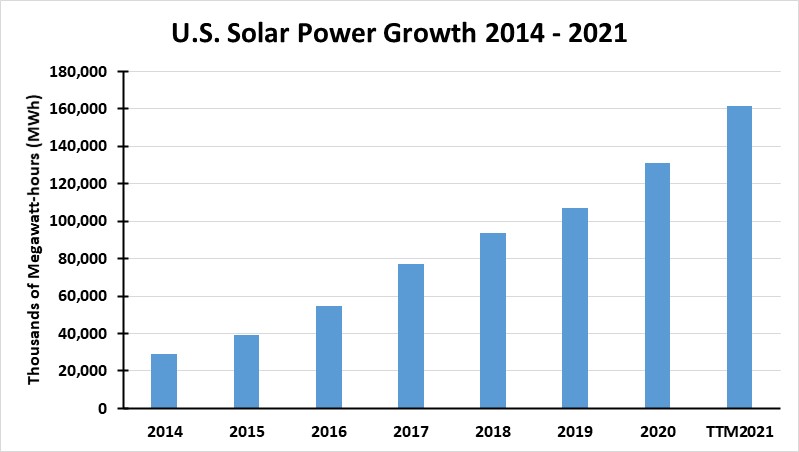
Source: EIA, PPHB
As expected, the amount of solar generation capacity installed has also increased. Shown in the chart below is the solar generating capacity installed each year and as of November 2021, as reported by the Energy Information Administration (EIA).
Exhibit 15. U.S. Solar Generating Capacity Has Grown Faster Than Output
Source: EIA, PPHB
What is most interesting is how the IEA changed its accounting for solar. Starting in 2014, the agency began collecting and reporting the capacity and amount of electricity generated by small solar PV units, those under one megawatt (MW) in size. When it reported the 2014 totals, the small units represented 46% of the total capacity of solar PV. Interestingly, since then the utility-scale solar PV capacity has grown faster than small solar, so that utility-scale now represents 61% of total solar PV installed capacity as of November 2021, leaving small solar PV with only a 39% share. That does not mean that small solar units are not an issue, it really depends on the concentration of small units on a specific utility grid.
The table below shows the net metering data collected by the EIA for all renewable and battery storage technologies. We are showing only the solar PV portion of the EIA table. Residential customers account for just over 96% of total customers as of the end of 2020, but they represent only 62% of the installed capacity. According to pv magazine, the top three states with the most small-scale solar PV capacity at the end of 2020 were California with 10.6 gigawatts (GW), New Jersey with 1.9 GW, and Massachusetts with 1.8 GW. However, in 2020, there was a total of 4.5 GW of small-scale solar capacity installed nationwide, with California accounting for the largest share at 31%. We suspect this trend has continued, albeit with other states taking market share.
Exhibit 16. Utilities Are Struggling With The Growth In Net Metering Capacity
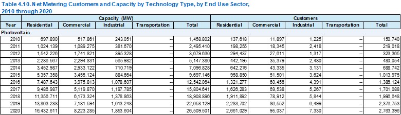
Source: EIA
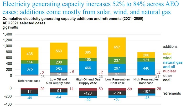
The importance of solar in the future of the U.S. electricity sector is shown by the forecast by the EIA in last year’s Annual Energy Outlook 2021 (AEO2021).
Exhibit 17. Solar Power Is To Be An Important Player In Future U.S. Energy Market
Source: EIA
Although the United States has been slower to promote solar PV than other regions, it is projected to grow rapidly in the future. The chart above from the EIA’s presentation introducing AEO2021 reports the outcomes of the various scenarios it developed to show how the U.S.’s future energy business may unfold. The Reference case projects a cumulative 435 GW of new solar generating capacity to be installed by 2050. That total implies roughly 15 GW per year of new capacity being installed. Solar capacity will exceed natural gas generating capacity additions by 16% and is estimated to be nearly three times the growth in wind generating capacity. As can be seen, the amount of solar generating capacity installed varies materially between the various projections based on the assumptions employed in each model.
A reason so much solar capacity is projected to be installed is because the sun only shines for part of a day. This means much greater capacity is needed if solar output is to grow and represent a larger share of total electricity generated. As the EIA calculates, since 2013, average annual solar capacity utilization rates (amount of electricity generated relative to the total amount that could be produced if generating capacity were operated 100% of the time) have ranged between 24.5% and 25.6%, which is a narrow, but consistent range. It also points up the challenge for solar. Unless the capacity utilization rate can be increased, generating capacity needs to grow dramatically to boost solar output materially.
The growth in output depends not just on the amount of new generating capacity installed but also the rate at which existing panels lose their energy output efficiency as they age. Degradation ‒ the rate of output decline ‒ of solar panels was calculated in a 2012 study by the National Renewable Energy Laboratory at 0.8% per year. It means that after a solar panel’s estimated 25-year life, it is only putting out 82.5% of the panel’s original output capacity. Recognizing there is a range of degradation rates, planning for a 1%-per-year decline is appropriate when conducting an economic analysis of a solar PV installation.
As the EIA pointed out, solar energy’s share of total utility-scale electricity generation in 2020 was about 2.3%, up from less than 0.1% in 1990. That reality is highlighted by the following chart showing solar capacity barely registering in the national figures until 2020.
Exhibit 18. U.S. Solar Growth Has Been Spectacular In Recent Years
Source: EIA
As mentioned above, the issue for net metering comes when small-scale solar is concentrated. The EIA wrote that “As of the end of 2020, almost 38% of total U.S. small-scale solar PV electricity generating capacity was in California.” An EIA chart from 2019 shows that concentration, but also points to where it was high in other states.
Exhibit 19. Net Metering Becomes An Issue As Solar Share Rises
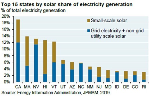
Source: JP Morgan Asset Management
The reasons for these state concentrations are aggressive promotions of the federal government’s investment tax incentives for building new solar systems and state net metering payment schemes. For example, Arizona offers a payment rate that is 30% below the time-of-day retail rate, however, the reimbursement declines over time. Hawaii repays homeowners at the wholesale power rate, which is approximately 50% of the retail rate, but it also assesses a monthly transmission charge. Massachusetts reimburses at the full retail rate, as does Maryland, New Jersey, and Vermont. In New Mexico, the payment rate depends on which utility a homeowner is connected to, receiving either a full retail rate reimbursement or the net avoided cost of the power displaced. Nevada pays 75%-95% of the retail rate.
Massachusetts also maintains a SMART Solar Rebate program, in which the state’s three investor-owned utilities will directly compensate participating solar system homeowners for their solar power generation. The program features a declining block structure that is capped statewide at 1,600 MW of incented solar power. Each utility supports a percentage of the program proportionate to the amount of electricity they distribute in the state. This means that homeowners desiring to participate may find the SMART program for the area where they live may end sooner than elsewhere in Massachusetts.
According to the Solar Learning Center, the SMART programs have 10-year lives and incentive values that range between $0.34 and $0.29 cents/kWh. The Massachusetts program is like one offered in Rhode Island, in which we participate with our summer home. Our contract with the local utility, a subsidiary of National Grid, has a 15-year life, is transferable if we sell our home, and is renewable for another 15-year term, although the rate to be paid in that renewal period will be determined upon renewal.
Under our contract, National Grid pays us $0.3475/kWh. Their program started paying initially at $0.41/kWh, then dropped it to $0.37 and in the third year to our rate. The rate it offers now is about $0.22/kWh, or close to what National Grid charges for its retail power ($0.20/kWh). The dramatic decline in the rate offered since the plan started reflects National Grid apparently approaching the maximum for its solar power commitment.
The economics of this program are compelling, but certainly no longer as lucrative with the lower rate paid and higher system costs. We were eligible for the 30% solar investment tax credit and a discount on the installation negotiated between our town and the solar installer it promoted. National Grid credits us for our electricity sold to them but does not credit against its social payment programs or its franchise tax. The balance of our power sales is paid directly to us but is taxable income.
We have been tracking our monthly progress. Our solar panels began producing electricity in late September 2017, so the system has been operating for 4.33 years, counting the first monthly bill in 2022. Pre-tax, the credits on our monthly electric bills and the monthly cash payments have enabled us to recoup 84% of our net investment (after ITC and installation credit). After applying a 24% tax rate to our cash payment, we are at a 64% recovery. Assuming we earn the average of the past four full years of system operation, we will recoup all the pre-tax cost in five years. The after-tax recoupment should happen at 6.5 years. The nice thing is that we will continue to earn the hefty power price for another 8.5-10 years after recouping our net investment.
We understand that Rhode Island has now developed a net metering plan that allows people to receive the retail price of the power. We are told a homeowner can have a net zero monthly bill, but we wonder how the utility is allowed to erase the social policy costs that they cannot erase from our bill with our credits. The information about the net metering plan came from the head of our solar system installer, but we haven’t pursued all the details as we already have our system. He mentioned the battle over solar, and cited California as the prime battleground. In mentioning the retail price that the net metering participants were receiving, he made the comment about the rate going up. Because we have been lectured by National Grid, the state’s Public Utility Commission, and politicians about how cheap renewable power is, we thought the price of electricity was supposed to go down in the future. Isn’t green energy cheaper than fossil fuel power? The more interesting question is why is National Grid selling its electric business in Rhode Island but keeping its natural gas business? Do they know something we don’t?
In California, which has had a net metering scheme since 1995, the recent proposal to change it, a long-time coming, has started a war between solar companies and the utilities. The 1995 plan was designed as a “way to encourage private investment in renewable energy resources.” It included a system size limit of 10 kilowatts (kW), and a very small total net metering cap of 0.1% of peak load (about 53 MW) statewide. Provisions were modified in 2001 and 2002 to increase the system size limit to 1 MW and the total cap to 0.5% of peak load.
The state’s big push for solar energy was incorporated in legislation passed in 2006 that increased the net metering cap to 2.5% of peak load and created the California Solar Initiative (CSI), a program designed to rapidly grow the solar market and reduce costs by providing subsidies to lower the cost of building solar installations large and small. The CSI stayed in place for roughly 10 years and when combined with the federal government’s solar Investment Tax Credit program helped California’s solar industry grow rapidly.
Further changes were made in 2010 when the total system cap was increased to 5% of peak load. In 2013, however, pressure for changes grew. Legislation that year set July 1, 2017, for the end of full retail rate net metering and directed the California Public Utilities Commission (CPUC) to develop a “successor” program that would apply to the state’s large investor-owned utilities. In 2016, the commission unveiled Net Energy Metering 2.0 (NEM 2.0).
Under NEM 2.0, solar owners get credit for all the energy their systems send to the grid, but the amount of that credit is reduced by around 2-3 cents per kilowatt-hour (kWh) to ensure that solar customers pay their “fair share” of certain “non-by-passable charges.” The charges relate to low-income assistance and energy efficiency programs.
Both the solar industry and the utilities viewed NEM 2.0 as a victory. The solar companies were not hurt much by the small reduction in the purchased power price, while the utilities recovered some money for programs they were required to fund, but most importantly, the utilities got to force all new solar owners to sign up for time-of-use billing, an energy efficiency structure envisioned as a way to reduce the amount of new generating capacity the utilities would need to build in the future. The utilities were also promised the CPUC would revisit the NEM rules in 2019. That promise made NEM 2.0 more of a stopgap measure than a true reevaluation of NEM.
Selecting 2019 for the NEM review was keyed to the fact that at the end of that year, the federal solar investment tax credit was to drop from 30% of the system cost to 26%. The CPUC recognized that since the federal government was acknowledging that solar might need less subsidization in the 2020s, it might be appropriate for the state to consider updating its solar compensation arrangement.
Another reason to update NEM was the recognition that the “cost shift” from solar homeowners to non-solar homeowners was becoming a more visible issue. Up to that point, all the studies conducted about the value of solar energy showed that when it represents a small percentage of total energy generated, it adds more value to the grid than the homeowners receive in payment for their excess electricity. The reality was (is) that small-scale solar is no longer a small proportion of California’s electricity business. Based on 2020 EIA data, the 10.6 GW of small-scale solar PV represents 13.6% of California’s total installed electricity generation capacity.
NEM 3.0 was unveiled in mid-December 2021 with a plan for the CPUC to vote on it in late January 2021. The key provisions of the new plan involved a drastic cut in the price at which surplus electricity would be bought. The new rate reportedly would be about a quarter of the current rate – around 5-cents/kWh, down from the 20- to 30-cents/kWh homeowners are paid now. There would be no “glide path,” meaning that the price reduction would be effective as soon as the revised plan goes into effect. Homeowners would also pay an $8 per kilowatt (Kw) monthly charge to help ensure solar system owners pay their “fair share” of the cost to maintain the grid and fund public policy programs. They would also be required to be on a very strict time-of-day rate plan that would increase homeowners’ bills.
The net result of the plan’s proposed changes is to double the payback time for new solar installations. According to an analysis by energy consultant Wood Mackenzie, if the proposed plan is put in place, the potential solar market in California would essentially be cut in half due to the doubling of the payback period, thereby reducing the incentive for many homeowners to go solar. California Governor Gavin Newsome stated that the plan would be revised.
As a result of protests and controversy, the plan’s implementation has been paused. The reason stated for the pause was because the new head of the CPUC had not participated in the earlier discussions, therefore the commission said it needed more time to consider the plan. A second regulator was added to the commission in January. In early February, when the plan was put on hold, it was announced that oral arguments about it would be scheduled “at a later date.” So far, no date for the arguments has been announced. That is probably in recognition of the opposition to NEM 3.0 from the solar industry. They have argued that the proposed plan goes against the direction and goal of California’s clean energy policy. Solar companies are racing to get people to go solar since there is a possibility NEM 2.0 will be retained. They also suggest homeowners install batteries giving them greater freedom to avoid the worst of the NEM 3.0 provisions.
The problem in California is that the CPUC is charged by previous legislation to develop a new NEM plan. Rising housing costs, which are partly due to the solar mandate, along with higher living costs, are driving Californians out of the state. The utilities recognize this economic pressure and are pushing for the NEM 3.0. The battle lines are being drawn. The Wall Street Journal editorial board wrote about the battle and described NEM as “welfare for the wealthy.” That characterization has drawn heated pushback from Californians in letters to the editor of the newspaper. Based on the political and economic drama playing out in California over revising NEM, we expect a lot more heated rhetoric before a solution is arrived at. Watch Sacramento for legislative solutions to the legal requirement to revise NEM, forcing the CPUC in whatever direction the legislature wants it to go.
While net metering is a growing problem for utilities, they are also beginning to understand that the energy transition underway will require huge capital investments for years to rebuild their generation, transmission, and distribution systems. This will be part of the estimated $275 trillion expenditures needed according to consultant McKinsey’s recent report. How to fund that investment is just now getting attention from utility companies.
To illustrate the challenge utilities face, the following chart from J.P. Morgan shows the historical rate of installation of generating capacity per capita for the U.S., Germany, and China. The U.S. history is the longest, starting back in 1960, which provides several interesting periods of very high-capacity additions associated with the coal and nuclear additions in the 1970s and the nuclear additions in the mid-1980s. The point of the chart was to illustrate the challenge facing the power industry globally when compared with the target rate of wind and solar power generating capacity needing to be installed based on a Princeton University study for getting to net zero emissions in 2050. That study suggests the rate of capacity installation needs to be at 300 watts per capita. As the data for the three countries shows, during the past 20 years when the push for new wind and solar power has been the strongest, the average power generation per capita addition has only been around 100 watts, well below the Princeton target.
Exhibit 20. Can Renewable Capacity Grow As Fast As Needed?
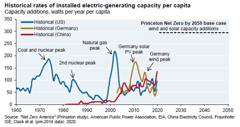
Source: JP Morgan Asset Management
Just how and at what cost will we increase the new generating capacity? If wind and solar power are struggling with raw material availability to meet their current growth rates, how will they step up these growth rates by threefold? While the mining industry will need to increase its investment efforts, the new mines, although likely more efficient than existing mines, will likely produce output that is more expensive than now. That will drive up the costs of wind turbines and solar panels, although there will be instances when costs appear to drop due to new mines and processing facilities coming onstream, but the underlying costs of delivering the necessary raw materials for the expansion in renewable energy envisioned will trend higher. This reinforces the challenge utilities will face in financing new generation capacity.
Our attention to this under-the-radar economic issue for utilities came from an article in the Halifax Examiner published in early February. It discussed the 3,100-page filing by Nova Scotia Power (NSP) with the province’s Utility and Review Board seeking an electricity rate hike, as well as a change in how it finances new capital investments.
With inflation in Nova Scotia jumping up to 5%, NSP is asking for a 3.3% increase in residential power rates for each of the next three years. We understand that undertaking rate request applications is time-consuming and requires significant company resources be devoted to the process, however, asking for three annual rate increases suggests NSP management understands that inflation is likely to impact their operations for an extended period. If granted their rate hike request, the newspaper suggests the average monthly electric bill will increase by C$5 (US$6.17), or a C$60 (US$74) annual hike. We are unclear as to whether this is the total cost impact of the three annual rate hikes, or the cost of each year’s hike.
The more significant issue in the filing, from our perspective, was NSP’s request for a change in the “debt to equity ratio” used for financing capital projects. Currently, the company utilizes debt to fund 62.5% of the cost of a project. They are typically able to borrow at 3%-4% annually. The remaining 37.5% of the project cost is financed by shareholder equity, which is guaranteed a return of 8.25%-9.25%, with a recent average of 9%.
NSP is proposing that it be allowed to change its financing structure to 55% debt and 45% equity, but that the equity cap be increased by 0.25% to 9.50%. The reporter used an example of NSP building a C$100 (US$123.6) million wind farm with a 25-30-year life. The change in the financing scheme adds C$675,000 (US$833,420) in annual revenues for NSP. Compared to the existing financing structure, it boosts revenues by 23%. It will add roughly C$8 (US$9.9) million to NSP’s revenues over the 25-year life of the project.
Why is NSP asking for this change? The company is legally obligated to meet the “green the grid” plan requiring 80% renewable power by 2030. In its regulatory filing, NSP stated the following justification for the financing restructuring plan, as cited by the Halifax Examiner:
The increase in the common equity ratio is particularly important to maintaining Nova Scotia Power’s current credit ratings given the significant capital investments that will be required to facilitate the clean energy transition… significant capital projects result in a deterioration in credit metrics during construction, as debt increases to fund the debt component of the capital structure, with no corresponding increase in cash flow until the project is placed in service. Therefore, the increase in the common equity ratio is imperative to ensure Nova Scotia Power maintains its current credit ratings such that it has the financial integrity to attract the capital necessary to fund these transformational capital investments.
This rationale appears sensible to us, as management’s job is to see to the financial health of the company. We wonder how many politicians or regulators have considered currently hidden cost increases that the clean energy transition will dictate? Is the NSP filing the tip of the iceberg for the utility industry? How much, if any, of this cost increase is reflected in McKinsey’s $275 trillion cost estimate for the energy transition? For some, this will be dismissed as a rounding error in McKinsey’s study. For ratepayers in Nova Scotia, it is a real cost.
Random Thoughts On Energy Topics
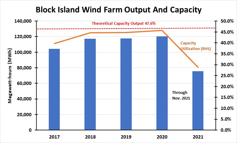
Updating The Block Island Wind Farm Data Leaves Questions
We now have the November electricity data for the 5-turbine, 30-MW Block Island Wind Farm. Electricity production for November was 7,334 megawatt-hours (MWh), a 59% jump from October’s output. The gain suggests there has been a recovery from the issues that had the turbines shutdown for parts of the summer and early fall months. The historical performance of the wind farm is shown in the chart below. One can clearly see that for last July and August, the wind farm produced only about 1,500 MWh, its lowest monthly output since the turbines began spinning in December 2016.
Exhibit 21. How The Block Island Wind Farm Has Performed Over Time
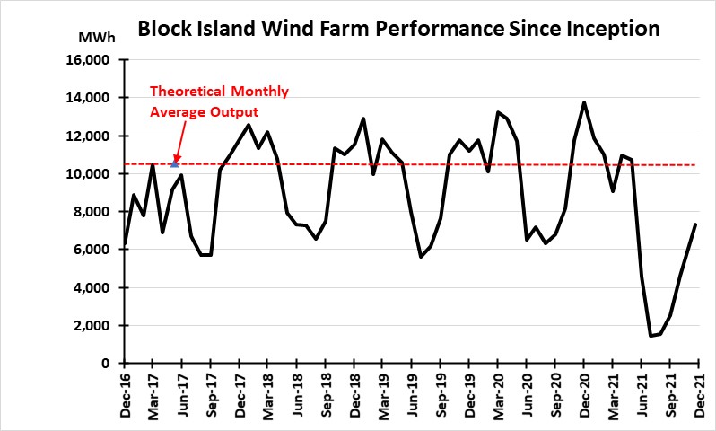
Source: EIA, PPHB
We have also updated our annual assessment of the wind farm’s performance, which will confirm that 2021 was a disaster. The wind farm continues to underperform its annual targeted output. This underperformance should be of concern for those developing new offshore wind farms, but we hear no expressions of concern, nor any explanation for why the Block Island Wind Farm is underperforming. There has also not been any explanation for the extended repairs at the wind farm last summer and fall. There was a report that the cracks observed in the wind turbines were merely surface issues and did not threaten their operating integrity.
Exhibit 22. 2021 Offshore Wind Output Will Be A Disaster
Source: EIA, PPHB
November is traditionally a good month for wind power. Weather consultant meteoblue.com has modeled the wind speed for Block Island for each month of the year. (See chart below.) The yellow and orange colors in the chart represent the two highest average wind speeds. Their appearance substantiates that wind off Block Island is strongest during the winter months. This is important, as wind-generated electricity can help National Grid, the primary utility serving Rhode Island, meet its power needs at a time when it has less access to natural gas, which powers most of the power grid in the state and region, due to gas being directed to meet home heating demands.
Exhibit 23. How Wind Speeds Differ In Each Month Off Block Island
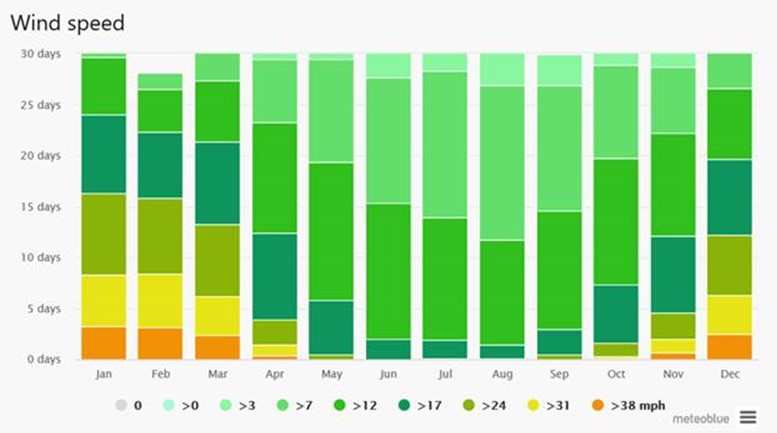
Source: meteoblue.com
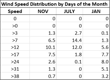
The following table shows the distribution of wind speeds by days for November, as well as calm July and windy January. One can see that there are fewer calm days and more days with strong wind during November and January when compared to July. The difference between November and January is striking, too, based on the number of days with the strongest winds.
Exhibit 24. Days Of Wind Speed In Months
Source: meteoblue.com
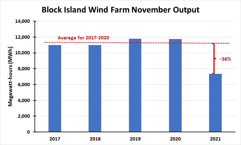
Our last chart shows power output for each November since the Block Island Wind Farm has been operating. The first four Novembers, 2017-2020, were similar in the monthly amount of electricity generated. November 2021, while up dramatically up from repairs-depressed October, was 36% below the previous four-year average for November. It was also interesting looking at the difference in electricity generated between October and November for each year. In 2020, there was nearly as large an increase as in 2021, as November output was 43% greater than October. In 2017 and 2019, the November increases were 8% and 7%, respectively. Surprisingly, there was a 3% decline in November 2018. Unfortunately, we have not be able to find sufficient weather data from those past months to be able to tell how similar those Octobers and Novembers were. The large increase in November 2020 is also somewhat of a mystery, but we think there may have been a late tropical storm or a Nor’easter, both of which would have generated strong wind for several days.
Exhibit 25. Offshore Wind Power Was Down Significantly From Past November Outputs
Source: EIA, PPHB
Other than for the mystery of the turbine repairs, the performance record of the Block Island Wind Farm has not met the projections made when it was permitted and pricing the electricity it generated was approved. The underperformance should be a cautionary note to regulators, developers, and utilities that the assumptions about output should be viewed with some skepticism. With the start of construction of the Southfork Offshore Wind Farm off Long Island, and several other New England, New York, and New Jersey offshore wind farms moving forward, the region will soon become a hotbed of offshore turbine construction activity. We will be watching the development of these wind farms, as their operational and financial performance will tell us much about how big the U.S. offshore wind business may become.
The Battle Over Stoves Continues
In our last Energy Musings, we wrote about the recent study from a team of professors at Stanford University showing that natural gas stoves release too much methane and present a climate health risk. Therefore, the healthiest kitchens should have electric stoves, regardless of whether they are the best tool for cooking food. In our article, we mentioned “a 2020 report from the Sierra Club and UCLA’s Fielding School of Public Health that addressed the dangers of residential gas usage.” That report said gas stoves were unhealthy. We commented that the study received “pushback from a study by Catalyst Environmental Solutions showing miscalculations in the earlier study’s methodology and conclusions,” but that hardly slowed the push by California politicians to ban residential gas hookups in cities and counties in the state.
Now, Catalyst has weighed in on the Stanford professors’ study and, as expected, found some troubling conclusions. Moreover, they found that the press release announcing the study went beyond the actual research to make climate and health claims about gas stoves and ovens not substantiated by the results. The telling paragraph in the press release stated:
Larger stoves tended to emit higher rates of nitric oxides, for example. Using their estimate of emissions of nitrogen oxides, the researchers found that people who don’t use their range hoods or who have poor ventilation can surpass the EPA’s guidelines for 1-hour exposure to nitrogen dioxide outdoors (there are no indoor standards) within a few minutes of stove usage, particularly in smaller kitchens.
The next paragraph in the press release went into the health effects of gas stoves, without offering any counterbalancing considerations. The paragraph reads:
“I don’t want to breathe any extra nitrogen oxides, carbon monoxide or formaldehyde,” said study senior author Rob Jackson, the Michelle and Kevin Douglas Provostial Professor and professor of Earth system science. “Why not reduce the risk entirely? Switching to electric stoves will cut greenhouse gas emissions and indoor air pollution.”
Well, of course no one wants to breathe dangerous air. However, linking a few minutes of stove usage to the EPA’s guideline for 1-hour exposure to nitrogen oxides (NOx) outdoors is misleading. The EPA NOx guideline is for one hour of constant exposure in an outdoor work environment and not for merely a couple of minutes of use of a natural gas stove. There is no indoor NOx guideline.
Catalyst characterized the press release linkage as “very much apples and oranges.” The professors did not conclude that their findings would violate the NOx standard. Furthermore, using a sealed kitchen to collect the gas during the study is not representative of how kitchens are set up or how people use them. Catalyst commented that what the study really concluded, rather than the costly replacement of kitchen appliances, is that better ventilation when cooking is the best and easiest answer, and the most healthful one. This sounds like a rational conclusion.
Stoves Are A Target In The U.K.
Across the pond in the U.K., a battle is raging over stoves, but it has nothing to do with gas versus electric. Their battle is over woodburning stoves and whether people should be able to use them. The latest revelations from a new study by the U.K. Department for Environment, Food and Rural Affairs (Defra) show that woodburning stoves cause half as much pollution as previously thought. That is a significant revision in the data, especially as people struggle to keep warm this winter in the face of soaring heating and utility bills.
Exhibit 26. Woodburning Stoves Are Being Targeted In The U.K.

Source: The Telegraph
Two years ago, woodburning stoves were targeted, along with stoves fired with other polluting fuels, by Defra. It banned the use of wet wood and bagged coal in 2020, claiming coal and wood being burned at home was the “single largest source” of fine particulate matter (PM2.5) – a pollutant damaging to human health. This claim was despite just 8% of U.K. homes burning fuel indoors. New rules introduced in January 2021 block sales of appliances that do not comply with eco-friendly standards.
The problem is that those laws and regulations were based on government figures concluding that woodburning stoves alone were responsible for 38% of all PM2.5 emissions in the U.K. Now Defra has determined that those emissions only account for 17% of the pollution. This revision means that home wood and coal burning stoves emit less pollution than manufacturing, although they do exceed road transportation and industrial emissions.
Defra says the new analysis is based on better data, as the earlier study assumed that newly installed stoves were additions rather than replacements. The earlier study also incorporated the time in 2018 when the U.K. was subject to the “Beast from the East” winter storm and an unusually high number of people were relying on stoves for heat.
As expected, the new facts have not changed any minds. The founder of Clean Air in London points out that the pollution has increased by 35% between 2010 and 2020 and is growing at 3% per year. Therefore, his group still wants a ban on new installations and on the use of stoves in urban areas.
On the other side, the chairman of the Stove Industry Alliance said, “The SIA would welcome further research into particulate matter source apportionment for domestic combustion, as we believe the true figure from modern wood burning stoves is significantly lower.”
It is interesting that woodburning stoves are being attacked when generating electricity by burning wood chips is considered “green.” When Brits open their April utility bills and are shocked by the 54% increase in the price cap, they may think differently about woodburning stoves. That increase is the average utility bill for all people on variable rates that have their payments deducted from their bank accounts. A further 20% rise in the cap in October is expected, following the end of the 6-month period starting in April. According to utility experts, there are no fixed rate plans available that are cheaper than the cost of the variable plan, even after assuming a further 20% increase this fall. Estimates also are that this price cap hike will push another 2.2 million Brits into energy poverty, bringing the total to 6.3 million people, over 9% of the nation’s population. Energy poverty is when you spend more than 10% of your income for utilities. This is a sad situation due to the mismanagement of the U.K.’s energy situation.
U.S. Electricity Consumption Poised To Rise
An article by Donn Dears, a retired GE Company senior executive specializing in power generation, published recently on his web site Power For USA highlighted the issue of U.S. electricity consumption and the impact of lightbulbs. Several years ago, Dears wrote about the fact U.S. electricity consumption was not growing and he explained why and when growth might resume. This is an important consideration given the generating capacity being added and the focus on renewable energy generation.
Dears first put up the following chart showing total electricity usage in the U.S. measured in billions of kilowatt-hours. As the chart clearly demonstrates, electricity growth peaked in 2010 and remained flat to lower for the next seven years before showing meaningful growth in 2018. The following two years, electricity growth declined, capped by the pandemic-caused drop in 2020.
Exhibit 27. Addressing The Lack Of U.S. Electricity Growth
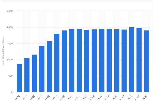
Source: Power For USA
On the question of electricity growth, Dears pointed out the impact of the shift from incandescent light bulbs to light-emitting diode (LED) lights. LEDs consume much less electricity in producing their light, and they do not generate as much heat as incandescent bulbs. To show the impact of LEDs, Dears produced a table of the trend in U.S. electricity consumption by sector of the economy, and the role of lighting within the residential sector’s electricity volume.
Exhibit 28. LEDs Have Impacted Residential Lighting Consumption
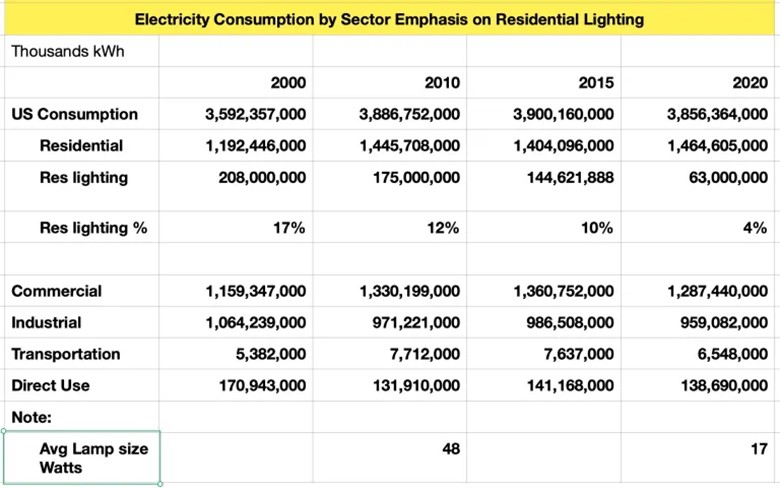
Source: Power For USA
Dears makes the point that lighting is a tiny portion of electricity consumption in the industrial and commercial sectors. With residential lighting accounting for a progressively smaller share of total residential electricity consumption over time, Dears believes this explains the plateau in total U.S. electricity consumption. He further believes that the residential lighting market transition to LEDs is largely done, and that consumption will begin growing 1%-1.5% per year given population growth. He recognizes that industrial electricity use will depend on future economic activity, as does commercial use.
Having lived through the transition from incandescent light bulbs to fluorescent bulbs and now to LEDs, we understand the dynamics of the lighting market. Dears’ observations about the electricity market and future consumption growth are enlightening, and we think on the right track.
Good News For Our Rhode Island Electricity Bills
We recently learned from an article in The Providence Journal that our electricity bills will be going down due to a settlement with National Grid over the surcharge levied on the cable that brings the surplus electricity from the Block Island Wind Farm to the mainland. The settlement is awaiting approval from the Federal Energy Regulatory Commission (FERC) and is projected to save electric ratepayers in Rhode Island more than $100 million over the next 10-15 years.
National Grid developed a formula for the surcharge for the transmission cable in 2014, using a formula allowed by FERC. The cable did not come into use until late 2017. In late 2020, the regulators realized that the estimates factored into the rate were wildly inflated. In 2020, National Grid collected $13.8 million from ratepayers for the cable when actual expenses were only $3.2 million. Despite the overcharge, National Grid was not doing anything illegal and was under no obligation to lower the surcharge. In a public meeting last March, the head of the state’s Public Utility Commission slammed the company, saying they were “ripping off ratepayers.” National Grid immediately followed up with a filing saying it would produce a solution.
The state worked with National Grid on a solution, which got more for Rhode Island than had it only appealed to FERC. National Grid agreed to pay $12 million into a storm repair fund on Block Island and a cap of $144 million on repairs to the Block Island cable. They also agreed to the lower rate, which arises from having the line classified as a transmission line subject to a lower rate than being a distribution line with a higher allowed return. The cable originally was designated a distribution line. The difference in classification returns is about equal to the $12 million payment.
We will be interested to see how much money we save on our electricity bills. We also will be investigating the repair cap on the cable, as National Grid suspended its rebuying efforts last spring so not to extend them into the tourist season.
Contact PPHB:
1885 St. James Place, Suite 900
Houston, Texas 77056
Main Tel: (713) 621-8100
Main Fax: (713) 621-8166
www.pphb.com
Leveraging deep industry knowledge and experience, since its formation in 2003, PPHB has advised on more than 150 transactions exceeding $10 Billion in total value. PPHB advises in mergers & acquisitions, both sell-side and buy-side, raises institutional private equity and debt and offers debt and restructuring advisory services. The firm provides clients with proven investment banking partners, committed to the industry, and committed to success.